Introduction
This most recent unit called reflections was a chance to look into who I am as a person. Through English, Digital Media, and Design projects I have been able to find out how much I enjoy delayed gratification. I value the time that I put into work, and I think that the effort that one puts into a project can be seen through your satisfaction in it as well as the quality of the work itself.
Digital Media Work
Mandala Project
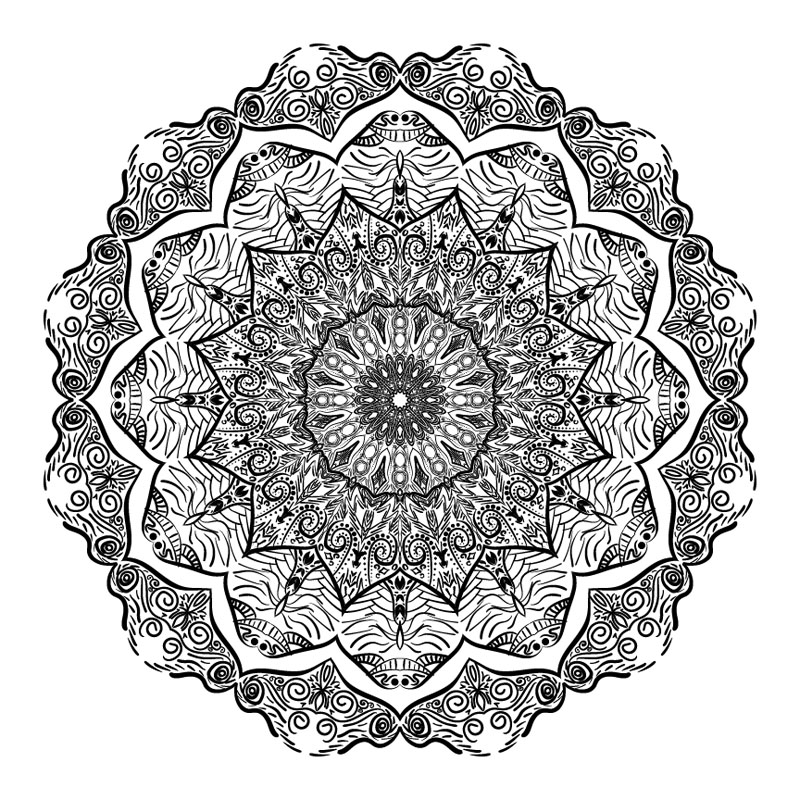
The mandala project started with formatting the mandala to mirror around the circle with different numbers of slices like 8, 10, 12 or 16. The process of making it was very satisfying and relaxing, and helped me learn how working on projects doesn’t have to be a mentally taxing thing. You can still make quality work while giving your brain a break, and the mandala project has been a great example of that for me.
Artist statement:
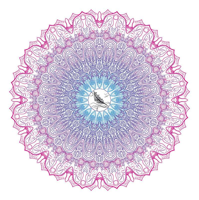
If I could do anything differently about my Mandala Productions, I would incorporate more images into them. I loved making a drawing in the middle of my colored mandala but I wish I had done that for my black and white one. Also, I would want to make themed mandalas where instead of just having patterns I would have visuals like maybe fire or nature.
I valued the progression of this project, it was very satisfying to create things and discover new ideas along the way. When I was creating the template, I wasn’t sure of what I wanted to do or how to create something that is visually appealing, however, all I had to do was start the project and then ideas popped into my head. Once I had gotten to the colored version, I valued the time spent on it where I could just zone out and work.
I have learned that I have more of a creative side than I realized and that I’m capable of keeping a good schedule as long as I enjoy what I’m working on. I learned that dedication comes with happiness, you can’t have one without the other. However, happiness can be a delayed reaction, a response to the fulfillment of finishing a project.
Photoshop Art
The photoshop art unit was a little more technical than the mandala unit. We learned to utilize skills like overlaying images on top of each other to transpose them, and we also did digital pastel and watercolor painting. It was a fun experience to start by the books, but as the projects progressed and I got more skilled, I could let my creativity take over and create what I wanted to. I really valued the freedom to make whatever image we wanted to.
Photoshop Pastel Painting
Artist Statement
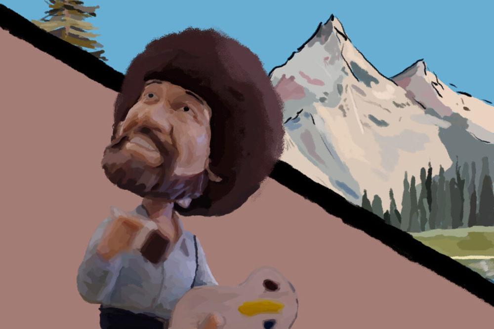
My experience with creating a Photoshop Pastel Painting was very positive. I really enjoyed the process of creating it and being able to express some ideas. The process of painting was very satisfying, getting all of the colors to blend into each other but still be able to see the brush strokes, emphasizing the fact that it is still a painting. I put two different images together and I think it worked out even better than I had imagined.
The things that I valued about creating this project were the process and the creativity. Initially, I just started working on this specific image as practice for my idea of the final outcome, but I liked the practice image so much that I stuck with it. I valued the creativity of implementing a separate background of a different painting based on one of Bob Ross’ actual paintings, and the process of putting everything together into one piece.
I learned a few things about myself through this project. First of all, I learned that sticking with an initial idea and letting it morph as the project progresses is actually a real way of making a project. That is exactly what happened to me, with the initial idea being the practice image that turned into the final product. I also learned that I pay more attention to detail than I previously thought. I found myself wanting to get the shading on the subject perfectly, and redoing a lot of sections to make them look better.
Photoshop Watercolor Painting
Artist Statement
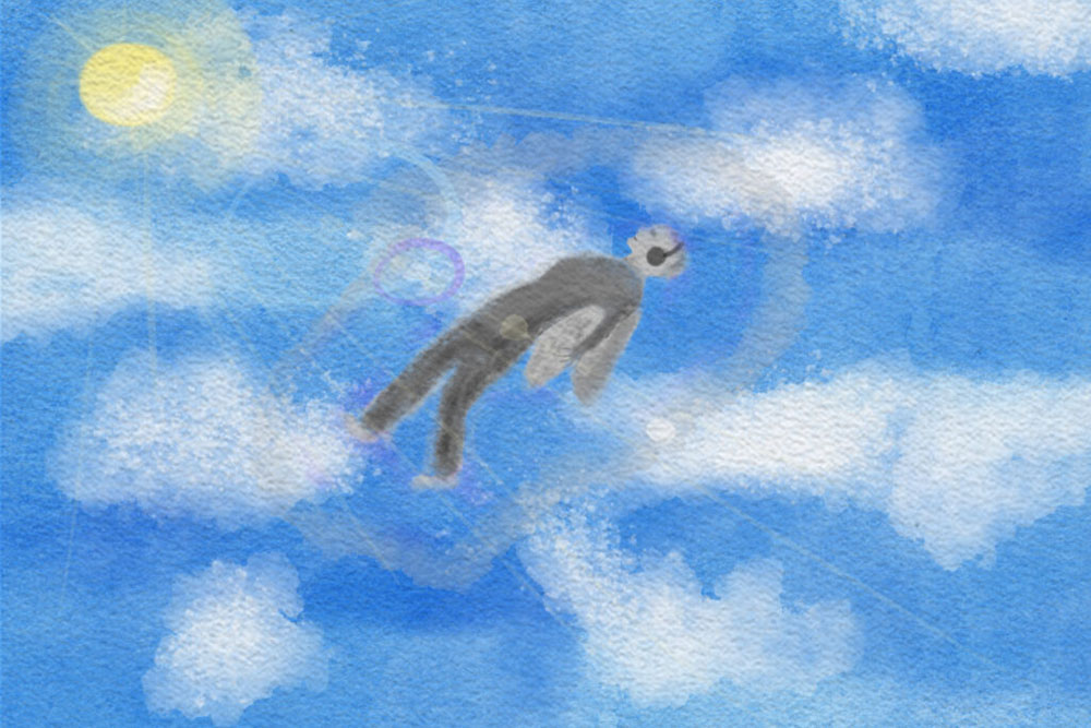
The story behind this watercolor painting is based loosely on an album cover to an artist that I used to listen to back in elementary school, Imagine Dragons. I loved the album art of Evolve, a person floating in a beam of light, but I wanted to make it my own. I decided to have the floating person be in the sky, during the day. I also wanted the person to be facing where they were floating, rather than being dragged up and unconscious. All of this with the sunbeams and lens flare make this painting almost exactly how I wanted it to turn out. It represents free will and how your mind can take you to places where you can’t physically go.
One connection that I related to while painting this was the idea of making a painting that prodded. This painting was something I have never done before because I have never used any watercolor paintbrushes in Photoshop before. This painting also holds a memory to me because it reminds me of my childhood, back when I used to listen to Imagine Dragons. It reminds me of my simple routine and old friends. Judi Betts says, “I really like the affect of building up many layers of paint”. I relate to this, I found it satisfying to experience the learning curve of paint mixing with other layers, making new colors that I would not have intended.
I valued making the Photoshop Watercolor Painting in a different way than the Pastel Painting. The pastel painting was more straightforward because we had the other image to paint on top of, whereas this assignment we had to use our imagination. The Pastel Painting was a little mindless, I found myself zoning out while I painted, but working with watercolor requires focus and creativity, two things that I really valued about this assignment. I used to do quite a bit of analog painting so I enjoyed spending time learning how to apply this knowledge to digital painting. It was a lot more similar than I would have thought, but one main thing that was hard to get used to was the flow of the brushes because it was different for each brush.
Photoshop Watercolor Painting Effect
Artist Statement
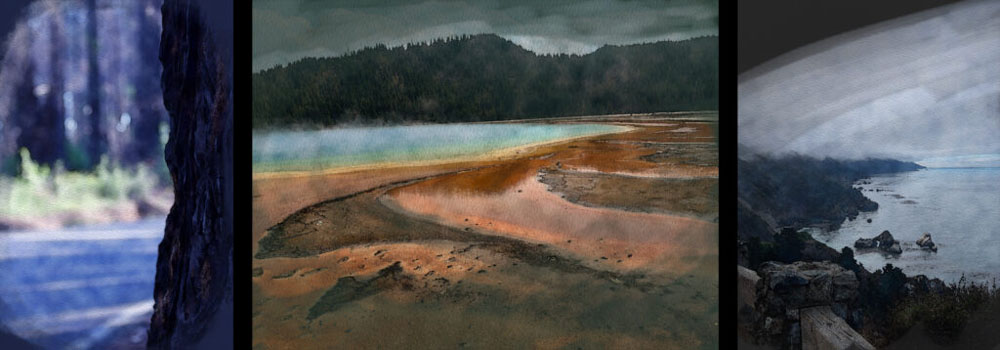
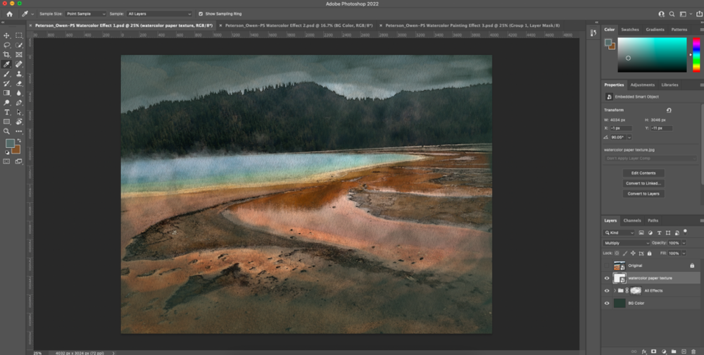
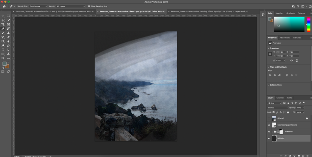
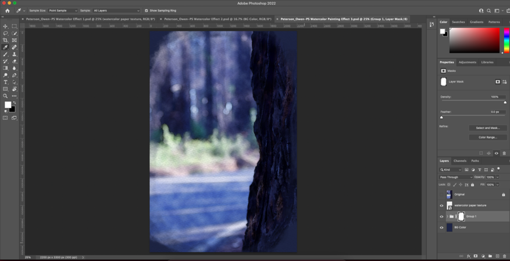
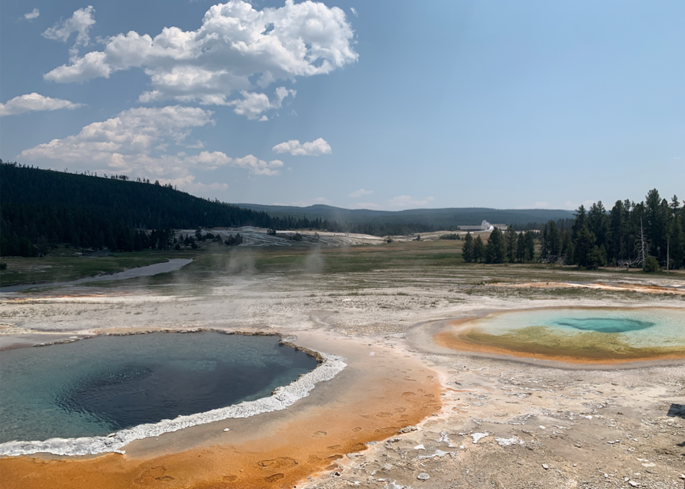
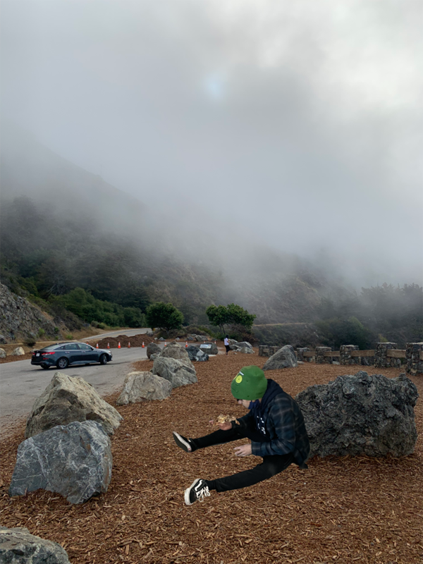
The subjects in all of my photos that I converted to watercolor paintings were all shot by me, and each of them was from a different trip that I’ve taken. The story of the first subject was that I have always wanted to go to Yellowstone my whole life, just from the reputation of it being beautiful. Last summer I got the opportunity to go, and it was nothing like I had expected it to be because I found out then that it was famous for its geothermal features. The picture you are seeing is a lake that is 180 degrees, purely from energy from the earth. The second picture is a picture of Big Sur, with the subject being the coastline. That was one of my favorite drives I have ever done. The third picture is a picture of a burnt tree in Big Basin. The reason it is important to me is that I used it to make a PSA about sustaining the environment, and I wanted to show the effects of not living sustainably.
The filters and textures that we used to make this project were very unique. I can’t see myself using them for any other purpose because it seems to take quality out of the picture, however for this assignment that is the whole point. They all tie together to make something with some imperfections and with less detail, but still just as beautiful.
For my own art, I may use these effects in situations where I want to make something appear more natural, or hand-made. Digital art can often take away from the reality of the unpredictability of painting with real paint, and I think these filters, specifically the color blend layer that we made, can help bring the painting to a more realistic and sometimes better-looking appearance.
Photoshop Composite of 2 Photos
Photoshop Composite of 3 Photos
Surreal Art
Artist Statement
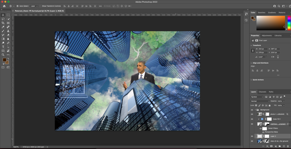
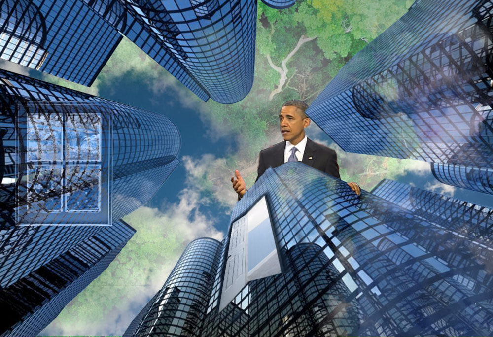
The message that my surreal composition is conveying is that the city and nature are one in the same in that they all come from the same materials. The earth provided us with the materials to make the city, so we have to give it some recognition for that. The window and the door give us a peek into the city showing that it’s not as dense as it may seem. You can see me looking at it in the reflection of the windows on the right side, showing that it’s how I am seeing everything. Obama represents the people in the city, he is looming over the building giving a speech, telling everyone the message in the image.
The techniques that I found most effective in this piece are the paintbrush on masking layers as well as the “Select and Mask” tool. I was also able to use the perspective warp tool for the door to make it appear like it’s actually a part of the building rather than just a picture.
I think that Surreal Compositions are much more thought intensive than Realistic Compositions because there are much fewer rules to follow. It makes it more difficult to wrap my head around what I actually want out of the picture since the idea is not to just make it look pleasing to the eye. However, it is also more fun because there are no closed doors in the Surreal Composition, you can place whatever you imagine in the image.