Welcome to my portfolio! These are some of my best works and projects I am most proud of from my time at Freestyle.
Watercolor Name

This project was created using a mirroring effect in Adobe Illustrator. It was fun to play around with the different ways i could write each letter to create a different effect, and I really used my creativity to find ways to make each letter different with varying details, colors, and styles.
Narrative Creature

This project was based off of our short stories that we wrote in English. I took personality traits from my main character and translated them into animals that I believed matched these traits. Finally, I combined different parts of each of the animals into one.
Documentary Book and Magazine
This project was extremely rewarding. The process of designing my book taught me how to use InDesign efficiently and effectively, and I have since used it multiple times for projects outside of school. The final outcomes of both my book and magazine article are probably two of the projects at Freestyle that I am most proud of. Completing both gave me a fun opportunity to try out multiple design choices in different formats, and although different, I love how both turned out.
Magazine Ad

Although I am proud of the entire product design unit, I especially enjoyed creating the magazine ad and its outcome. I had already created the brand itself, so I got to have a little bit more fun with how I chose to advertise it. I chose to make the ad pretty simple to really draw focus to the bottles and lettering. I made the background a subtle gradient because I noticed that many ads from the ’50s had gradients, and my brand was heavily inspired by 1950s and ’60s products. I finally added a grain to the ad to further call on the vintage look.
Movie Poster
The narrative that I created with my group in English that this movie poster is based on is called the Highest Bid. It takes place in a world where, at the age of 15, girls are sold to the highest bidding man for marriage in an auction. Esther Bennet is sold to her town’s capital representative and forced to move away from all her friends and family. Her husband becomes violent in the next few years and she begins to trace clues to a rebellion to get away from her husband and break down the system of oppression.

To create the movie poster, I searched Pexels for lots of photos. At first, I wanted the poster to show a perfect-looking suburban town, to show the facade of the town in the narrative. However, I then found a photo of a silhouette of a girl behind a curtain. I used this photo and applied a few photo filters on Photoshop to make the image more cool-toned. I then duplicated the photo and lowered the opacity to create a more warped version of the silhouette and represent the two selves that Esther has: the one she has to be in front of her husband and the one that wants to rebel and save herself.
Throughout the process of creating the poster, I learned a lot of patience. In the beginning, I had a very specific vision about what I wanted the poster to look like and couldn’t find any photos that seemed to fit that image in my head. However, when I found the image that I ended up using, it was so different to what I had imagined my poster would look like that I initially didn’t want to use it. However, I also learned that being flexible is important and the initial vision is often not what ends up being the final result.
PSA
The idea behind this piece is to spread awareness about light pollution. The lamp casting its light onto the city is representative of how much light cities constantly shine, which builds up over time and stays in the sky as light pollution. This prevents us from being able to see the stars in the night sky, which is why there are no stars in my PSA. The absence of stars is meant to be noticed by the viewer, because it feels wrong, but it is our reality. I used mostly blue and yellow because they fit with my composition and the objects in the project. They also are complimentary colors and I knew that the yellow of the light would really pop against the dark blue background, and create an emphasis on the light and words.

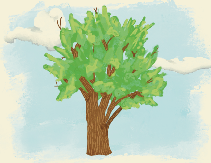
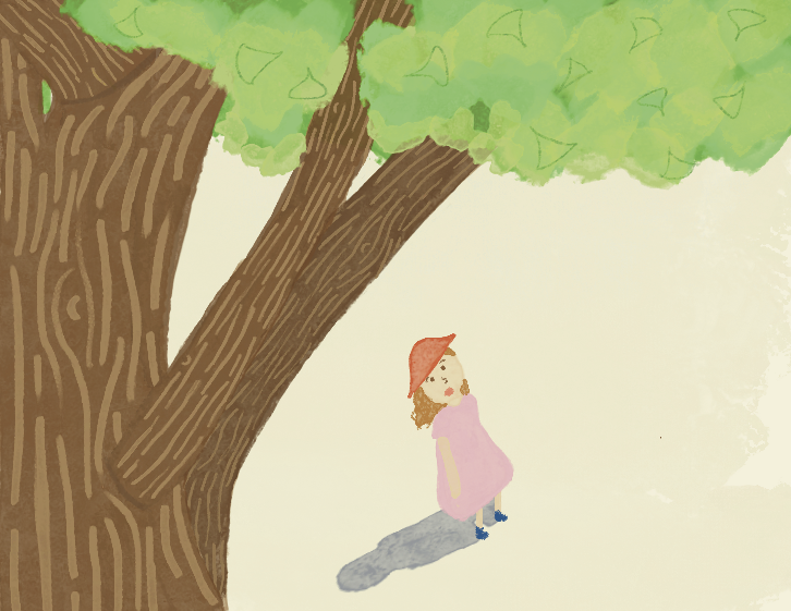
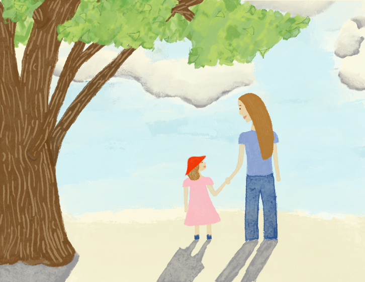
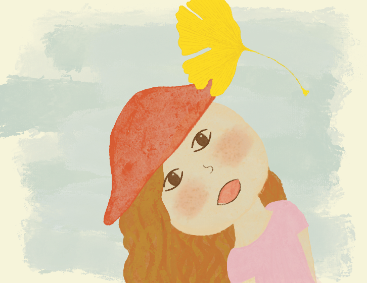
Zenith
I have always been a big reader, and I learned how to read with illustrated children’s books, so I thought it would be really cool to make one of my own, which is how I decided to illustrate a book for my Zenith project. I used Procreate to draw the illustrations, and I had never used the app before so it took some getting used to. This project was especially important to me because it was inspired by memories of my mom and I taking walks around the neighborhood when I was little, and looking at all the ginkgo leaves.