Why this unit? Why “Reflections”?
It’s so hard to know what you’ll want in four years or even four months at this age. I’d even say it’s impossible. Even if we plan every detail step by step, when things change (which is inevitable), it will be much harder to let go and adapt. But if we let ourselves get carried by expectations and impulsive whims, we may end up choosing paths we regret. And being at the midpoint of one’s time at Freestyle, it’s important to slow down and force yourself to enjoy the limited time you have left.
So in Reflections, we wrestle with the big questions:
who am I?
what have I done?
and how can I tell my Story?
We focus on thinking back on what we’ve done, how we’ve lived, what we’ve used our time on, to try to piece together what we want for our future. The Personal Essay project in English is one of the foundations of this unit and a really useful unit to write the college essay for the Common Application. The Mandala project in Digital Media is another highlight of the unit.
Taking the idea from the famous book College Essay Essentials (by Ethan Sawyer), we started the unit by creating a list of our “essence objects”, in other words objects that represented us, and a lot of brainstorming for potential topics to write about. Here is my list of essence objects:
- Lula-my childhood stuffed animal
- A Totoro DVD
- Albrijes-little hand-painted wooden animals from Mexico
- Sheet of squirrel stickers
- Tiny dessert spoon
- Jello with fruit
- Shirts I painted in Middle School
- My favorite picture of myself as a four-year-old eating dirt
- And more!
Recalling my childhood memories was a bit of a cathartic experience for me. It really made me think about the fact that I’ve been alive for seventeen years, and how each moment piles up to define who I am in the present. I felt nostalgic, and a bit of grief, because by going through so much change you are bound to lose parts of yourself. But it was a nice exercise that helped me start on my Personal Essay and even influenced my Mandala project (so read on!)
We also created a Core Value video after learning how to animate text! We recorded a voiceover in the new Isolation Booths (or IsoBooths for short) in the Digital Media room which was pretty cool, and then I spent way too long timing the text animation to the music (so please watch the video with audio to really enjoy it!)
Personal Essay
This project is based on the structure of the book College Essay Essentials by Ethan Sawyer, so the project was very much a bootcamp for writing the Common Application college essay. College applications are such a stressful experience in the US but especially here in California, in the Bay Area, where everything is really competitive and expectations are really high.
We were told to choose between four different “paths” for the essay, depending on whether we A. knew what we wanted to study in college or B. we had gone through some difficult obstacle or challenge, or both, or neither!
So without further ado, here is my Personal Essay with a Personal voice-over done by me!
Mandala
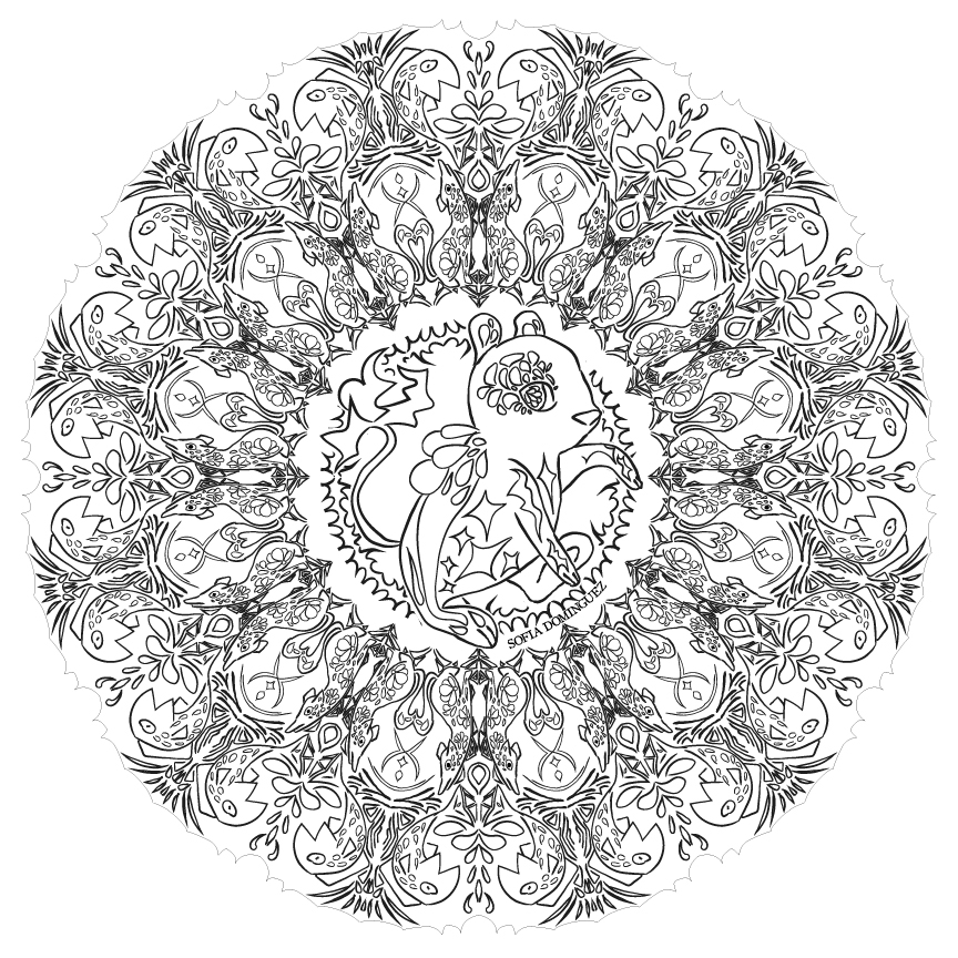
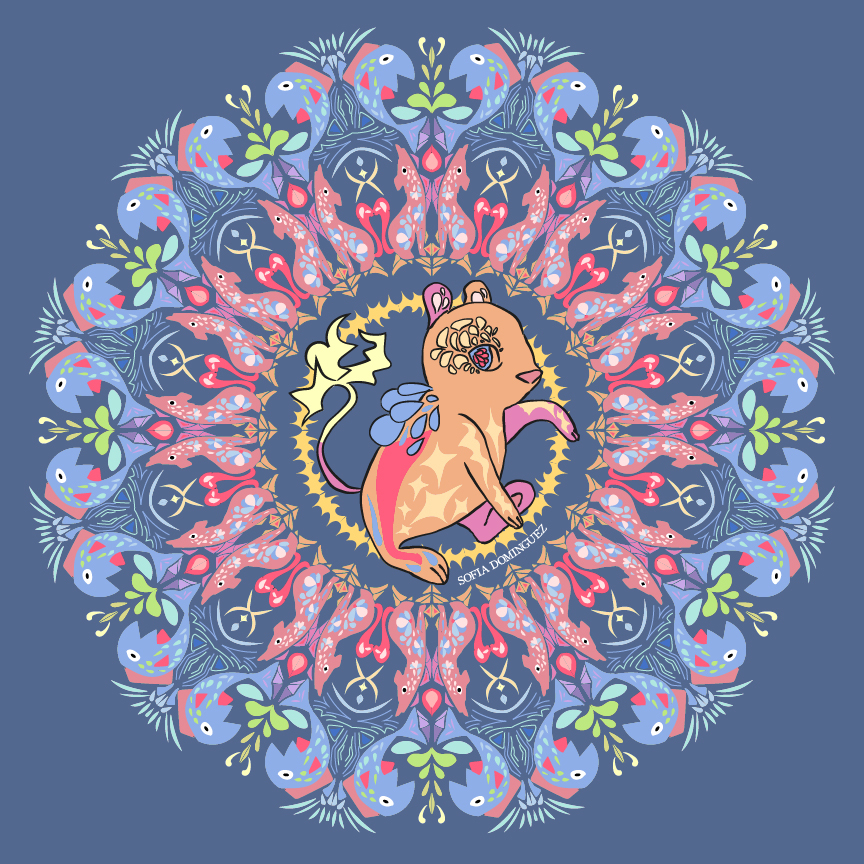
A mandala is a type of geometric art in which shapes are reflected and rotated, so that you end with a circular, beautifully symmetric design. It originated with Buddhist Monks, where they would create mandalas with colored sand, and after painstakingly long days of work days, erased the final intricate product to show how everything is impermanent. But this project is adapted for high school students who don’t have the time or discipline for such a thing, so we used Adobe Illustrator and set up some effects so that the program automatically reflected and rotated every stroke placed! I decided to make a 12-slice mandala with a non-symmetric centerpiece. It was very difficult to choose my theme, but when I thought back to the essence objects I had brainstormed for the Personal Essay project, the idea of making an Alebrije-themed mandala seemed really fun!
Watch the video below to see how I pieced together my mandala, and stick to the end for the reveal for both the Black-and-White and Colored version!
Here are the two version in all of their glory! Move the bar to reveal more of either picture.
*If the images above do not display,
On a Mac, press Command + (plus) then press press Command – (minus)
On a PC, press the Cntrl + (plus) then press the Cntrl – (minus)
Black & White Mandala Artist Statement:
I wanted to make this mandala more personal than just adding cool shapes together, so I decided to include a few objects. Using one of the “essence objects” we brainstormed in English to self-reflect on our values, I decided to make my theme Alebrijes, which are Mexican wooden hand-painted animal figures that usually represent mythical creatures (think a dragon or a pegasus). So I wanted to add patterns that are usually used when painting them, like petals or repetitive lines, etc. I decided to add a squirrel alebrije in the center to represent me, and made its tail lighting-y to make it more mythical and visually appealing. I also added some coyotes and fish to tie the mandala back to the animals theme. It took me a really long time to finish the mandala because I was constantly adjusting details to fit the theme better, but I actually liked how it turned out. This project really helped me to think about the bigger picture, like the shapes and the negative/positive space, rather than the tiny details.
Colored Mandala Artist Statement:
The process for this part was so much more simple than the black and white mandala, because I just had to choose good colors that fit well and not worry too much about shapes or space, because the colors blocked out areas really nicely. This was the chance to really push that theme of Alebrijes: expressing those crazy colors that shouldn’t go together but look incredible anyways and their firework-like energy. The hardest part was blending all the colors together without desaturating them too much and losing their energy. I learned to fix this problem by assigning a “focal color”, which would be the most noticeable area, and adapting the other colors around it. Through this, I decided to make the fish a more noticeable character than the coyote. Also, by using repetition of certain key colors (like the hot pink), I was able to tie the whole composition together. In the end, I ended up going for a kind of rainbow pattern: oranges and yellows in the center, then reds/pinks, then blues/greens. Also, fun fact: I wasn’t planning to make the outside lineless, but I just turned off the lineart layer by accident and really liked how it looked, so I decided to keep it that way. This project was a good refresher on the Live Paint feature on Illustrator, which is a really useful tool for quickly filling in colors and changing line color/size. Overall, I am fairly satisfied with my mandala, but maybe I’d like to rework the subject in the future to see if I can make more interesting results.
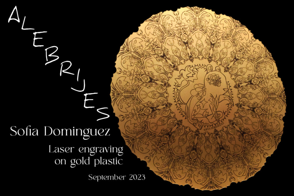
Then, we laser-engraved our mandala! We had several options, such as wood or acrylic board, and I chose a gold plastic.
Laser-engraved Mandala Artist Statement:
It was a bit difficult to choose which material to print my mandala on, because none of them really seemed to fit my theme exactly. I chose the gold plastic because I wanted to add the feeling of “radiance” to my mandala. Now I think I’d rather print it on the bamboo slab because it looks softer, or on white plastic to embrace the roughness of the lines. I am proud of how the picture turned out, because most of its glamor is actually thanks to Photoshop. To make it, I took advantage of the underexposed original photo that blacked out the background to fix the orientation of the mandala and make many edits on lighting.
Motion Graphics
Through a very long assignment in Digital Media, we further our abilities in Adobe After Effects by learning certain effects such as creating an Audio Spectrum waveform, adding distortion to text, learning how to use the Rotoscoping brush and masks to seperate elements from the background, more text effects, and also line tracking. We then created our own videos using these effects but with whatever music or images we wanted.
Rotoscoping video: (I just used a basic footage and wrote some random text)
Graphics and Audio video: (I decided to use a music track and official art from the videogame Omori)
Simple Motion Graphics video: (This is an inside joke to all Freestyle students because we read the novel 1984 in English class in Junior year)
Animation
Second year of Animation is all about 3D Animation! We started off learning how to use Maya to make basic forms, then transferring over to ZBrush for the sculpting and detail work, and finally to Adobe Substance painter to add colors and textures!
Maya
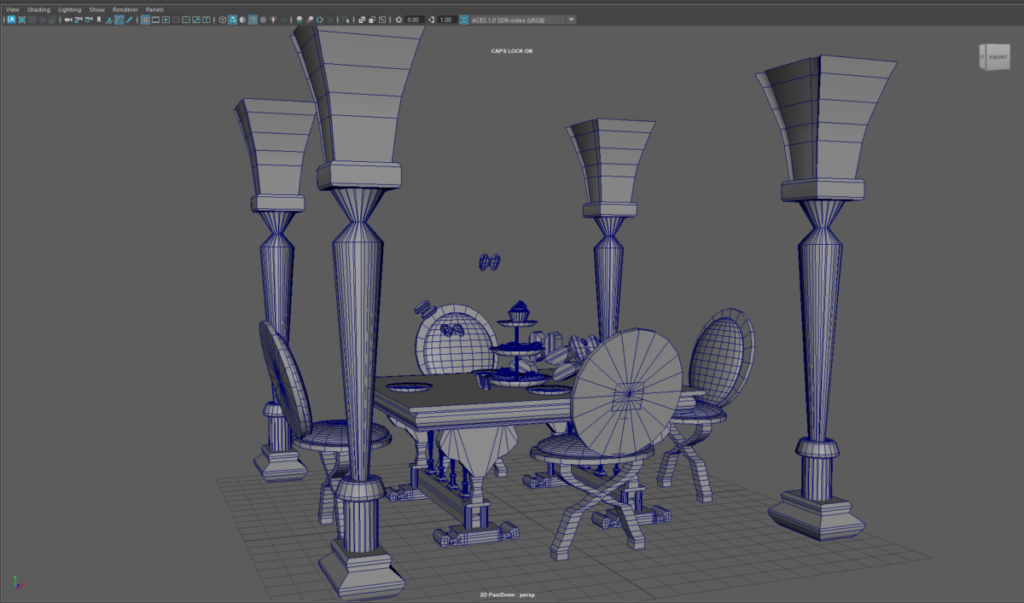
We started off with no experience by creating a table scene. I got really into it and made it a bit too complicated. We learned to control shapes by their faces, vertices, and edges, and using the cut tool to create more edges on shapes. Later we learned to use the Extrude tool to essentially pull a face out of an object out? It’s very useful and makes models much neater by limiting the amount of cuts you need to do. This is very important because in Maya, you want to make models as simple as possible, in other words with the lowest amount of polygons you can (hence the term “low-poly”), so that it’s easier to manipulate it. You don’t add details in Maya, only the basic shapes (unless you do your sculpting there too). Although because of the limited time we don’t learn very advanced techniques, we learn the basics enough to get by.
Here are several models I’ve made:
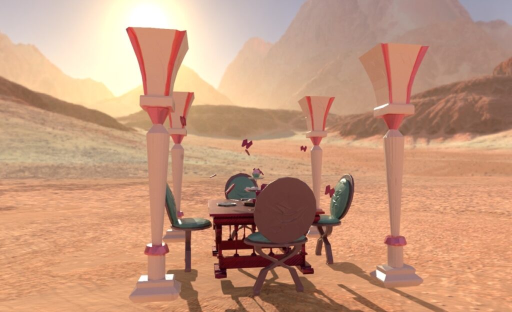
Table Scene:
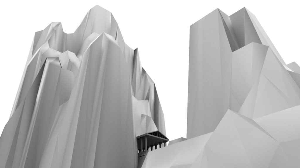
Temple Scene:
Giraffe:
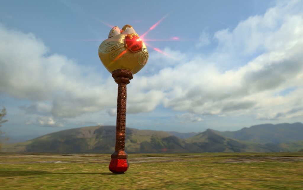
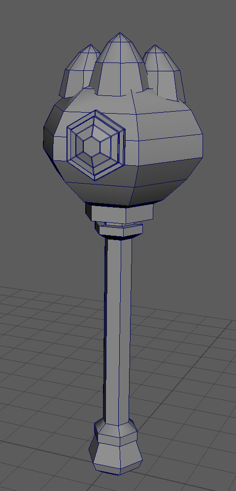
Hammer:
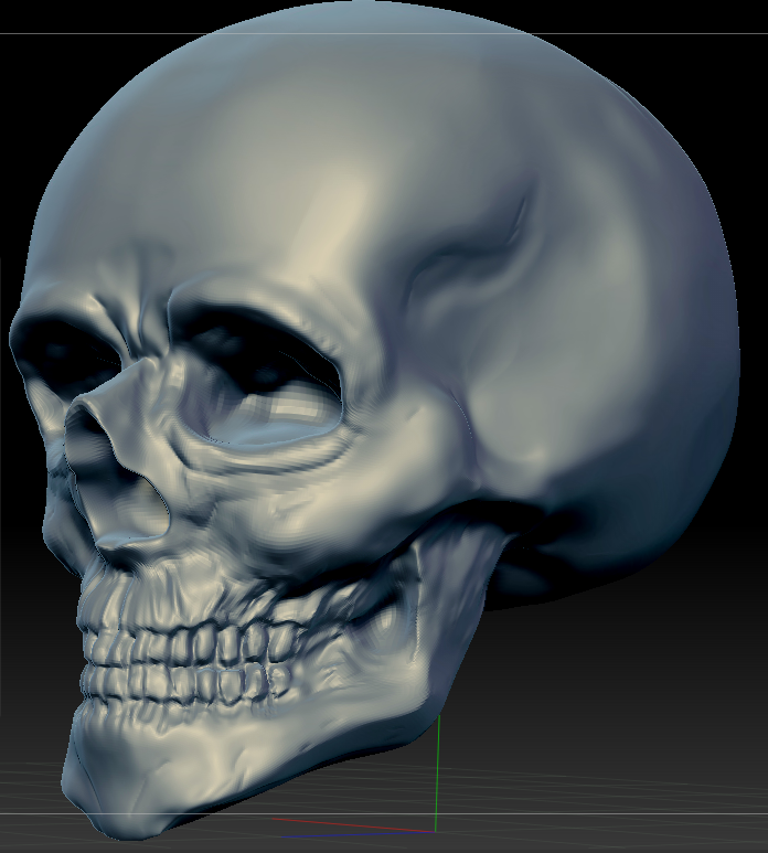
ZBrush
We began with an exercise to make a skull to get a feel for 3D sculpting. The difference between Maya and Zbrush models is that in Zbrush, everything is high-poly. In Maya, normally the model would be made up of 1-10k polygons, with 10k being pretty darn big. But in Zbrush, 10k is nothing. The normal is around 1 million, or 5, up to 10 million. With tools like Move, Polish, Clay Buildup, Smooth, etc., you can push and pull the “skin” of the models to create forms. You can also use images (called Alphas) and “print them” onto your models. You can also create basic shapes and do a bunch of other things in Zbrush, but again, we didn’t have enough time to dive really deep into it.
Skull:
Head Model: I tried to model Coraline, and I think I’m going to add some adjustments to her face and hair. Click on the pictures for full-screen!
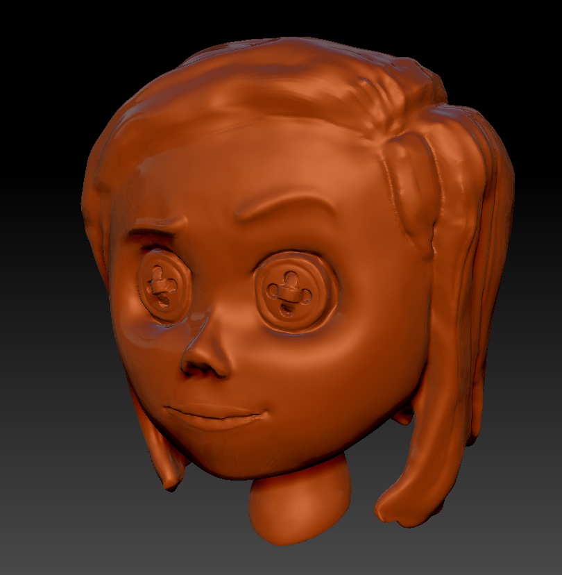
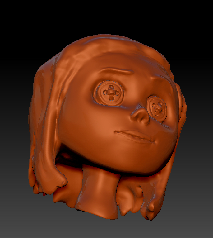
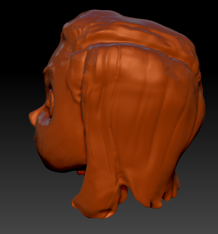
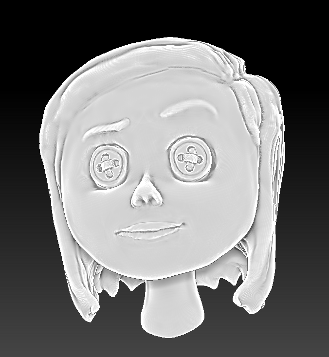
Table Scene:
Hammer:
Adobe Substance Painter
Finally, the last step: painting some life onto the models. Adobe Substance painter is a really easy to use program (unlike Zbrush, with a nightmare user interface), and it feels like a digital 3D coloring book. There are a multitude of materials you can use and change however you want, and by adding layers and layers of materials, you can really make unique textures. It also has a render feature with a small library of options for the background, and you can kind of control the lighting, which is really convenient!
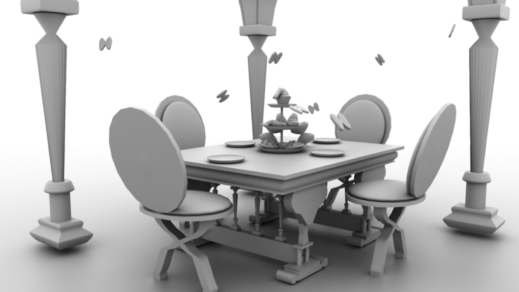
Table Scene:
Hammer: