REFLECTION
The narrative unit in Design opened our minds to visualizing other people’s perspectives. Through our photography and illustrations, we explored a variety of techniques to relate our work to society. I was grateful for the experience of the narrative unit because I improved my skills as a visual communicator.
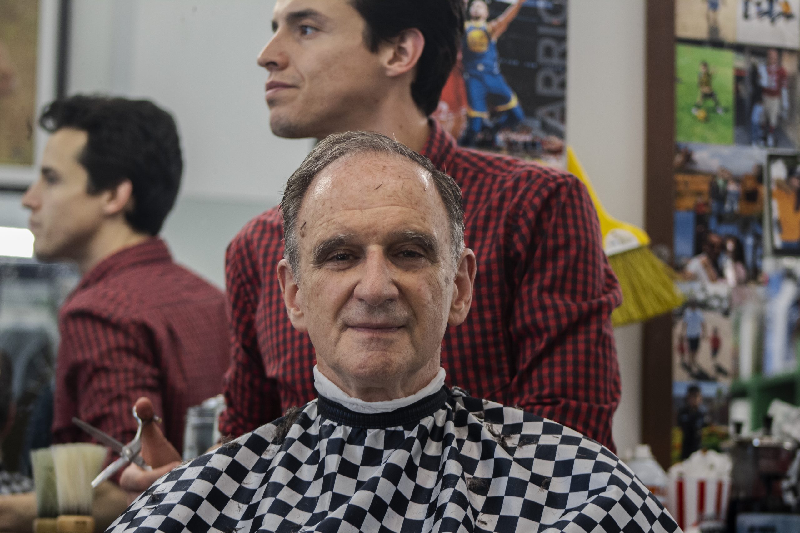
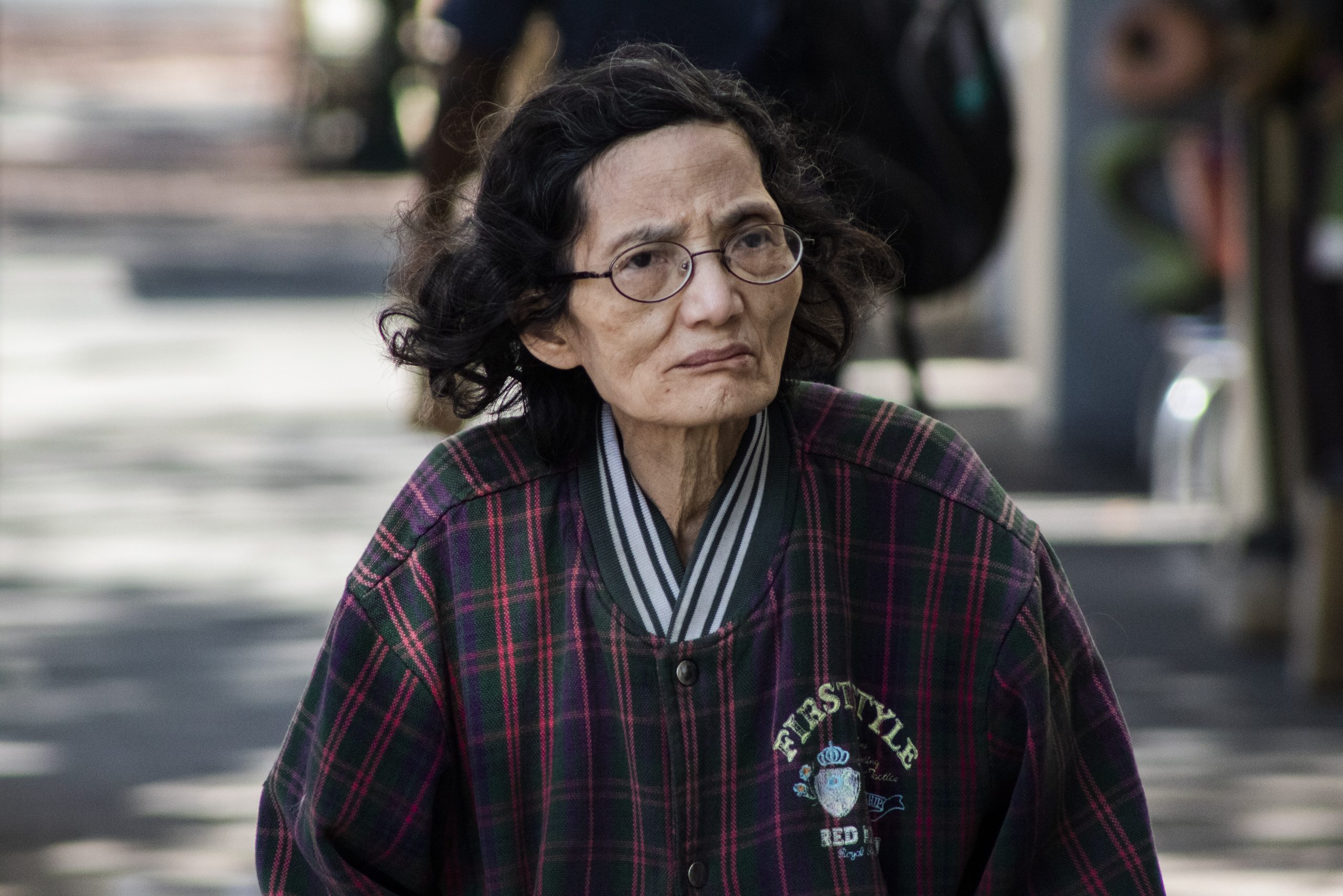
STREET PHOTOGRAPHY
CITIZEN PROJECT
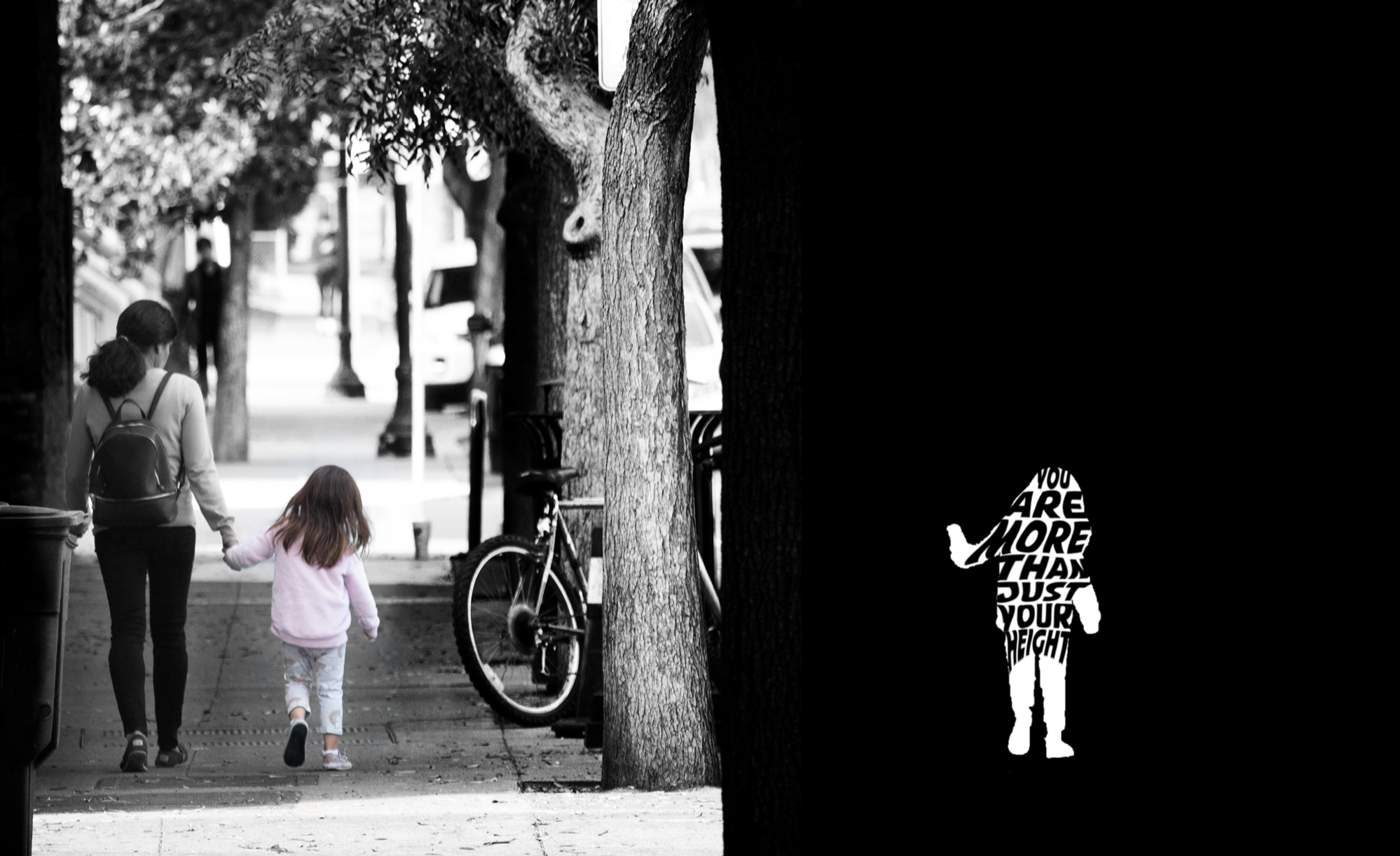
My Lyrical Essay, entitled “I am more than my size”, portrays the everyday experience of being a male who is shorter than average. I learned through this person how it feels to be looked down upon in all aspects of life just because of height differences.
Although there is no representation of a male figure in my photograph, there is an extreme height difference between the two female subjects in the photo. This most accurately represents the topic of my lyrical essay, and the idea of feeling smaller than everyone. The height difference shows an exaggerated literal sense of what my interviewee experiences on a daily basis. Although he feels this way, he continues to persevere and isn’t afraid of human connection. Having the two girls in the photo holding hands shows the connection represented in my essay despite the height difference. I also like how the subjects in my photo are seen as smaller compared to the tall buildings and trees around them.
To edit this photograph, I used Adobe Photoshop as a main application. Within Photoshop, I used a mask to turn the photo black and white, and then went back over the photo in detail revealing color with the brush tool. The font I used is a stronger looking font which is what I was hoping for. Although my interviewee feels smaller in height all the time, he uses his work ethic to gain more strength than everyone else. Having this hardship in his life, he has developed a mental strength as well, which is clearly shown through the strong font I chose. Finally, to place the text, I used the text tool and then used the warp tool to fit the text within the silhouette.
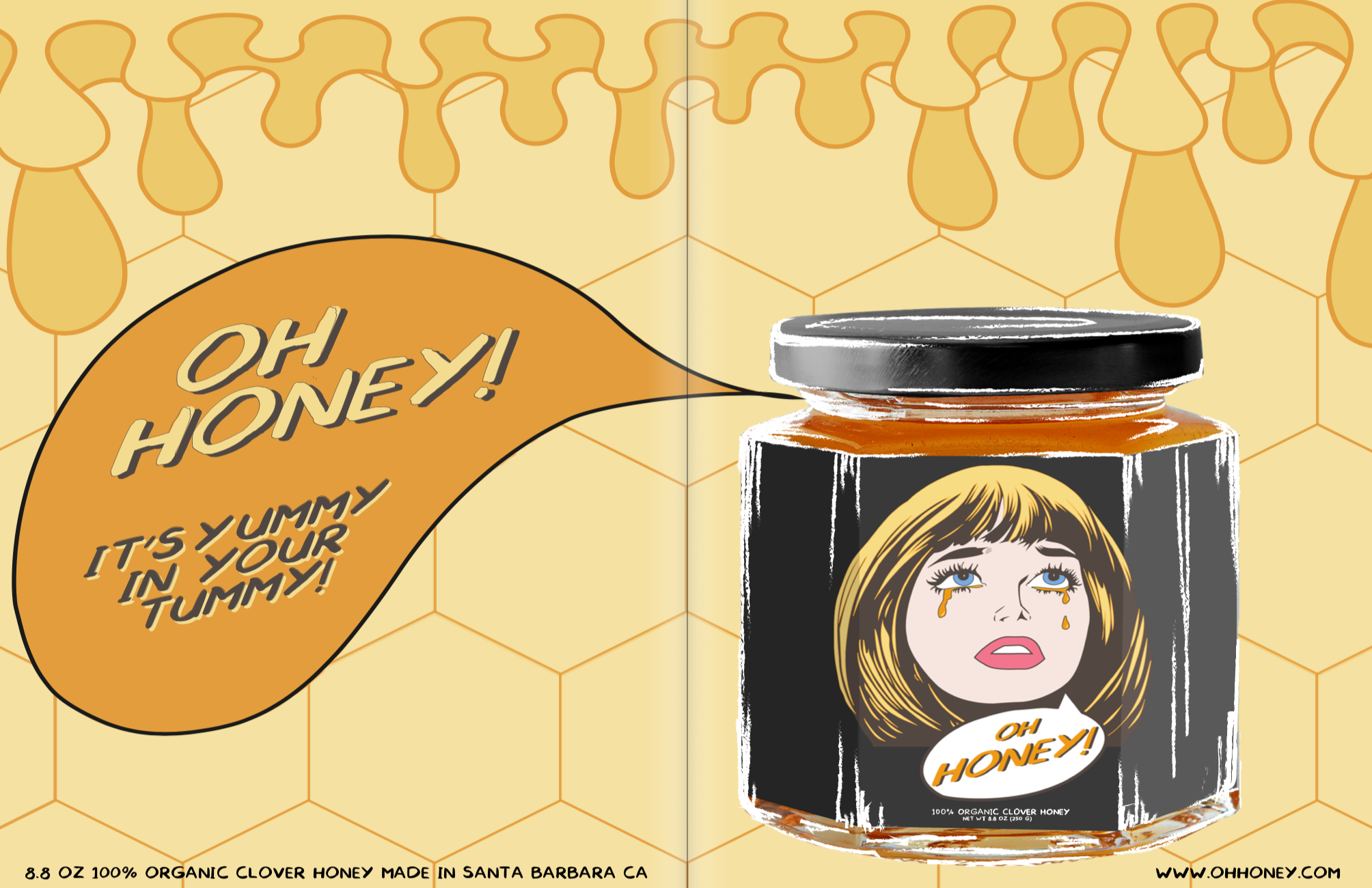
PRODUCT LABEL
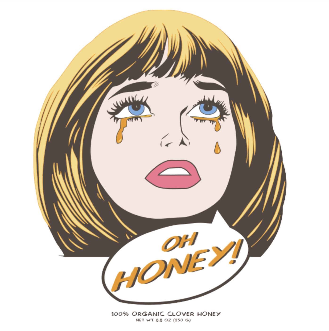
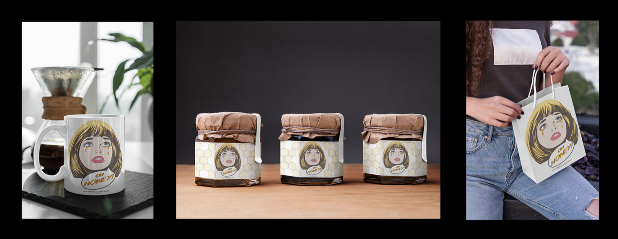
Through my brainstorming and research process, I found inspiration from Roy Lichtenstein to design a honey label using pop art. Lichtenstein used bright expressive colors to portray different moods, and I wanted to do the same. Ultimately, I chose a color scheme based on the product, honey, with emphasis on the colors pink and blue. I chose to work with a chocolate-brown outline instead of black to keep the colors for the honey color scheme consistent. Lastly, the font I chose to work with was an all-capital cartoon font, similar to the typography Lichtenstein used in his pieces.
I worked with the pressure and time constraints of the project instead of letting it overwhelm me with stress. After finding my inspiration, I created a color scheme to work with and then used Adobe Illustrator to draw the woman’s face. I used the pen tool to illustrate a traditional pop art look of tears running down the face to incorporate honey. The most challenging obstacle was finding a font that worked with the pop art theme. I needed to find a font that would emphasize the product but not take away from the art of the label itself.
: I learned that if I had chosen colors that didn’t resemble honey, the label would not have emphasized the product well enough. The font was also key in expressing the pop art look I was going for. If I had chosen a cursive font, for example, it would not have had the same effect as the all caps cartoon lettering I chose. Everything needs a purpose. Working with the product and choosing specific aspects of the design is crucial in helping to express the correct message to buyers. Finally, I created a triptych of mockup products with my label on them. I chose to put the honey jars in the center of the triptych and the mug and gift bag on the sides to emphasize the product, honey, that the labels are meant for.
MAGAZINE AD LAYOUT
MOVIE POSTER
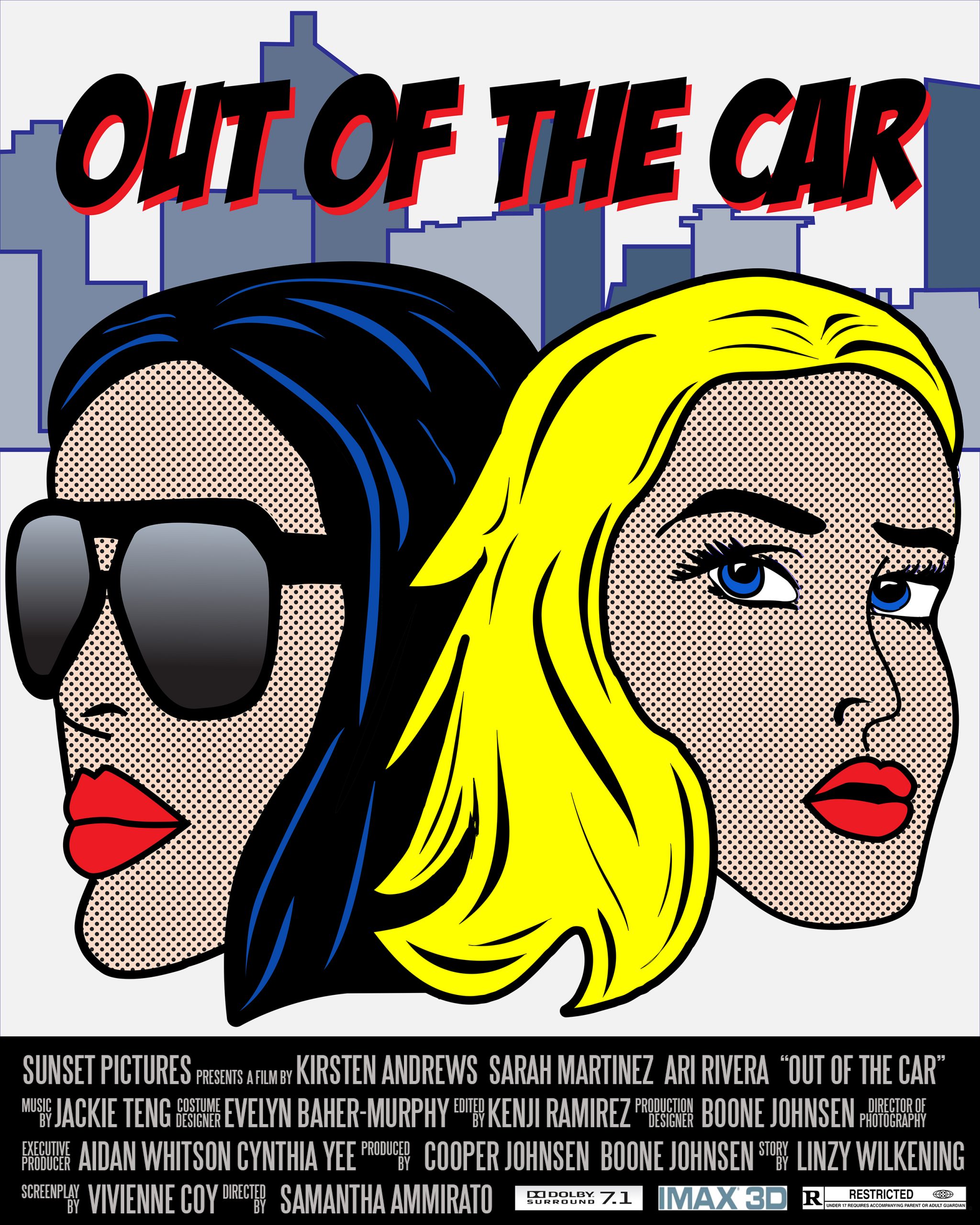
Using Adobe Illustrator, I created a poster for an action movie plot. The plot consists of two very different women who team up to fight crime in a big and troubled city. The film begins with an innocent woman, who had just moved to the city to find love and an ex-convict, who is trying to restart her life. One day, the two women meet sitting next to one another on the subway, and become friendly. As the story progresses, both girls spend more time together as they find more about one another and unveil the secrets of each other’s past. Despite their differences, they work together to help their city stay safe. With their unique and different qualities, they are proven to be unstoppable. I chose to illustrate a film noir type scene, showing an emphasis on the two women, the main characters. I used the background as an opportunity to emphasize the silhouette of the environment, the big city landscape. Having a pop art inspiration, I chose to stick with a basic primary color emphasis for my color scheme. I also went with a thick black stroke for most of the objects in the piece, also emphasizing the relation to pop art.
Roy Lichtenstein, a famous painter, was my inspiration for this project. He was born in 1923 in the United States and served a tremendous role in the pop art movement during the 50’s and 60’s. I was inspired by the emphasis of color in his art and how bright and contrasted everything was in his pieces. I chose to work similarly using almost the same color scheme. I defined the facial features and accessories on my subjects using a thick, black stroke, just as Lichtenstein and many other pop artists do. In addition, I found it interesting that each of Lichtenstein’s pieces had a sense of deeper meaning than what you saw at first glance. His pieces demonstrate different perceptions and understandings of situations, and I wanted to accomplish the same thing with my poster.