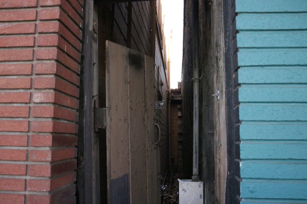
I found this spot randomly while walking through downtown Mountain View with my brothers. I thought it looked really cool and I liked how the two vibrant wall sections on the side contrast to the muddier colors of the middle.
I found this spot randomly while walking through downtown Mountain View with my brothers. I thought it looked really cool and I liked how the two vibrant wall sections on the side contrast to the muddier colors of the middle.
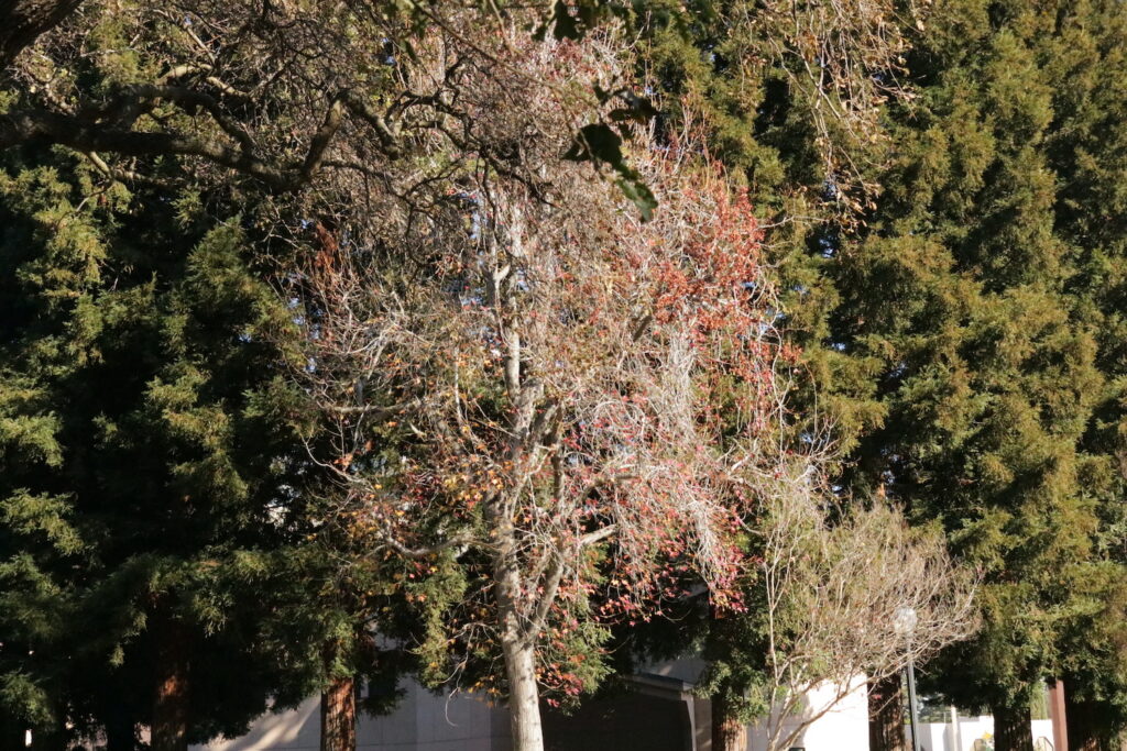
We had the same rule of thirds prompt last year, so I wasn’t sure how I wanted to do it this time around. The added prompt of “emotion” made it a little easier to choose what I wanted to do, but I’m not sure how well that came across in this picture. The two green trees on the side help emphasize the wilting one in the center. I think that the tree in the center on its own is a little sad to me, because all the other trees look so full and green.
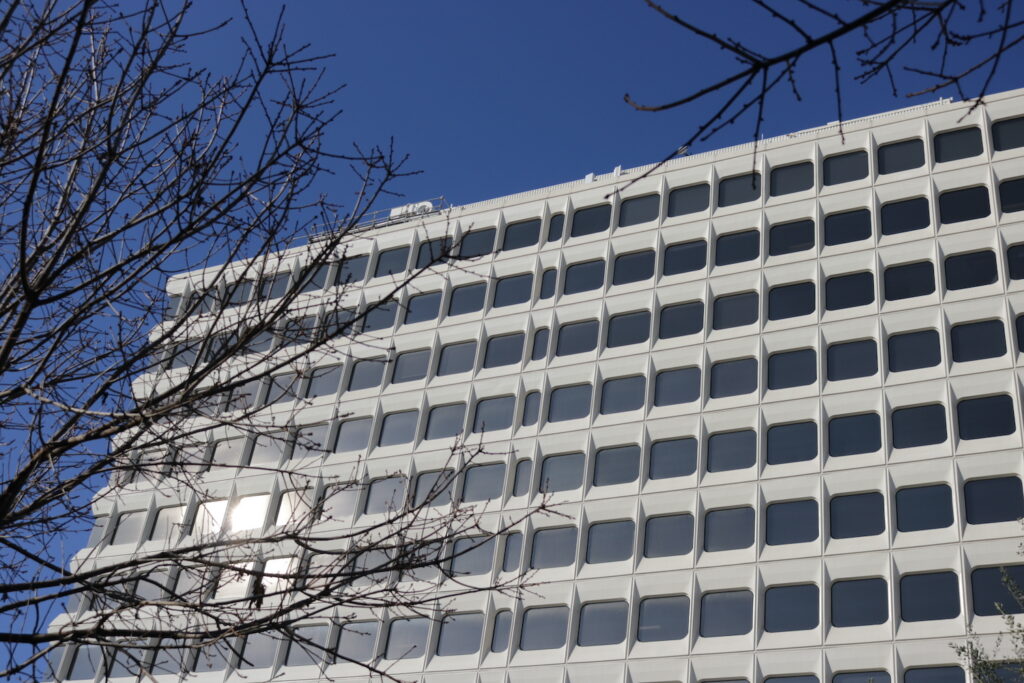
The prompt for this week was pretty open ended, so I ended up choosing a picture of this building on Castro Street. I really liked the way that all the windows looked in the frame, so I thought it fit pretty well. That being said, I kind of hate this building, because as you can see, there is a panel with slimmer windows than the rest of them, but it is slightly off center and it bugs me to pieces every time I see it.
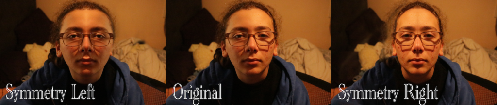
For this prompt, we were asked to use Adobe Photoshop to create an edited version of a profile photo to show perfect symmetry. I decided to use a picture of my step-brother, Eli (a current Freestyle Junior), in front of his bed. I think the photos came out a little silly, but I still think creating symmetrical photos was a cool skill to learn that will come in handy later down the line.
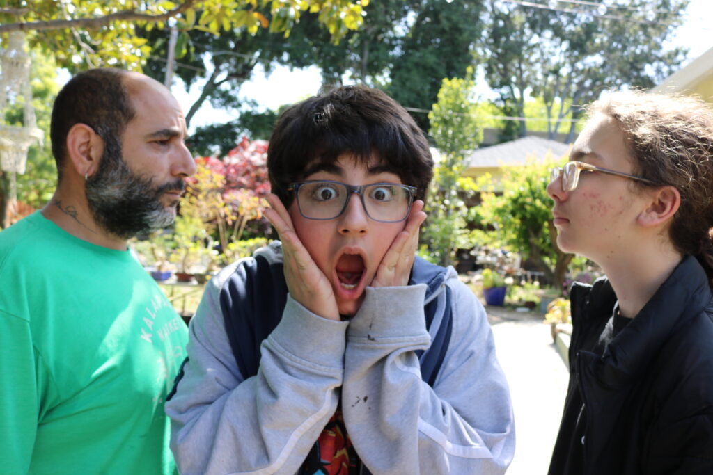
For this week, we were challenged to take a picture using to Rule of Odds. I knew I was gonna use my family in the picture, but I wasn’t sure what I wanted the composition to look like, so my dad suggested having him and Eli look at each other while Ronan looks at the camera (I told him to make the face though). I think it turned out really funny so I’m definitely happy with it.
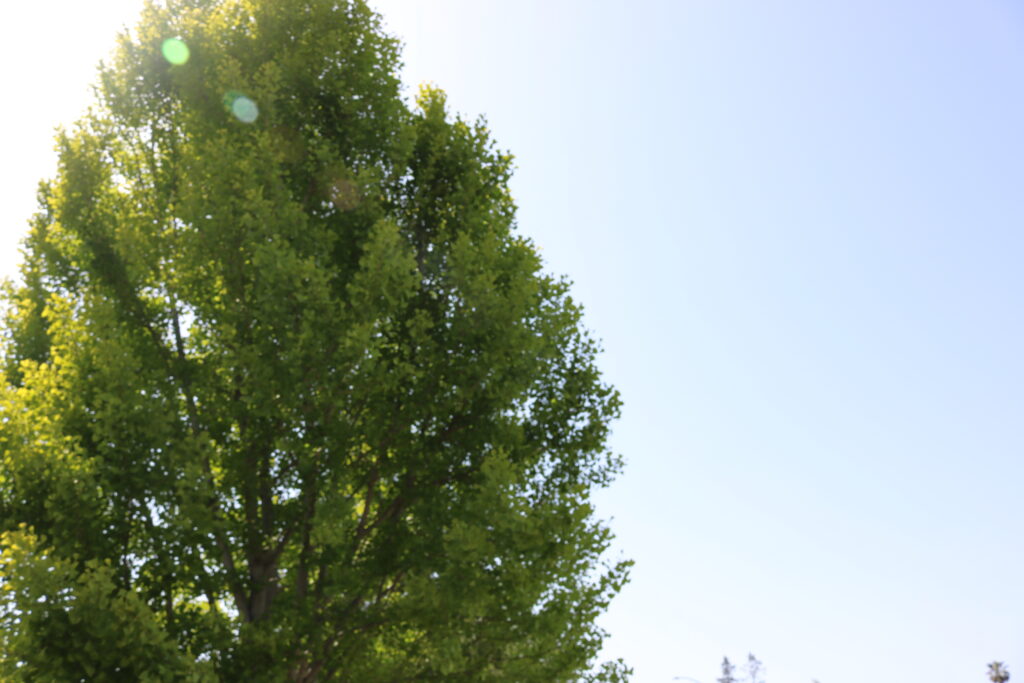
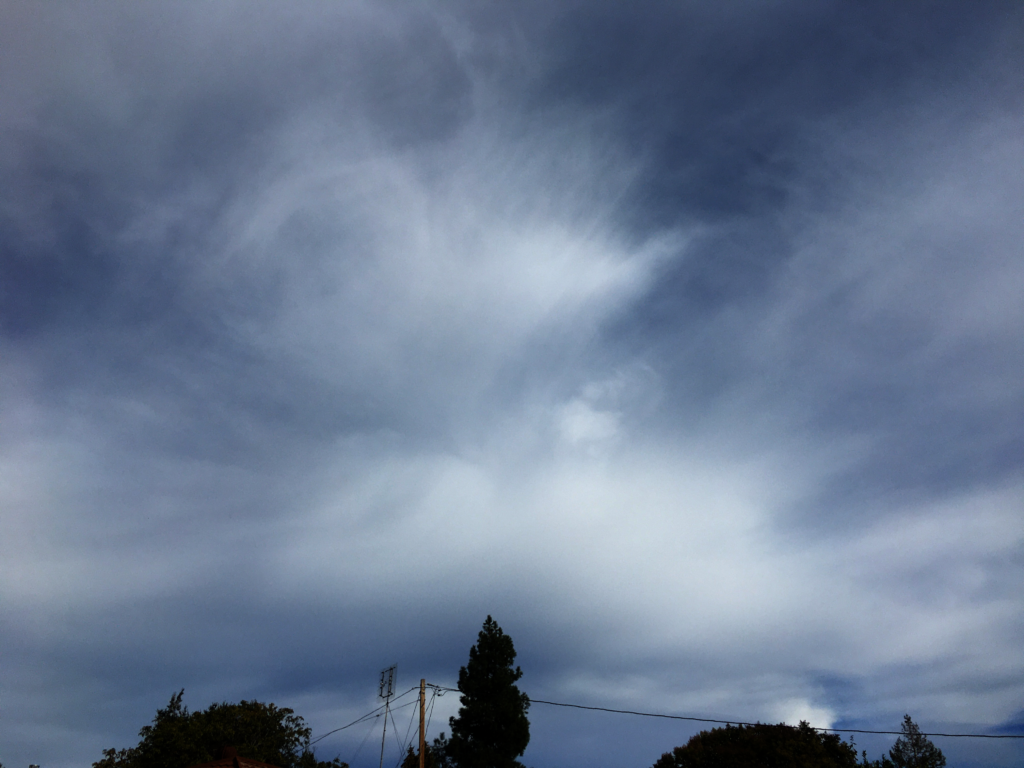
This weeks theme was personally really challenging for me. I’m not a huge fan of minimalism or blank space, so it was really hard for me to take any pictures that I really ended up liking. I ended up deciding on this photograph of the tree in my front garden with the blue sky. Again, not a huge fan, but I think it turned out nice enough.
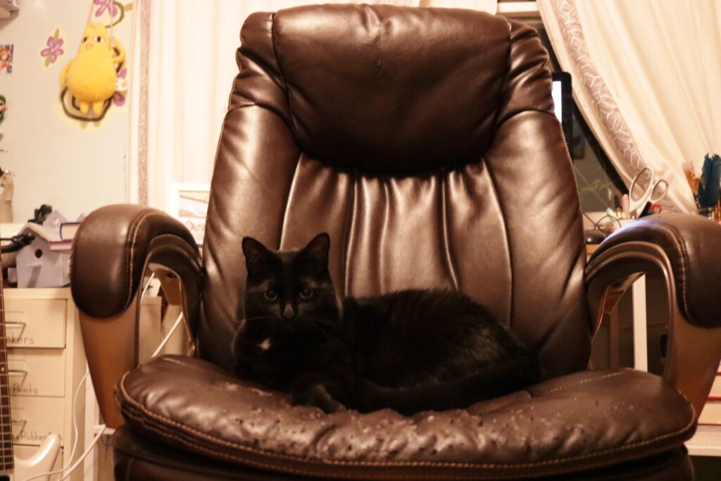
For this weeks photo, I decided to capture my cat, Poppy, on my chair. I like to think that she comes and sits here when I’m at school or work because she misses me, although, knowing cats, that’s probably not the case.
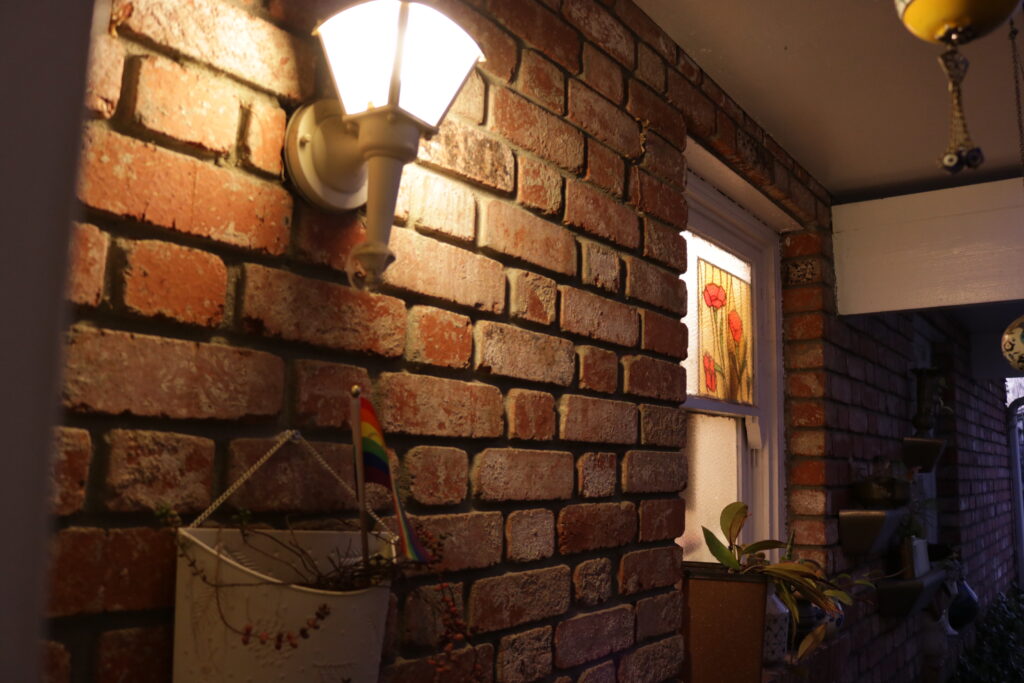
With this picture, I wanted to show balance in the lighting composition, as one side of the picture is clearly darker than the other. I also wanted to take advantage of the lines created by the brick wall and window to stretch between the dark and light.
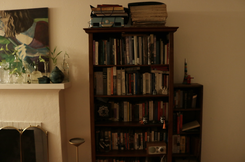
This week, I tried to capture intersecting lines as well as leading lines, which is why I decided to use a bookshelf, which features vertical lines from the books as well as horizontal lines from the shelves.
This challenge was truthfully really difficult, as finding large examples of symmetry in nature is kind of uncommon. My strategy here was to include as few objects as i could in order to make the symmetry as visible as possible. Although the end product isn’t perfectly symmetrical, I’m still really happy with how this picture turned out!