In Design, we got to explore the world of Product design and how to create a product, logo, and then eventually a magazine advertisement to go with it. We used Photoshop, Illustrator, and InDesign to produce these elements.
We started off by creating a moodboard of our product to help get a sense of the color scheme and theme we wanted to incorporate in our product.


Artist Statement:
For our Product Logo and Label Design project we got to dive into the product development world and create our own product. I had originally chosen to do chai, however, I switched to wine because I loved the formal aesthetic that came with it. My product caters towards young females, ages 21-30.
If we had been able to create a magazine advertisement, I would have continued with incorporating the same royal colors along with the mature vibe you get when looking at the bottle. I would also include more bubbles to show that I’m catering to young females in their early 20s.
To start, I created a logo for my company, Bubbly Elégante, in Illustrator. Then, using different mockups from a site, I was able to choose three different products that I wanted to place my label on. Something I struggled with was finding the right font for my logo and choosing the right colors to incorporate in my label. Overall, I really enjoyed being able to create a product from start to finish and learn more about product design.

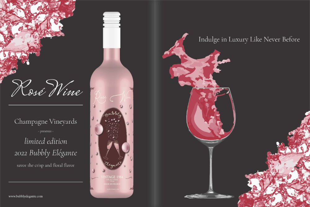
Bubbly Elégante
My triptych consists of three images that support my brand, Bubbly Elégante. I created a logo that I placed on both the tote bag and tumbler, and created a Wine label that I placed on the wine bottle. My magazine ad consists of different elements to promote my brand. Wine is typically an expensive and formal product and to express that in my magazine advertisement I used a formal layout to express that. Since my target audience are females in their mid twenties I incorporated wine splashes as my border to create a fun and lively vibe.
For the triptych I used Adobe Illustrator to create the logos for each item and then used a site called Placeit to place it on a mockup. I used Adobe InDesign to create the layout for my magazine ad and then Adobe Illustrator for all the elements within it. The wine bottle was created in Adobe Illustrator using a tool called 3D Extrude and Bevel which gave the bottle a 3D effect and allowed for my label to be form fitting on the bottle. The wine glass was also created in Adobe Illustrator using the image trace feature for the wine coming out of the glass. The diagonal borders of wine splashes were also created in Illustrator and then I recolored it to match the color palette of the ad as a whole. I really enjoyed working with InDesign and creating the layout for my magazine ad and I look forward to exploring InDesign more in the future.
Chai and Pakora Anyone?
It’s another rainy day in November and Jaya is working on her sketches for an upcoming fashion show at her favorite coffee shop called Chai & Pakoras anyone?. Kabir walks in drenched from the rain. He’s upset because he lost all his progress on his layout design for a hotel he’s designing. He sits down at the table right next to Jaya who’s enjoying a hot cup of coffee and a plate of pakora with Maggi ketchup. Jaya offers him one and they start a conversation. Two hours had gone by and the coffee shop was deserted; the rain had finally stopped. They say their goodbyes and go their separate ways. Two days later when it started raining again they both found each other at the coffee shop and this time they were just at one table. They continue to meet like this until Kabir asks Jaya out to dinner. They have a lovely time. A day goes by Kabir doesn’t hear from her. He doesn’t think much of it thinking that she might be busy. When a whole week goes by he gets worried that something happened or he did something wrong. He goes to Jaya’s apartment and finds her packing. Her dad decided he was marrying her off to one of his good friends. Kabir can’t stand the thought of her marrying someone else and tells her that he wants to meet her dad. Jaya’s dad doesn’t approve at first but once he sees that Kabir makes his daughter very happy he finally agrees to their marriage. They get married and live happily ever after. My movie poster pictures these two lovebirds sharing a cup of coffee together.
InDesign is one of my favorite Adobe programs to work with so I decided to use that for my initial layout design for my poster. I feel like I am able to communicate to my audience that this is a Bollywood movie through the font I chose for the title. Additionally, I found my image from a free stock photo website and it went perfectly with my theme of the movie. Then, in Photoshop I added my credit block, rating, and any other logos.
Reflection:
I valued that we were able to explore different ways these skills and techniques we have been using can be applied in the real world. We put our skills to use by dipping our toes into the Product Development world by creating and designing our own product. Then, we also got to explore what it takes to create a movie poster and all the elements that go into creating it.