In Digital Media we were given the opportunity to explore digital art using Photoshop. From pastel and watercolor painting to Photo Composting, we were exposed to many different art forms.
Pastel Painting
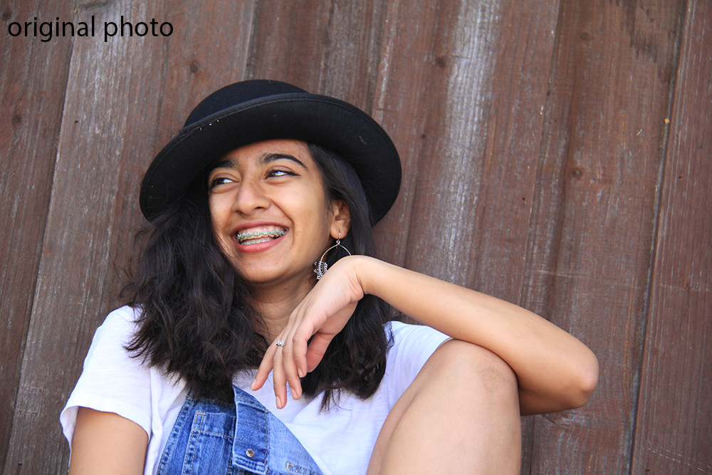
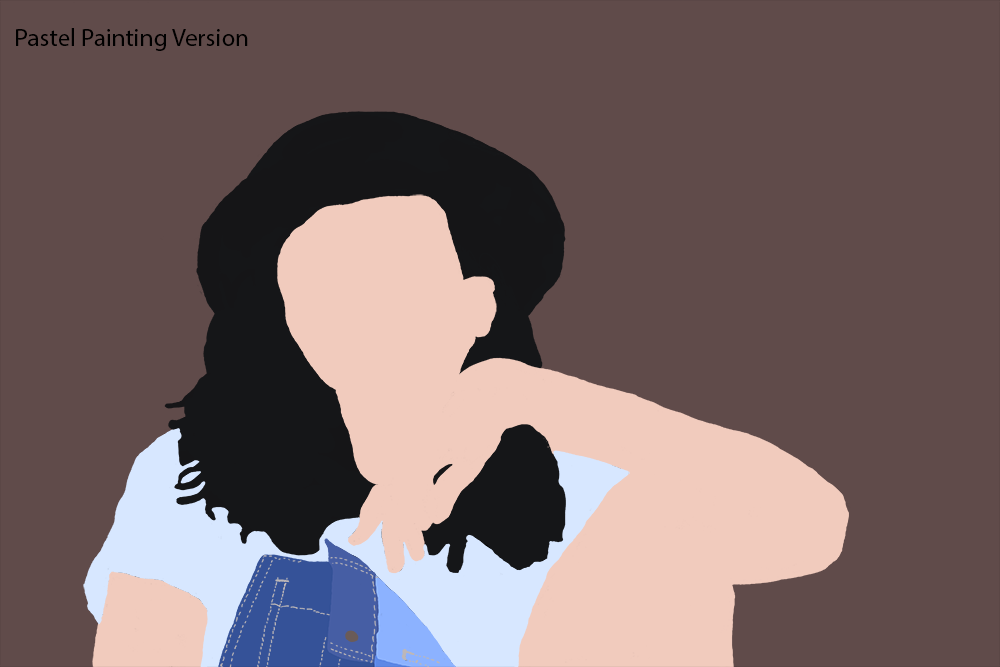
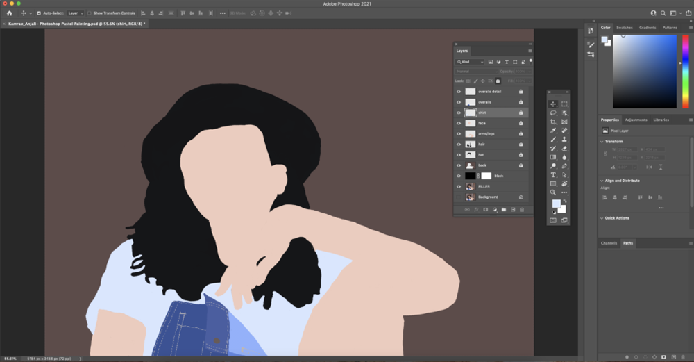
I really enjoyed creating a Photoshop Pastel Painting because I was able to try something completely different in Photoshop that I was not used to. We mainly used the brush tool in Photoshop and I was able to experiment with different brush tips to see which one worked best with the picture I was painting. I ended up painting a picture that I took of my sister in one of our backyard photoshoots. This was my first time painting in Photoshop which was hard because I was new to everything. Since I had trouble blending colors together with the brush tool, I ended up settling and using a very limited color palette. I also struggled with drawing the hair too; it was hard to get all the small wispies by the top of her head and then at the end. Overall, I think this was a great experience and I’m glad I got some exposure to painting in Photoshop. I think with some more practice I could find ways to blend colors or find a brush tip that can be used to draw hair.
During this project I found that I got frustrated many times during the process because what I was painting didn’t align with what I envisioned. This really taught me the importance of patience and learning to just trust the process. Once I let go of feeling the need to add all the details into the painting right away, I was able to take a step back to work on the bigger picture before moving back and working on the details later.
Through this project I learned how to paint in Photoshop by using the brush tool. It was definitely a struggle at first, however, after a couple tries I was able to navigate the brush tool a little bit. This project opened my eyes to many other possibilities of projects that you can create in Photoshop similar to this one.
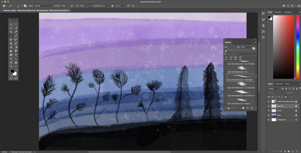
Watercolor Painting
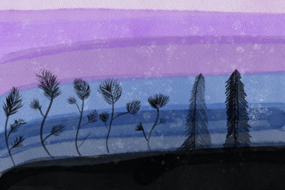
For my watercolor painting I decided to incorporate a silhouette theme throughout the piece. I included dancing plants and some tall pine trees as the main artwork. For the background I tried to create an ombre of cool tone colors ending with black towards the bottom to represent the ground. I loved exploring the different brushes and creating small splotches throughout the painting to add texture.
“Enjoy the process, and don’t treat each painting as a product. Remove all expectations from the work,” Katherine Chang Liu offers. I struggled with just starting my watercolor painting because I was so scared of how it would turn out. I haven’t been that exposed to watercolor in the past which also created a mental block to start. After reading this quote it really helped me to just get started and get pen on paper, well in this case pen on tablet. Additionally, in another article I read I saw how an artist describes how when they use watercolor it brings their drawing to life whereas a sketch is just an outline. This gave me an idea to start out with a sketch of what I envisioned and then moved to bringing the painting to life.
I really enjoyed creating a Photoshop Watercolor Painting and exploring different brushes and the textures they provide. The Watercolor Painting was definitely more difficult than the Pastel Painting and I think I ended up liking the Pastel Painting more. It was a lot easier to work with digitally and I think I could’ve done better with my Watercolor Painting if I did by hand instead of digitally. Working with watercolor was a lot harder to blend colors together as well as create strokes on top of another because the brush strokes were not very opaque. I value being exposed to the different types of paintings you can do in Photoshop and I look forward to experimenting with new techniques and brushes soon.
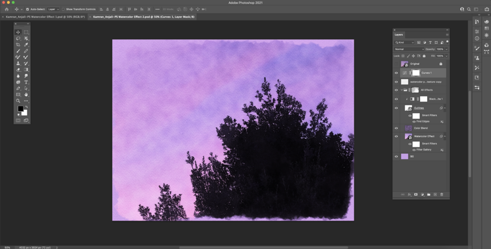
Watercolor Painting Effect
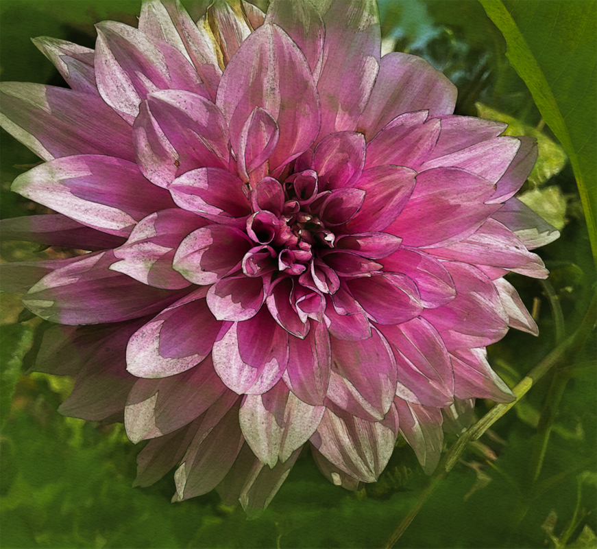
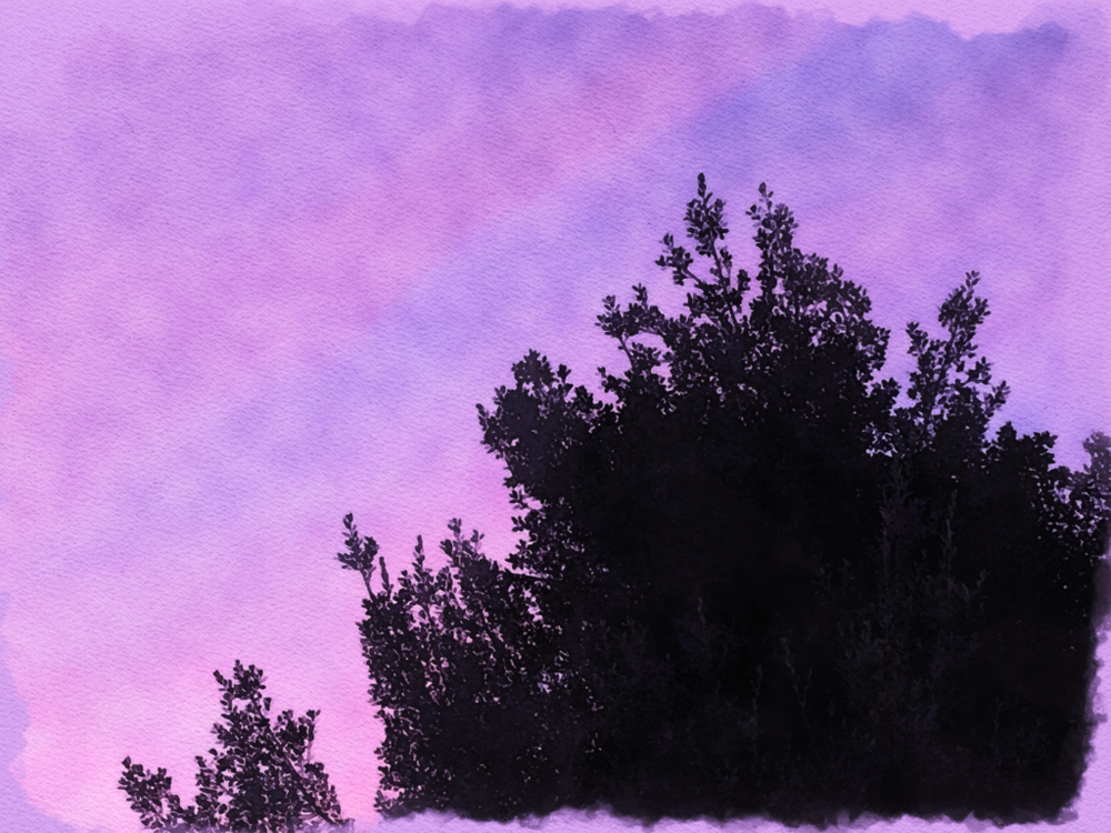
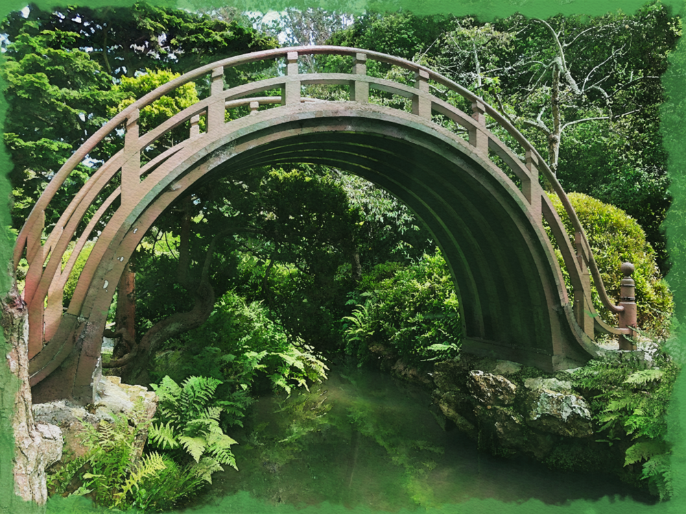
For all of my Watercolor Effect paintings I chose to incorporate a nature theme within all of them. The first picture is of a flower I took in my friends’ garden. I loved the texture and the way it bloomed and I knew I needed to take a picture of it. The second one was of a sunset that I took on one of the many family walks I took during quarantine. Lastly, my third painting was of a bridge in the Japanese gardens in San Francisco.
I really enjoyed learning about the different filters that can be used in Photoshop. It definitely opened my eyes to many potential projects that I can create in the future and I look forward to exploring the many other filters. It was really interesting seeing how different filters changed the effect of how the watercolor painting looked. I found it really cool also how we were able to get the watercolor effect that you would get when using specific watercolor paper. We were able to import it to get the colors to have that same effect but in Photoshop.
I think I could use these techniques for my own art and explore the many different filters that Photoshop has to offer. There are many ways that I could use filters in my own art other than watercolor. I look forward to experimenting with new techniques of adding filters and adding life to my artwork.
Photo Composting
Photoshop Surreal Art
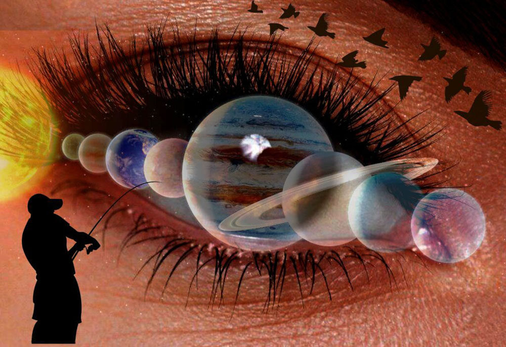
Fishing for Planets
I want the message for my Surreal Composition to be left up to the viewer’s interpretation. There are quite a few subject points that all connect back to the main subject, the eye. When we were first introduced to this project, I immediately thought of eyes as a way to express a dreamlike and surrealistic image. Sure enough, when we were looking through some of the examples, a lot of them had something to do with eyes. I loved how I could use the eye as the focal point and then had smaller things around it. For example, I included a solar system that fit perfectly over the eye, especially Jupiter because it aligned really well over the iris of the eye. Additionally, I included a juxtaposition of a man fishing for planets. This really added to the surrealist aspect of the project.
I found it helpful that we received insight on composting photos together to create a masterpiece through practice exercises beforehand, so we weren’t thrown into the deep end and expected to create something without having some knowledge about key concepts that would be helpful for us to produce this project. I also value that I had the knowledge of basic editing skills, from Design, so I could edit the photos to match the surrealistic vibe that we are going for. I mainly used the curves adjustment layer to add a darker pigment to the eye and vector masks over images to add or subtract details from the image.
I definitely like creating Realistic Compositions a lot better than Surreal Compositions. This was really out of my comfort zone and I struggled a lot with just where to start. There’s such a broad range of choices but at the same time also many restrictions that just got me stuck. Overall I’m really happy with how my Surreal Composition turned out, especially given that this was the first time I was working on a project like this.