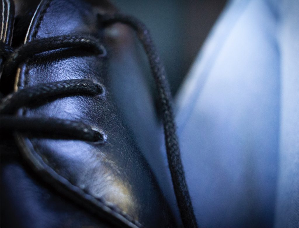
Macro Photo
We learned about macro lenses which take close up to capture small details. With our macro lenses on, we were to take photos of objects and eventually choosing our best picture. We then edited our picture through Photoshop.
Conceptual Photo
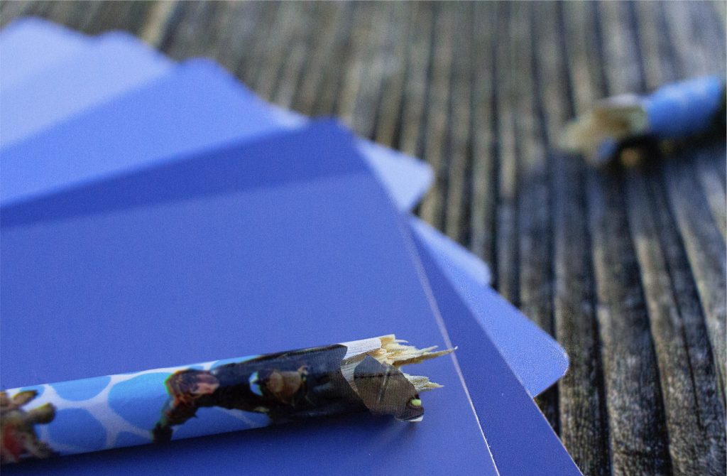
Our conceptual photo consists of two objects that represent the emotion and action of our conceptual statements given to us in English. We brainstormed ideas of these two items and took pictures of these two items together from different angles, backgrounds, and lighting. Finally, we took our best photo and Photoshopped it.
I am exploring the feeling of resignation through the experience of meditating.
For my conceptual photo, I took a picture of a broken pencil that is stacked upon blue paint samples to visually portray my concept statement. I chose to shoot at eye level and close up to emphasize the broken pencil. I chose for the focus to be on the pencils because resignation happens first and the recovering of the lost is resolved through meditation. Meditating also isn’t very obvious and often is minimal. It can improve someone’s entire day so to that, the paint samples cover most of the background.
I chose a broken pencil to represent resignation. I interpreted resignation as giving up. With the pencil snapped in half, it shows the anger and frustration before one gives up. I chose different shades of blue paint samples to represent meditating. Meditating is a calming activity that some do. I think watching paint drip is calming and each drop of paint falling is like each breath we take. I specifically chose blue colors because blue represents calmness. I chose to shoot at a park bench because the wood could also represent the calming of meditiating, especially in the park where people can take a break to look around.
Through Photoshop, I was able to sharpen the wood at the end of the pencil to make more emphasis on the brokenness of the pencil. I also sharpened the edges of the paint samples to let each blue sample stand out. I used the blur tool to blur the characters on the pencil and attract the eye more towards the broken pencil. Saturating the photo, specifically the blue, allowed for the paint samples to become more vibrant and the different blues to stand out from each other. I blurred the wood background near the bottom right of the photo to emphasis the objects rather than the wood.