Narrative 1
introduction
Our first narrative unit was designed to be an introduction to storytelling. Beginning with English, we wrote flash fictions inspired by works we read. In both my digital media and design classes, I used illustrator to create interesting designs. Design provided a great learning experience as I became familiar with the tools involved so that the digital media project was much easier. I feel that I’ve improved my storytelling as well, but there’s still plenty of room to grow, as there always is.
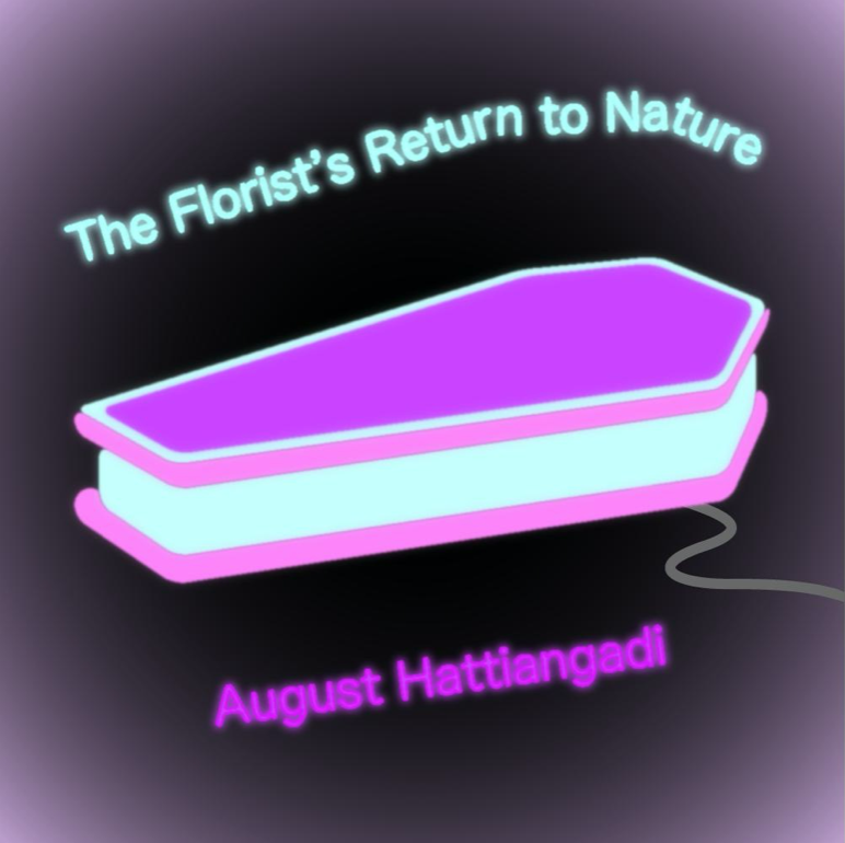
“The Florist’s Return to Nature”
My narrative began with the concept of someone going to sleep in a coffin each night because they wouldn’t want to burden the person burying them. I could relate to this character, being the masochistic sadgirl martyr I am. It’s really derived from the “Gosh, if I die, who will remember me?! Have I made a lasting effect on the world?!” sort of dilemma, but I’d read enough romantic YA novels with deep characters to become bored of that. So I spun it around to consider the type of person that really doesn’t want to be known at all, and yet craves recognition, as anyone would.
To be honest, everything I created after that was a sort of caffeine-fueled fever dream. I cringe whenever I look at any of my own writing, never mind the short story I completed four months ago, which I’m now expected to record and write a page about. I may be a little too harsh on myself, or perhaps Mr. Greco is entirely too kind.
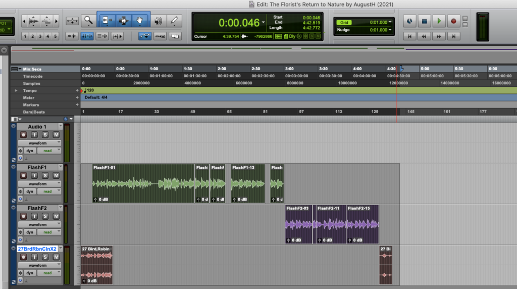
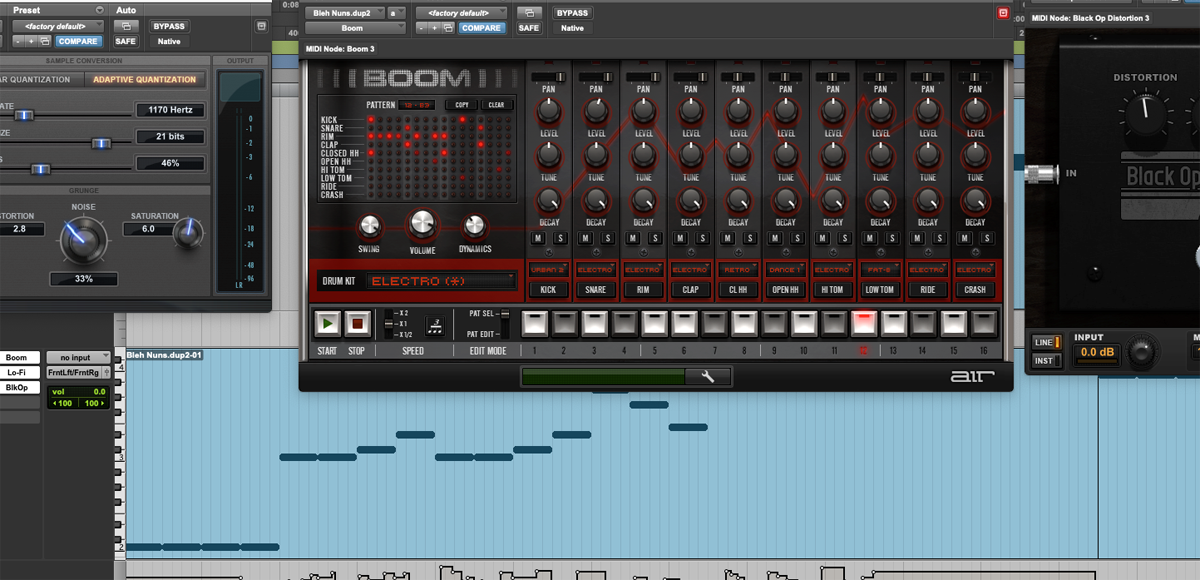
For the vocal production, I recorded myself narrating my story, then edited it in ProTools. I added bird sound effects as well, and faded them so that they’d blend in with the production.
illustrations
I dedicated my illustration project to my boy friend. That is, we’re friends, and he’s a boy, ha! I’m so quirky. Anyways, we’re also dating and I made him this hilarious patch in the supposed dimensions of a Boy Scouts merit badge. He’s working on his Eagle project, so I thought I’d give him a little motivation. I’m pretty darn proud of the design, so I’m glad you’ll be able to appreciate it along with the final product.
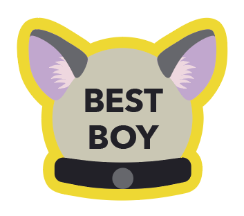
For the design portion, I used the official Boy Scouts of America brand guide as of July 2019. It turns out that they’re incredibly attached to their style, which I can appreciate as a designer. In addition to their ridiculous possessiveness of Scouting Red, The Boy Scouts of America offer comprehensive color schemes for each brand of scout, ie. Sea Scouts versus Cub Scouts, and other gems, such as the recommended angle for diagonal overlays (72 degrees, the angle of a Boy Scout pocket). I highly recommend checking out the full 98-page pdf here. I used Scouting Tan, Scouting Warm Gray, and Scouting Dark Gray.
However, for the physical production, I ran into some problems. For one thing, I was limited to the colors of thread that were available and compatible with the embroidery machine. This was easy enough to overcome; I simply estimated which thread color was closest. You may also notice that, while the font in the original design was sans serif, the final patch is serif. I chose the closest .25 inch font available for the machine and realized that serif would be easier to read in person. For some reason, the inner pink part of the ear appears to be printed over the outer ear portion of the left, but I was reassured that this is an almost imperceptible error. I figure the final product does the job for a gag gift.
music
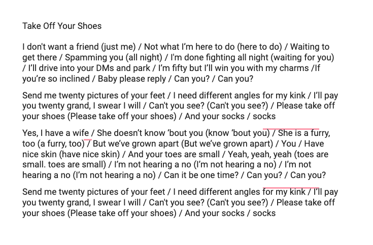
This parody was inspired by the intrusive nature of Men on the Internet™. The idea formed from a phenomenon documented on Instagram by @swipes4daddy: older men in their 50s or 60s on social media/dating platforms, their ludicrous interest in much younger women, and the strange mental acrobatics they used to justify this behavior. Something that stood out to me was this blatant disregard for any sort of boundaries a young woman might have; in fact, they seemed to lead with explicit fiction or requests, completely unprovoked, with as much panache as one might belt the sudden introduction of a chorus. I chose Joji’s “SLOW DANCING IN THE DARK” as the song of origin based on these factors. It was incredibly popular, with a dramatic chorus that stood in high contrast with its verses, and its energy was self-victimizing, which I love. Like I said: masochistic sadgirl martyr.
In practice, the idea proved to be much more of a struggle. While I’ve had experience in a choir, the main focus has always been blending, attentiveness to surrounding voices, almost to the point of reliance. In a solo, it was difficult to mimic Joji’s casual articulation, and though the awful sense of pitch was somewhat intentional, my improper enunciation paired with low-quality recording techniques resulted in unintelligibility at times.
It was a welcome surprise when the production was met with laughter. I hadn’t expected an iota of the appreciation the class had for my poor taste in comedy. Though I remain convinced that a large portion of the humor stemmed from the absurdity of a song about foot kinks playing in an educational setting, the reaction to this piece of work reflected something more meaningful to me. People don’t look for flaws, and they don’t want to hate something they can laugh about. They’re inherently forgiving when they can find joy. That was the most important thing I learned during this production.
design
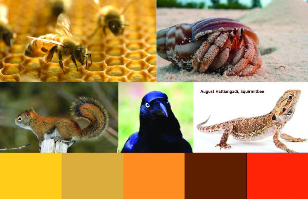
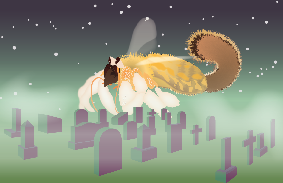
Our class was instructed to create a creature from a variety of animals that share characteristics with our narrative’s main character. My Squirmitbee includes the features of a squirrel, hermit crab, and bee, which have been combined to form the name, as well as a crow and iguana. To create my creature in Adobe Illustrator, I worked from the head backwards, finally ending at the tail and wings. At first I struggled to make progress because I was so focused on the details, but once I decided to outline the basic shapes, it became easier to manage my time. These are all mellow, cunning creatures, to reflect my character’s melancholy nature. I particularly enjoyed meshing the iguana pattern and underbelly with the bee body. For the background, I created each headstone individually using two-point perspective, which I found in most images of cemeteries. My personal favorite headstone is the second of the second row because finding and displaying the colors of the diagonal faces was satisfying. I wanted a slightly spooky, yet romantic look for the setting, so there’s plenty of fog and gradients to placate the harsher tones of forest green and deep purple.