Reflections
Introduction
The goal of the Reflections unit has been to answer questions about ourselves. From the mandala I made in my digital media class to the Aborigine-inspired Photoshop painting in design, this semester has been spent on the glamorous goal of self-expression. Though I’m generally an introspective person, I still feel that I’ve learned more about myself. Spiked with new skills and a variety of applications of technology, I felt that this unit had the perfect balance of familiarity and challenge.
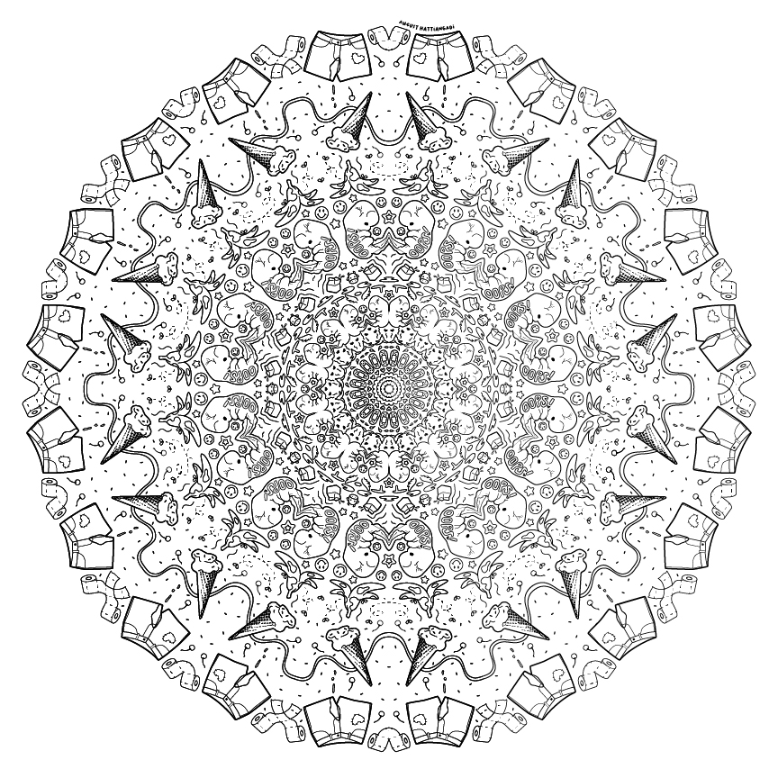
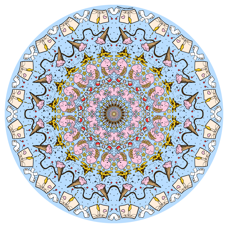
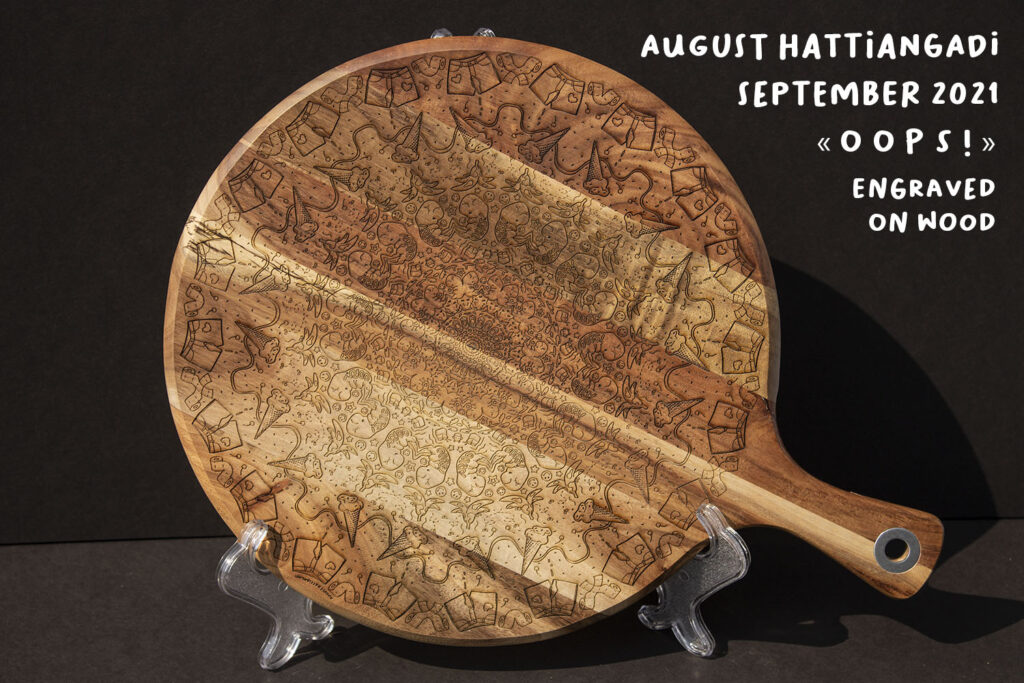
Mandala: « o o p s ! »
The mandala project has a lot of visual appeal without requiring much aesthetic thought. I’m pretty used to doodling symmetrical patterns mindlessly, and the mandala is very familiar to me because of my Indian heritage. My mom had a mandala hennaed onto her at her wedding. By my senior year, I’d become a little bored of mandalas. So for mine, I took the opportunity to flesh it out on Photoshop with a theme: mistakes. The appeal of using symmetry in Photoshop is that it will always be perfect and reorganizable. Like all digital mediums, it somewhat takes away from the organic nature of traditional art, but I found that the finished product was more rewarding because of the message I was able to incorporate. The line art was engraved on a wooden pizza board.
Artist Statement:
I created « o o p s ! » as a bit of a giggle. The concept was a theme of accidents. I’m really happy with the way the engraving and black and white mandala turned out; they definitely exhibit who I am as a person. The fetuses are interesting elements that stand out against the ordinary accidents like spilled milk and tripping hazards. I think that life is so chaotic that existence before life must be a snooze in comparison. It’s the people outside, viewing the fetus, that panic over conception. Similarly, a banana peel on the ground and dropped ice cream aren’t really harmful in themselves; it’s implied violence.
I appreciate the different skills that went into this project. I really enjoy working in Illustrator, but the After Effects application pushed my limits. However, I was already so invested in this project from the get-go that I couldn’t bear to finish it poorly. Creating physical objects is something I’m really looking forward to this year. I’m a visual and tactile person, so being able to feel an engraving that I produced really cements my confidence in my ability to work in different mediums.
This project helped me realize that fetuses aren’t that scary to me. I came to view the fetus as more of a design element than a group of physical cells to portray. I also stopped caring about who I scandalized. I found that the reactions of people who got the message and enjoyed the piece were more valuable to me than anyone who blew a gasket.
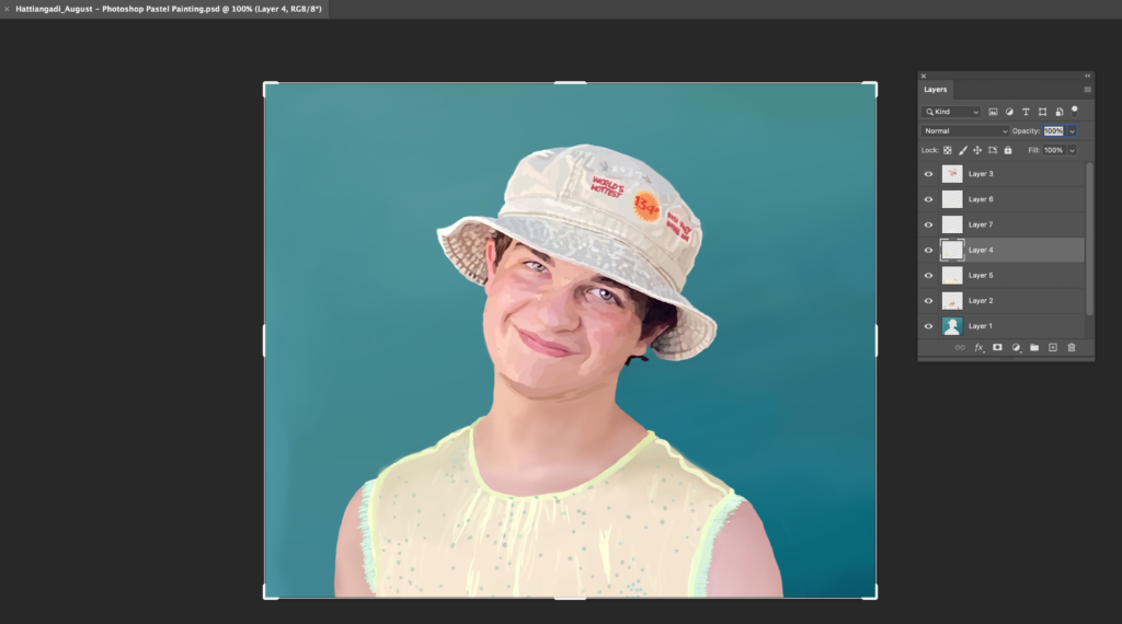
Photoshop Art, Part 1: Paintings
This project familiarized me with various Photoshop techniques, especially color matching and using brushes. Working on a tablet allowed for leeway in terms of “mistakes,” but I think that when it came to watercolor, I missed out on an aspect of painting typically central to the experience. I hope to one day be able to paint in Photoshop as well as I can with traditional paint.
Artist Statement:
My experience creating this photoshop painting was pretty rough. I spent a lot of my time on parts of the painting that later weren’t used because I realized it was unrealistic to attempt such a large image of a human portrait. However, I did enjoy the process of physically creating a painting from the strokes of my Wacom pen-brush.
This project definitely taught me time management. It’s the first of a longer unit on painting in Photoshop, and by spending so much time on this one painting, I’ve fallen behind on other projects.
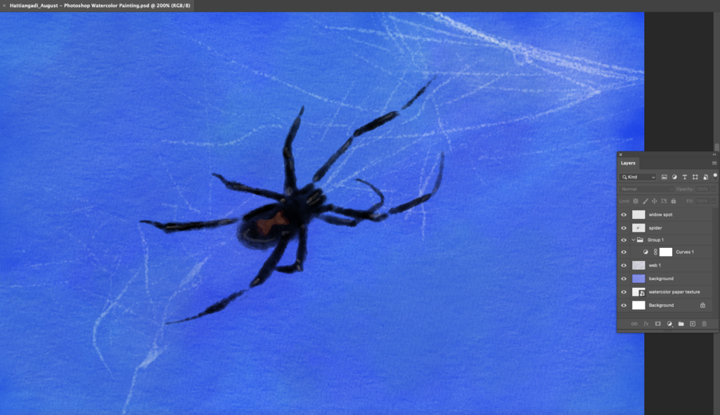
I learned that painting is a difficult and long process, especially in Photoshop. The ability to completely undo mistakes is both a blessing and a curse because on one hand, you know that it’s possible to have a perfect brushstroke for each feature you create. On the other hand, it’s necessary to question when perfect is the enemy of good, and you have to compromise with the limiting and often frustrating human digits you possess.
Artist Statement:
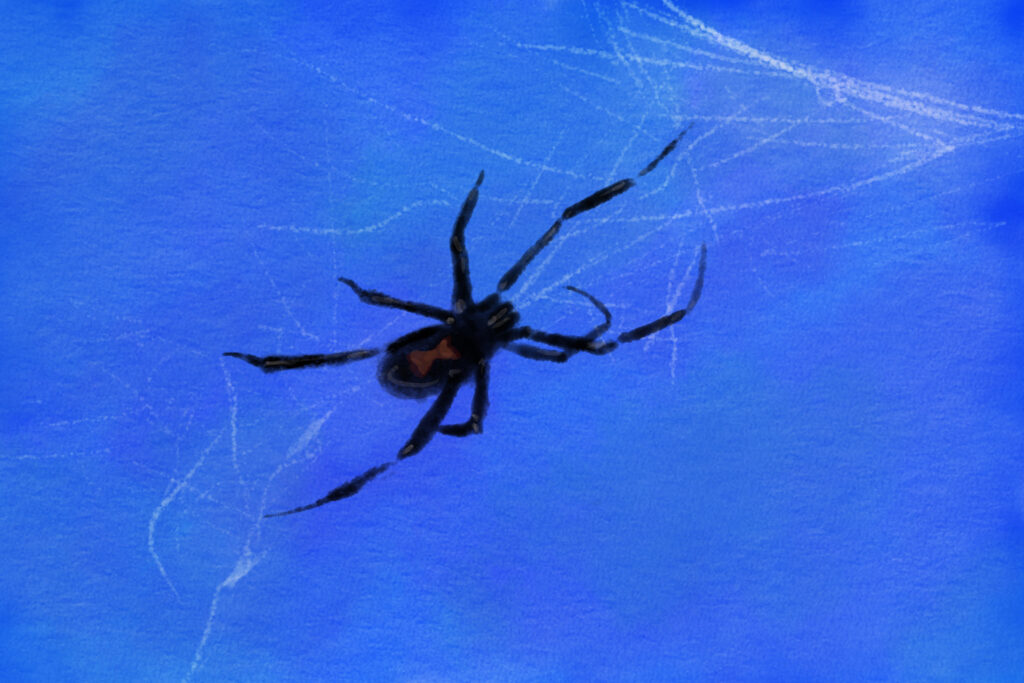
This is a painting of a black widow who was originally missing a few digits. She seemed moody and resilient, working with immense grace as if she was perfectly fine. I could imagine her limbs so easily, I returned them to her in my painting. The background is intense to match her mindset.
I connected to the message that technique shouldn’t be a priority before expression. I had a lot of fun choosing between various brushes to get the right texture, but I think they are simply a means.
I enjoyed being able to play with textures in this painting. I also think that the watercolor style is much more forgiving than pastels. Digital methods are a lot less messy, definitely, but my pen doesn’t have the same interaction with the tablet that a brush would have with real textured paper.
Photoshop Art, Part 2: Rock, Paper, Scissors
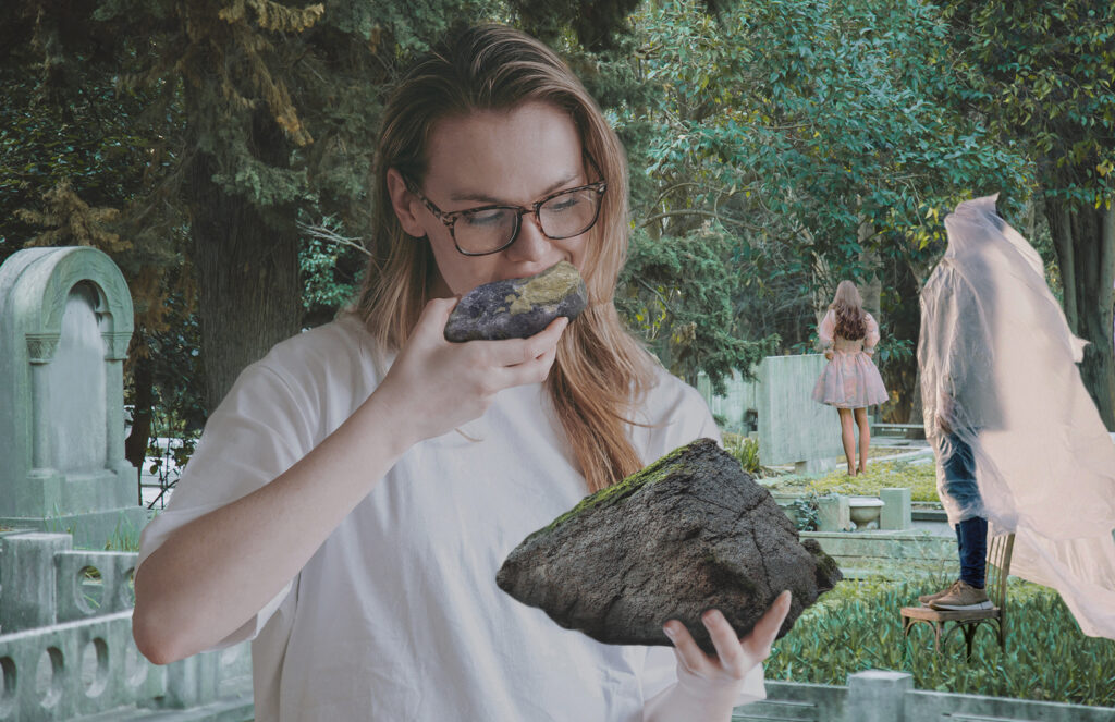
I’ve been looking forward to this project since junior year. I’m used to editing and creating images in Photoshop, but the level of visual manipulation that I achieved in this unit was disturbing. This part of the Photoshop project involved splicing and combining images in a way that looks realistic visually, even if our minds are doubtful.
Some practice images:

My final project:
Artist Statement:
My original concept for this project was going to be about pressures imposed on women to consume less and take up less space, but the image of the woman eating rocks, once I had photoshopped it, tickled me a lot. So I put her in a graveyard with a bunch of other hooligans, just doing what they seem to enjoy. The message is more about self-acceptance now, while you can still mingle above the earth (as opposed to below it).
Layer masks and clipping masks in Photoshop were my saviors for this project. Being able to go in with a brush and work with every detail of the images I was layering made me feel more connected to the work, and by the end of this project, I could plop an image on there very quickly and naturally.
The line between surreal and realistic is something very tricky and nuanced to work with, but I think I achieved my goal in that at first glance, there is nothing wrong with this image. Obviously, rocks aren’t something most people consume regularly. But some people live solely on iced coffee half the day, too.
Design Projects
Introduction
These are the projects I created in my elective class, Design. With a different teacher, the focus isn’t on simply learning skills and producing things quickly. In Design, I feel driven to excellence.
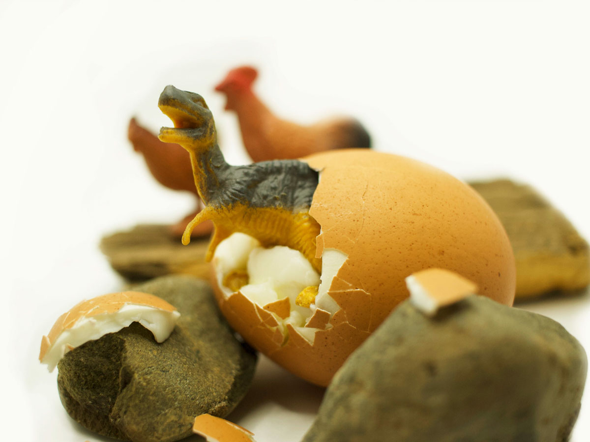
Micro-Macro Miniature Project: « r a w r »
Usually, photography is a reaction to one’s surroundings, simply capturing a landscape or object already created. The micro-macro project was a chance to produce photographs from their roots, controlling the inclusion and placement of the objects. To photograph a scene from scratch is to be God. Enjoy!
Artist Statement:
My micro scene is about the cycle of birth, as well as evolution. It’s common knowledge that chickens are vicious domesticated animals, but I think it says more about dinosaurs that they were tamed into produce. It’s also funny to me that they’ve been reduced to playthings, hence the cutesy, stylized name.
To create this scene, I used chicken and dinosaur figurines, a small plank of bark, some found rocks, and a boiled egg from home. I wanted to highlight the unnerving, looming chickens– especially their size in comparison to the dinosaur– so the background is clean. This way, the viewer is be able to decide whether the scene is of dino-sized chickens, or chicken-sized dinos. I truly enjoyed the process of nestling the egg between the rocks and placing the shell; it was a sort of power trip. The image was taken from within a lightbox, which helped to shine light on my objects without producing glare. In Photoshop, I whitened the background and used color editing tools to bring out the orange in the picture and emphasize some shadows. I am satisfied with the outcome, and overall, I think this project was a great way to start the year.
Public Service Announcement & Moodboard
This PSA was about a common theme of my senior year: nostalgia.

Artist Statement:
My poster displays the colorful and glittery text, “authenticity is maturity,” with a background of colorful gummy worms. The main idea connected to a part of my personal essay in English, which was that it is brave to be authentic, even if others may find your interests childish. This is communicated through saturated colors and childish effects, like glitter. Gummy worms are closely connected to my memories of childhood, and I still have some nowadays to feel secure. As my generation transitions into adulthood, it can be easy to give in to cringe culture, which is the tendency to react immediately with disgust to anything “un-adult.” I think that this is flawed because our perception of what is “adult” is extremely warped by popular culture and other influences. Instead of reaching for a fictional “mature” ideal, I advocate for embracing authenticity, which is more mature, in my opinion.
In my creation of the poster, I took a picture of gummy worms and converted it into an illustration in Adobe Illustrator. The challenge, for me, was getting the glitter text to stand out on top of the complicated gummy worm background. I used glow effects and a white set of text behind the glitter to make it legible.
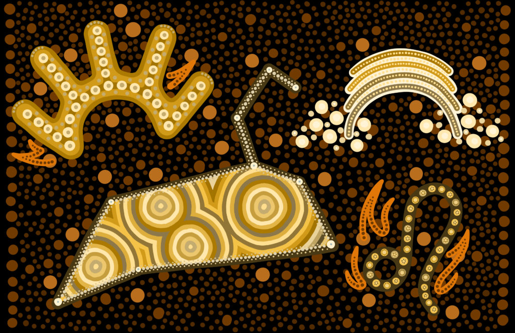
Aboriginal-inspired art
This piece of art made me very uncomfortable.
Artist Statement:
This project is meant to tell the story of my life through symbols that represent myself. The arc with rays is the symbol of a human footprint, and the set of arcs form a rainbow. I used these symbols because I like to think that I make impressions in the earth, and because I’m queer, respectively. Within the Leo constellation are overlapping symbols of the campsite (the rings) and the Leo symbol with flames is very literally my star sign. There is a lot of warmth and fire imagery because my star sign’s element is fire. I painted the dots using layering techniques on Adobe Photoshop.
Working to imitate Aboriginal art in a digital format feels disrespectful to me. I question whether we were undermining the original processes, which were used for storytelling and passing on information. According to various online sources, as dot paintings have shifted to canvas works (they were previously done on impermanent desert sand), the process of dotting has often been used to cover up other original iconography. Information in the dotted paintings are kept secret, not to mention that uninitiated western viewers are unable to understand most of the meaning of the uncovered works in the first place. This humble approach to painting conflicted with the original assignment, which is the rather glamorous goal of self-expression. I do not claim that this design falls in the category of Aboriginal dot painting; instead, it borrows partially from the aesthetic.