Product Logo and Label Design Project
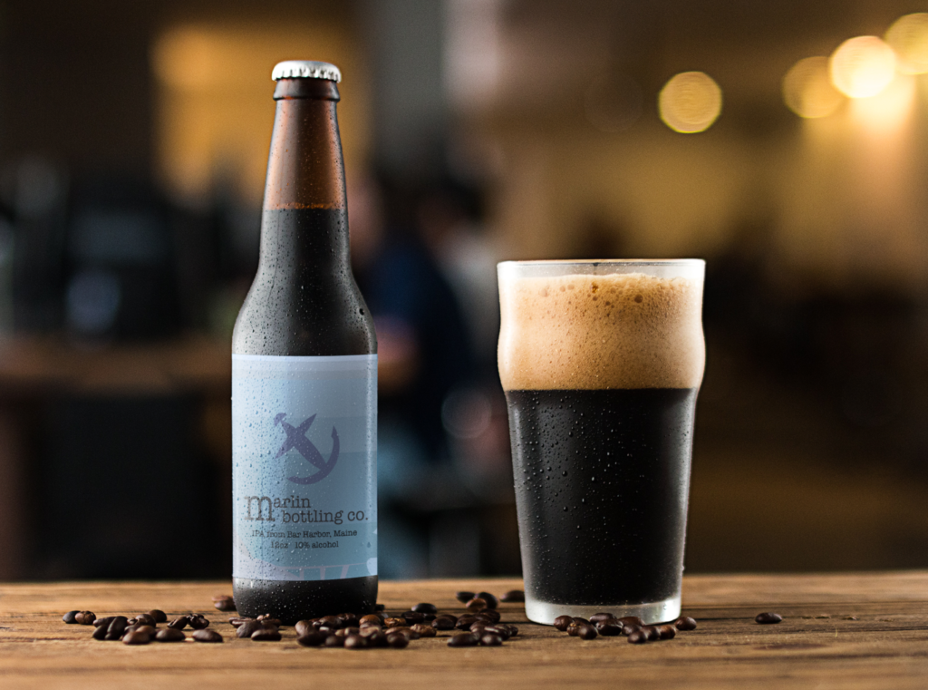
My product, a beer brewed at the Marlin Bottling Company, is marketed as a “after hours” beer for white collar workers and college students. To do so, I tried to stay with a somewhat minimal design and a monochromatic color scheme. That being said, I think I could’ve spent a lot more time developing the parts that are not with the logo, and refining it as a whole.
I would want to, in a more robust advertisement, focus on appealing to emotion— and really sell this as a recreational beer that’s good for winding down. It isn’t a light beer meant for chugging at frat parties, or a drink that is only meant for its alcohol content. To complement that, I’d put it with a backdrop of a somewhat cozy bar or living space, and really try to send it home as your small house party beverage of choice.
The main new experiment that I tried was messing around with the golden ratio, particularly in circles. I’ve seen a lot of internet posts showing the golden ratio circles in logo designs, so I wanted to try it out. So, the anchor icon was made from the golden ratio circles, in which I started with a sketch, and then after that, translated the borders into the circle borders. It was a weird process, but I think it turned out relatively well. Everything was done Adobe Illustrator, and then after that processed in Photoshop and Placeit by Envato.