For my Zenith Project, I wanted to do an expansion on the Movie Project from this year, since I thought the premise was neat and I wanted to add more stuff to that universe to make it a bit more flushed out. At first I wanted to do stuff with Adobe Photoshop because I was uncomfortable with it, however that didn’t end up working out very well and I didn’t come up with anything I was happy with presenting. So instead, I ended up moving back to my comfort zone, which is Adobe Illustrator, and I decided to make multiple different assets for this universe.
I started with a set of logos for some of the companies in this world.

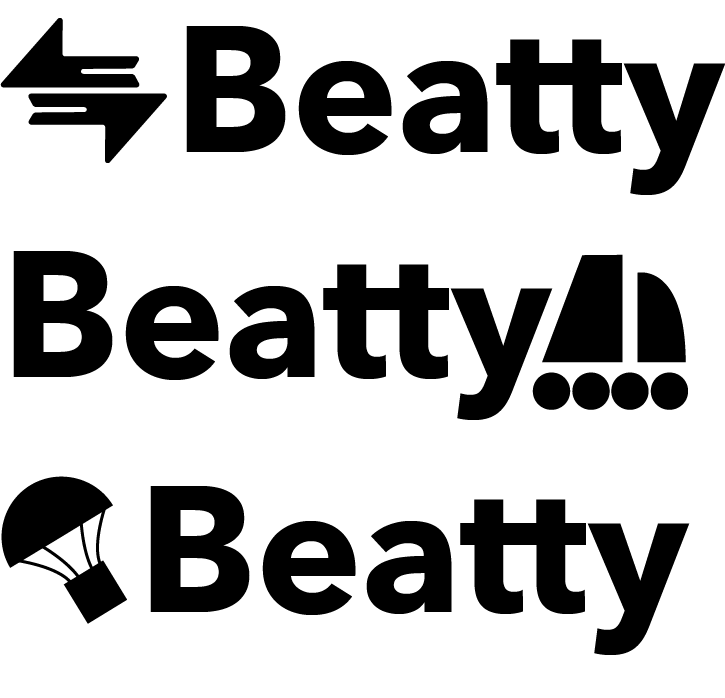
These are both companies inside of the movie’s universe, with the first one, Beatty, being the company that the main characters work at. I wanted to check the effectiveness of the logos by asking people if they could figure out what the company did from just the logo, which did actually work- as they correctly guessed that it was a Shipping Company. I had a lot of fun with the second logo here as well, since I messed around with making a logo with the golden ratio– since I want to get more practice with making this kind of style.
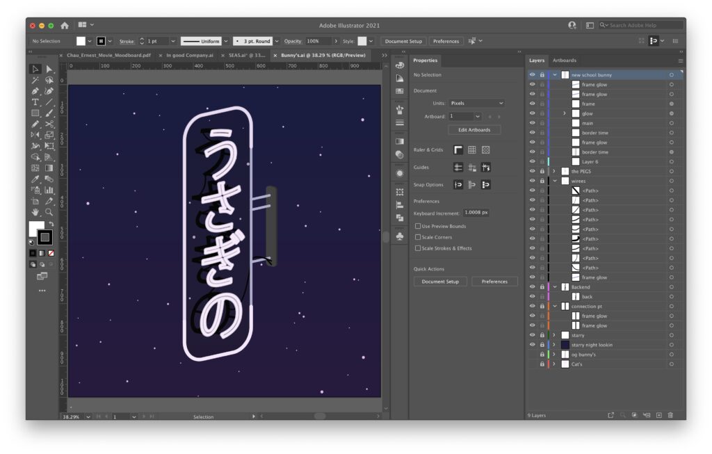
The next thing I wanted to do was this Neon Sign, since I wanted to make something physically in the world and more like a piece of art than an asset. Looking to push my boundaries, I thought it would be interesting to make something that looked less flat and clearly sticker-ish like most of my work, so I first made this sign flat, and then used the Shear tool to make it at an angle- and afterwards added a bunch of detail like the wires in the back and pegs to hold up the neon tubes to make it a little more grounded while still being stylized.
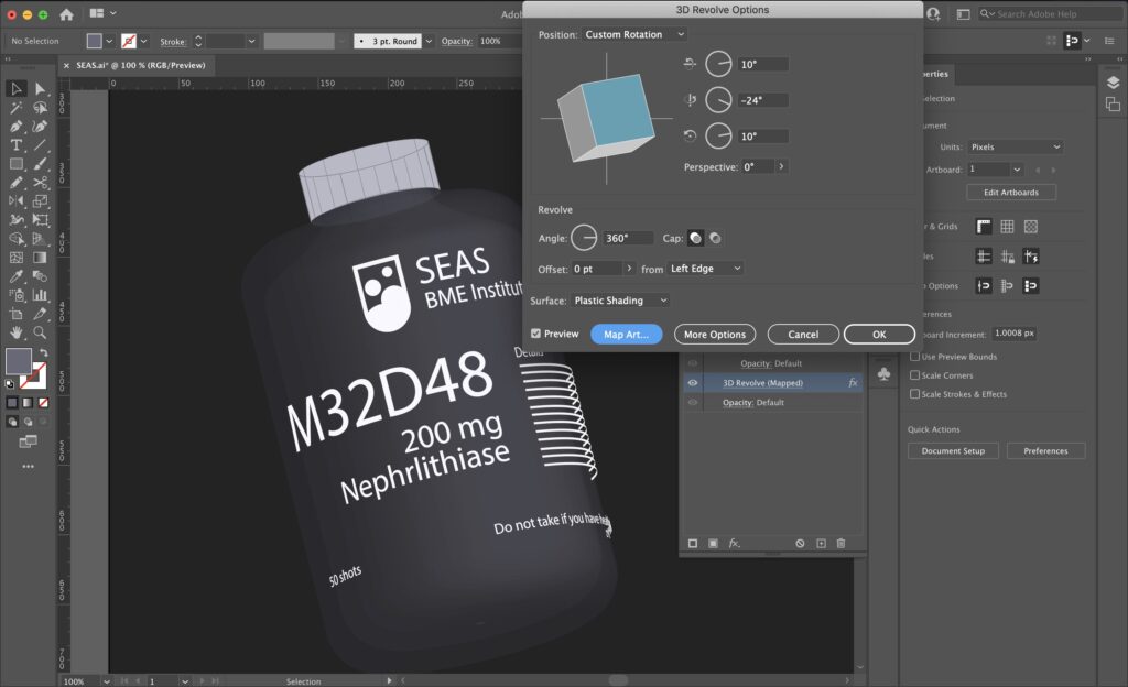
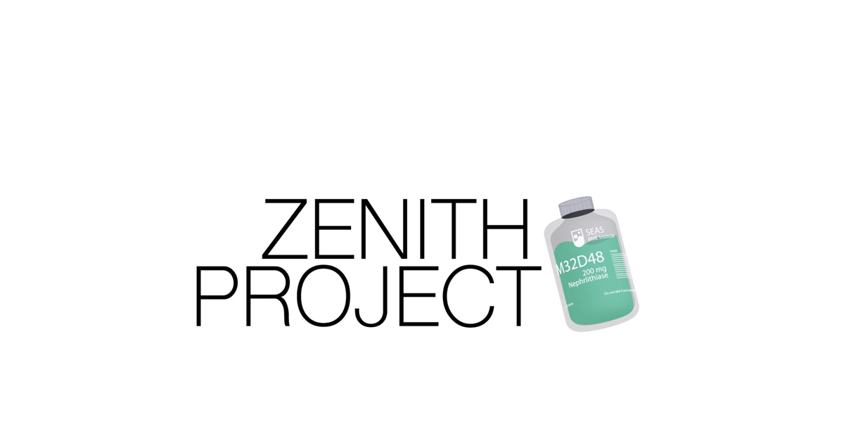
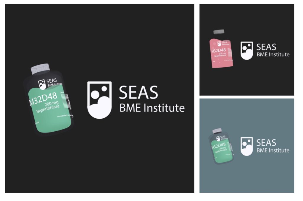
For this project, I had the idea of doing a pill bottle for the SEAS BME institute as shown before, and in the process of figuring out how to do that, I learned that Adobe Illustrator CC 2021 had a neat little 3D widget that let you do rudimentary renders, so I worked with trying to make it work.
This proved to be pretty difficult, as the software isn’t totally optimized for a 3d workspace, but it definitely lets you do some really neat stuff. In some of the finals, you should be able to see the thickness of the glass and text wrapping- but it’s obviously not perfect.
Despite having not made as much art as I wanted to, I think I had a lot of fun with this project– I felt like I was able to use my skills from the last two years and really pushed my Illustrator knowledge to the edge in trying to make some neat stuff using more experimental techniques. So it might not be too too much, but honestly, I’m pretty proud of it.