Conceptual
For this project, I learned how to push myself into taking creative risks in all different forms of expression. Starting in English I was able to push myself as a reader, writer, and poet, starting with deciphering poetry to coming up with my own complex poems. In Digital Media I was challenged to produce my own website, work with lots of different Adobe applications, and create soundtracks using professional equipment. Design is a class full of fun and has allowed me to learn and further my understanding of what I love to do. I have furthered my artistic view of the world through photography, art and using different Adobe applications such as Photoshop.
I have learned more than I can imagine in the past unit, and it has been a great experience. Starting with English, I have not only learned to feel more confident in expressing myself, but I have valued the support and confidence in my peers and fellow classmates in English. In Digital Media, I have valued the push and difficulties I have had, but more than that, the fact I have been able to get through them and learn how to do things I truly did not think I would ever learn how to do. In Design, I have valued the change that I see in the world because of the things I have learned. I pay attention to more things in the world ad I feel that I appreciate things more in the way they look, especially a photo. Practicing artist statements I thought was super fun because I got to explain each detail of every choice I made in my project, which made me think and realize all the thinking I truly did put into this image to make it look the way it looks.
Poem Photo and Recording
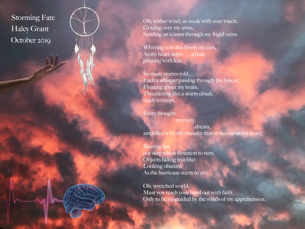
In this unit, we wrote three main poems of completely different styles that were inspired by a variety of things. We started with a Haiku, in which we were challenged to represent a feeling through an experience in just three lines of poetry. This made diction super important as one had to focus on the best words that would fit and follow the syllables rule for each line. Then we went to the SF MOMA and we photographed art pieces that grabbed our attention and then wrote an Ekphrastic poem about them where we were pushed to describe the scene reflecting on the action of the art piece by looking at the artist statements. Finally, we created a Free Verse poem, a poem with few rules. We did express ourselves with our concept statements we created. This poem went on to inspire my Conceptual Photo as well as this Poem and Recording seen here with my intention statement.
During this project, I had the opportunity to work with many different mediums, including text, images, audio, and video. Through experimenting and learning how to use and create all of these different forms, I also learned more about myself as I learned I love creating things such as images and layouts, but I also enjoy explaining my reasoning and the choices I made. I find it fun to see how much I have actually learned when I start to reflect and describe all the choices I made for a certain piece. I feel it allows me to have a more conscious and well though tout understanding of my pieces.
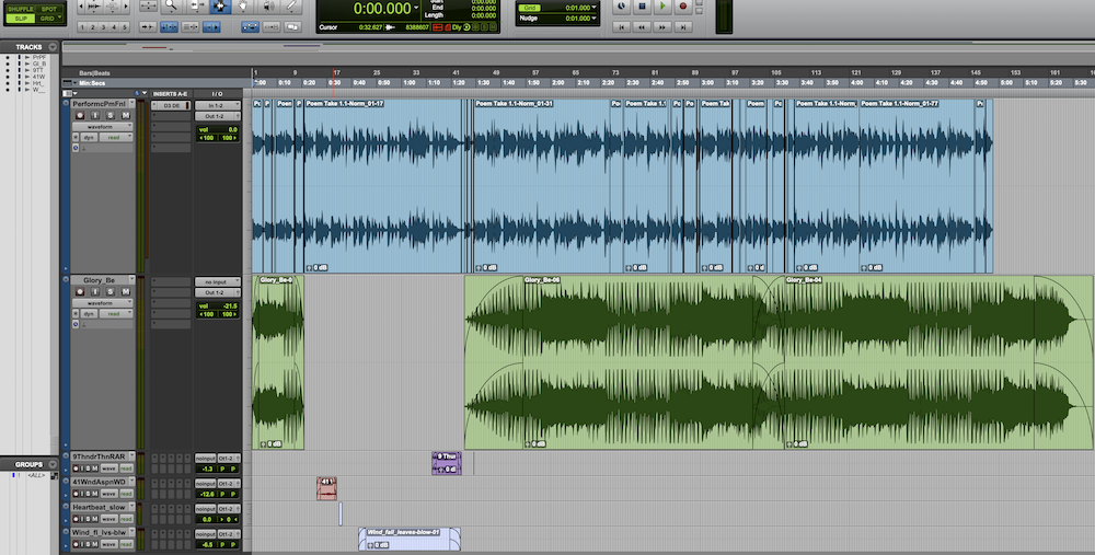
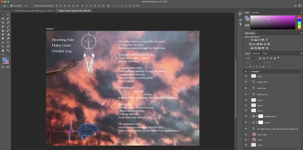
Photo Haiku Photo and Video
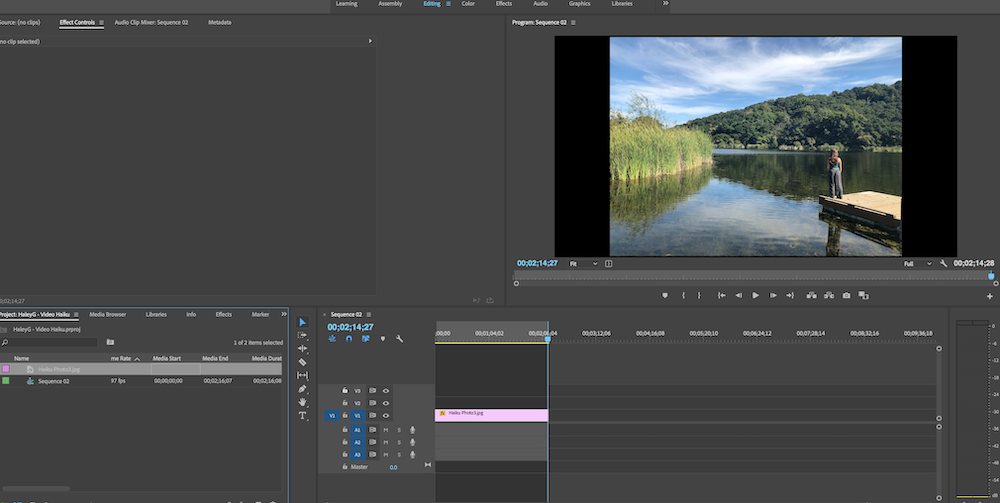
In English, we drew two pieces of paper, one piece from each bag. One bag was labeled ‘feelings’, and the other ‘experiences’. From that, we were given a concept statement that included those two things from the papers we drew. Then we were assigned to create a Haiku, a poem that consists of three lines and follows the syllable structure of 5-7-5, and an image that goes with it to further the understanding of one’s piece. Seemingly easy enough, but we were it was quite challenging to represent that concept statement with just three lines! After brainstorming and presenting our haikus in class, we moved on to digital media where we produced an audio recording paired with our first project on Premiere Pro, which added an animated video to our poetry audio and image. Working in both classes collectively to produce this final product.
I valued again the challenges I faced from Premiere Pro. I was able to practice patience as well as the struggle with all the little details that go into producing this short and seemingly simple video. I had a great time producing it and even more all I learned how to do. It was amazing to see the final product and be proud of it.
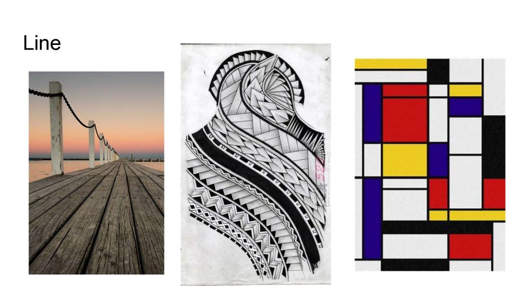
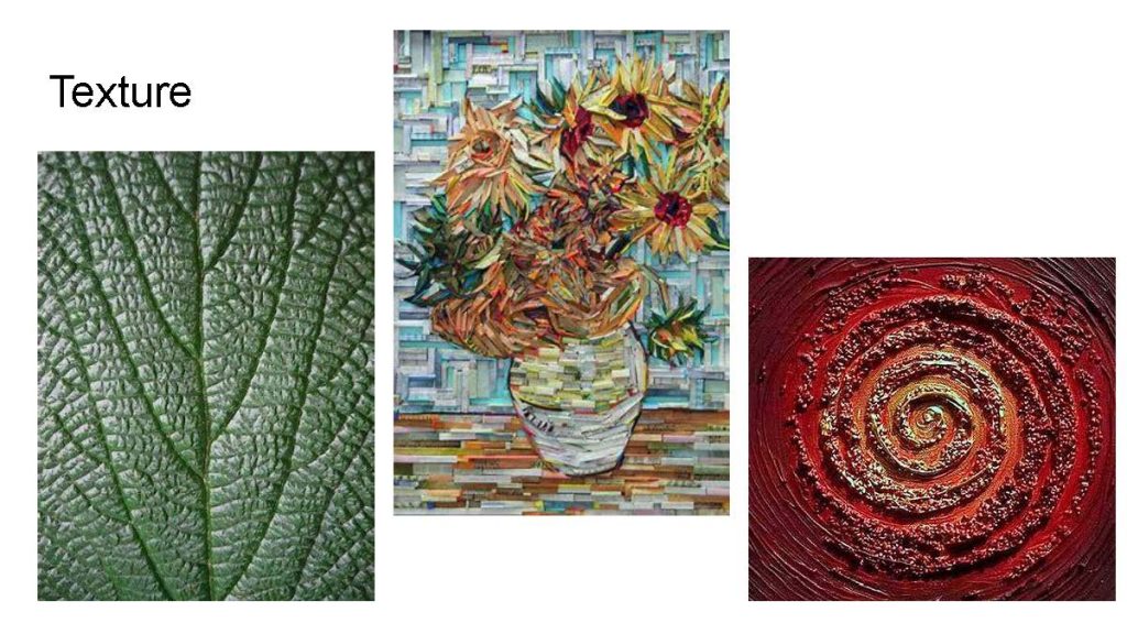
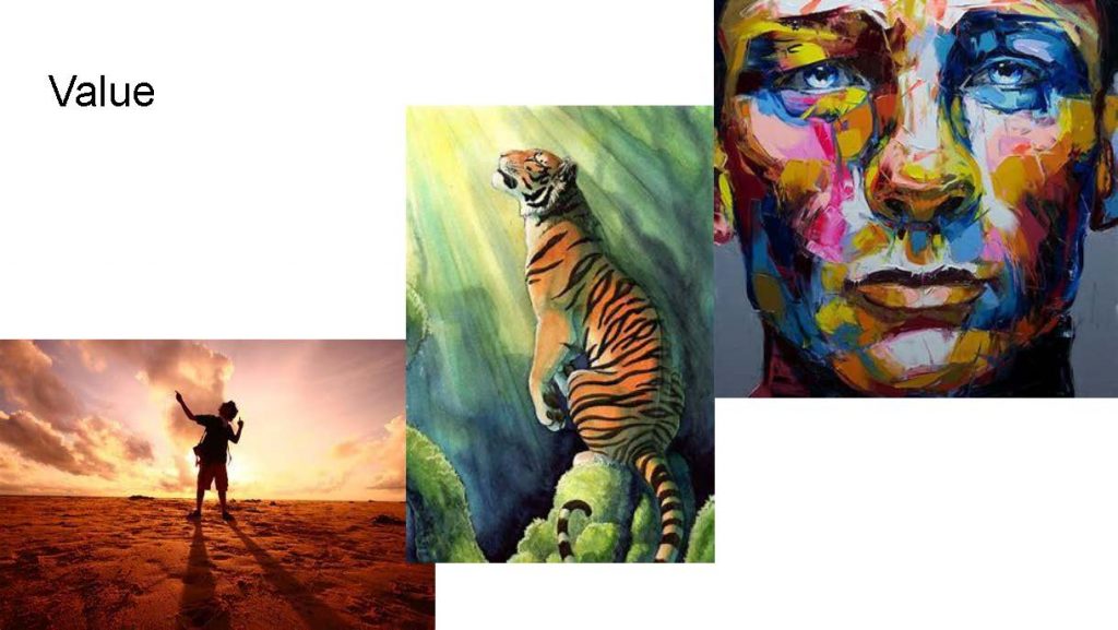
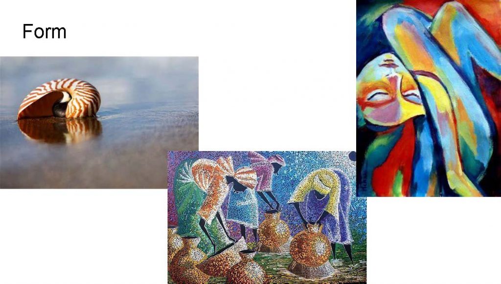
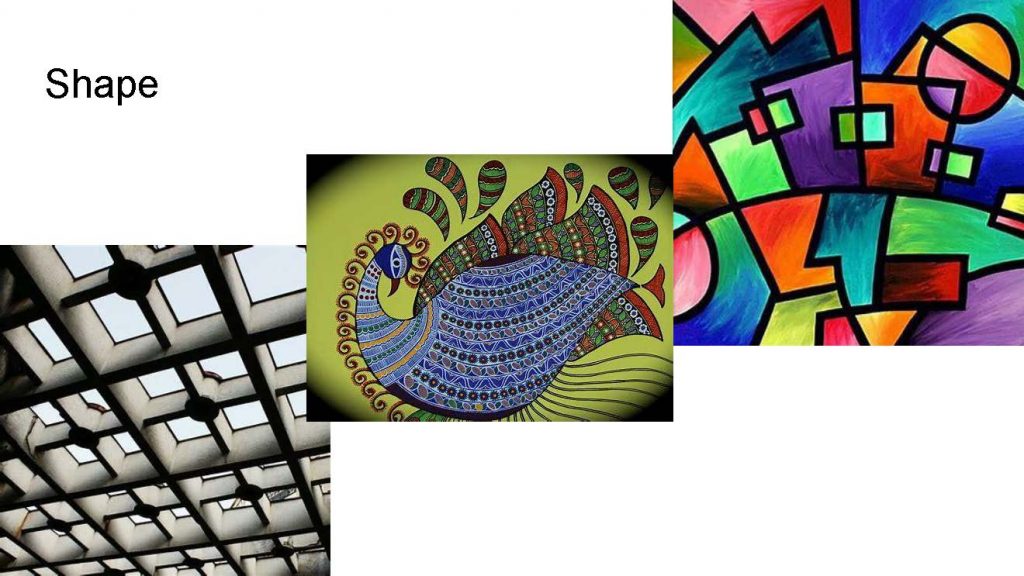
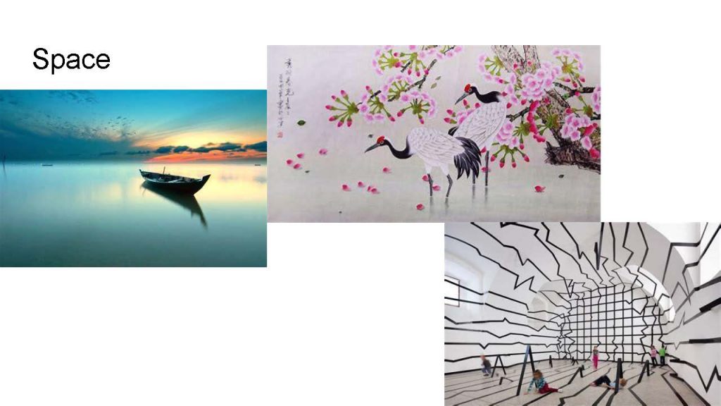
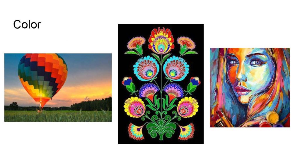
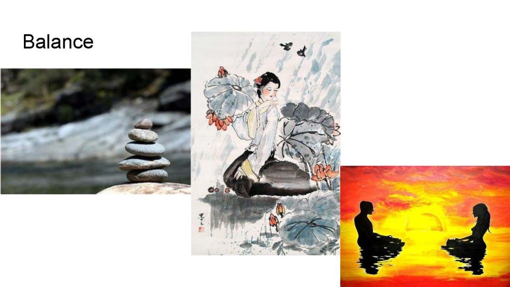
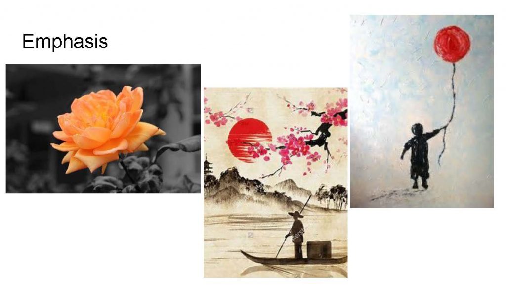
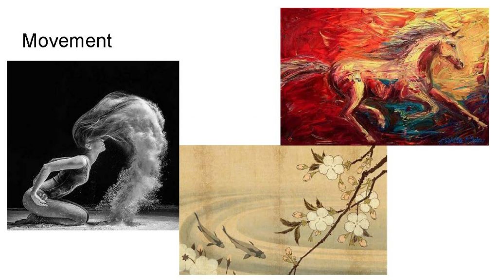
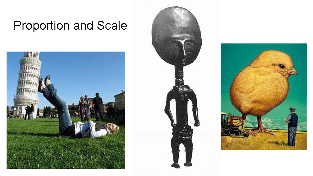
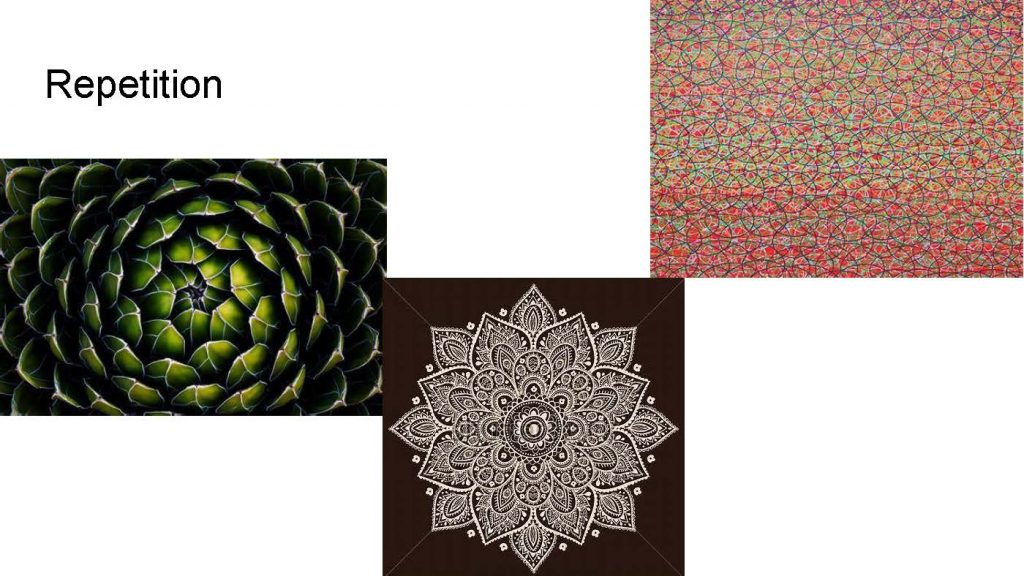
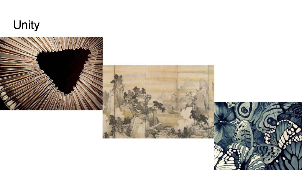
Elements and Principles of Art
In Digital Media we were introduced to the Elements and Principles of Art, all the things that go into an image or design that draw one in. There are several different elements and principles of art in one picture at a time. The main thing that this taught me was being able to see the world in a “artist view” meaning that I pay more attention to the details and the different elements and principles of art I see in everyday life.
Conceptual Photo and Artist Statement
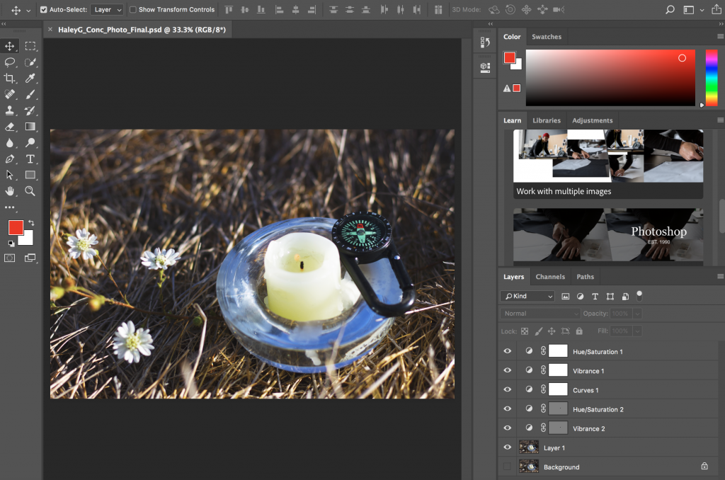
The conceptual photo was the main assignment in Design for the Conceptual Project where we used our same concept statement and were challenged to represent it in a photo. In this photo, we had to photograph two objects that we chose to represent our feeling and experience that made up our concept statement. We then had to choose a landscape or a place to take our photo, as well as be conscious of what type of lighting and angle we are taking the picture with. We then wrote an artist statement, which is a statement that challenged us to describe and explain the image and what we were thinking behind the image.
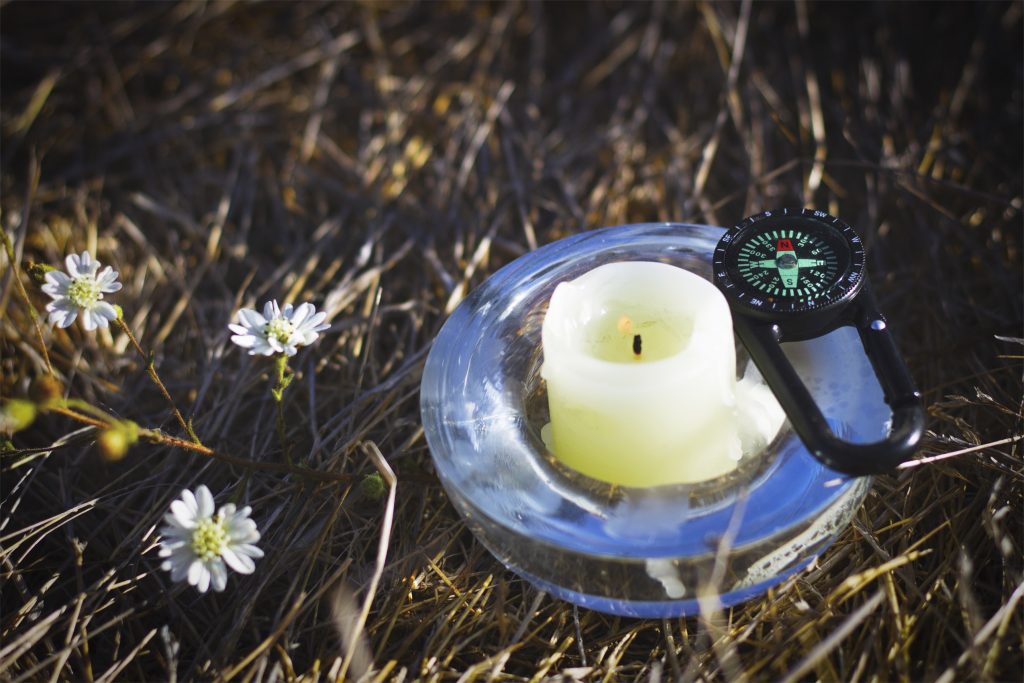
I am exploring the feeling of doubt through the experience of moving on.
I chose to have the compass rest on the side of the candle holder, pointing in a forward direction to symbolize doubt. It is also pointing forward to enhance the feeling of moving ahead. They are close because the lit candle represents light or a sense of clarity while moving on from a situation. I chose a wheat field in the background and included some flowers to represent emptiness one may feel with doubt, and it was in contrast to the white candle. The flowers in this image are seasonal and they come back yearly. I took the photo after sunrise so the lighting wouldn’t be too harsh with the candle being lit. I chose to take it from a forward-facing, slightly lifted angle, to see the candlelit and the top of the compass, without it being a birds-eye view. I was close to my objects to show detail in smaller objects and make them focus.
My two objects were a compass and a candle. I chose to represent doubt by using a compass as it symbolizes direction, and is often used when lost or unsure of where to go. I selected a candle to depict moving on because a candle represents a new beginning as they can be lit in happy times such as a birthday celebration, but also in sad times such as a memorial of someone lost. I also made sure my candle had a flame to portray how even if it flickers it can keep going and staying lit. I used an old candle shown by the dripping wax, furthering the idea that candles continue to stay lit.
In Adobe Photoshop, I learned how to apply a vignette as well as other layers. On my photo I used a curves layer to create a better contrast in my image, a vibrance layer to brighten my photo and brighten the flame, and a saturation layer to take some concentration away from the colors in the image.
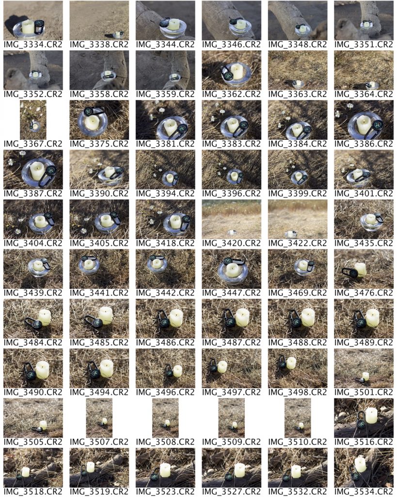
I had a ton of fun with this project. It was a lot of hard work, starting with taking over 300 photos and ending with just one, perfectly thought out, edited, and planned product. We all spent a ton of time on this one photo using all we have learned on photoshop and I think the part I most valued was seeing the hard work paid off. I think everyone was super happy with their final pieces and I know I was. Cutting and mounting them made it all feel so real and professional and it was awesome! Writing the concept statement was also super beneficial because it made me think about what I had just created and how much thought I had actually put into it, I definitely struggled to keep it on just one page!
Alphabet Name Photo
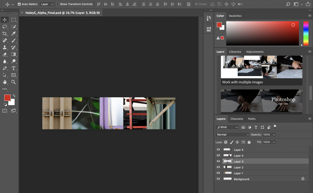
Our alphabet name photo was one of the first assignments we did in Design. I am not going to lie I was horrified when we first got the assignment and Ms. P told us to go outside and take a picture of each letter in our names. I thought what do you mean? Letters? Outside? We couldn’t take pictures of any signs or already made letters but rather find them in our surroundings in shapes, formed by trees or pipes. I went outside to complete the assignment, we shot for almost 2 hours before we had 5 different pictures of each letter in our names. We then made a (contact sheet?) with those photos, narrowed down our favorite of each letter, and started editing each letter in photoshop. Then we strung all the letters together next to each other to form our names.
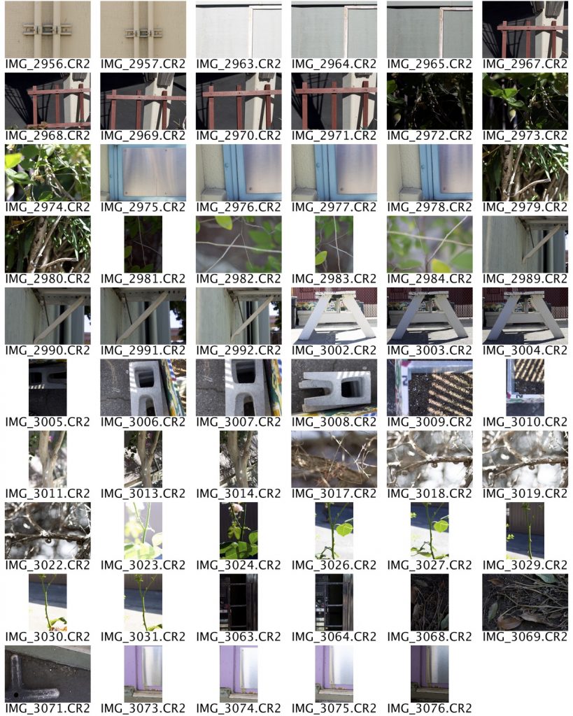
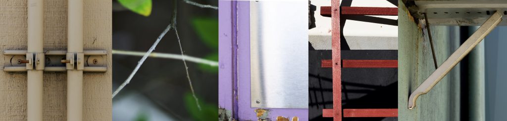
I was not super confident at first in this project but I valued that Ms. P believed in us, she believed that we could see the world in this way through letters. I will tell you, I now see letters on the ground or in a stain or a fence every single day. Looking back at my final name photo I love to remember how much fun I had taking pictures for this assignment. We went around the freestyle campus and it was super fun, especially once I got the hang of it and started putting my head in trees and getting super close to the ground to make the camera catch the letter that I was seeing. I definitely looked a little ridiculous but it was a fun way to really learn and understand a concept.
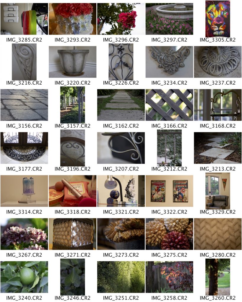
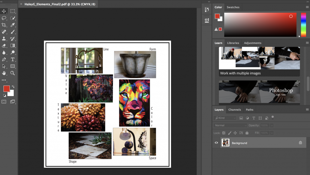
Elements of Art Photo Collage
For this assignment, we had to take 5 pictures of each element of art. We learned about each element in class, through watching videos and creating our own sketches of the 7 elements of art using colored pencils. As well we looked up examples online and went through examples as a class of where we could see the 7 elements of art in our surroundings. We then created a contact sheet and then narrowed down our final 7 pictures, edited them with Photoshop and then put them together in a collage, using text to label each one as well.
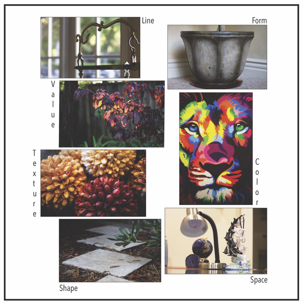
I learned more in-depth about the elements and I valued getting to take our own pictures to represent each element. I feel it taught me a lot about how to actually see it and understand each element. I spent a lot of time taking all of the pictures and capturing each element in each photo. I went around my house and in my yard and it was super cool to see all of the elements I could find in the things I see every day!