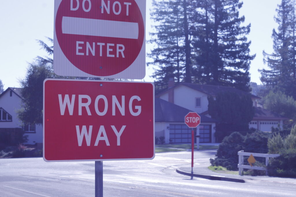
What’s fun about using white balance is that you are able to alter the entire temperature, mood and tone of a photo. Adding more blue makes it cold or artificial, while adding orange makes it warm and organic. I wanted to play with contrasting colors and make certain colors really stand out against the background.
To do this, I located two bright red signs and photographed them using a bluer color balance, so they would be more pronounced due to their contrast with blue. I made sure to adhere to the rule of thirds as well, so that the composition would be visually neat and pleasing to the eye.
I really like the way this photo turned out, even if it’s simple.