Mandala
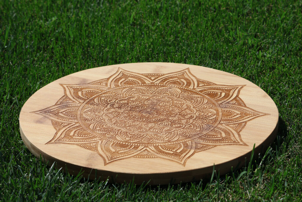
In Digital Media, we created a mandala, a circular piece of art that is perfectly repeated many times around the center. We used Adobe Illustrator to create our mandalas, which allowed us to achieve this perfect repetition. All we had to do was draw in one little slice of the circle, and the rest of the empty space would automatically be filled in. The first stage of this project was to create a black and white version, which was eventually printed out on a material of our choosing. I chose bamboo because I like its natural color and look. We then created a video showing the process of us drawing our mandalas, and we also colored our original drawings.
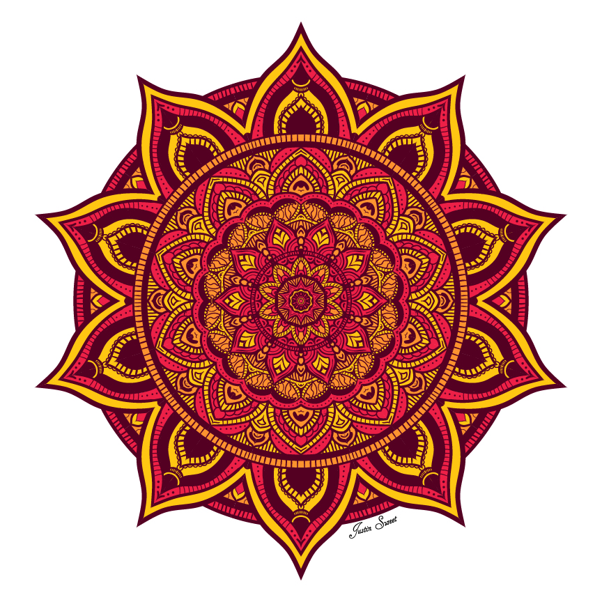
Black & White vs Colored
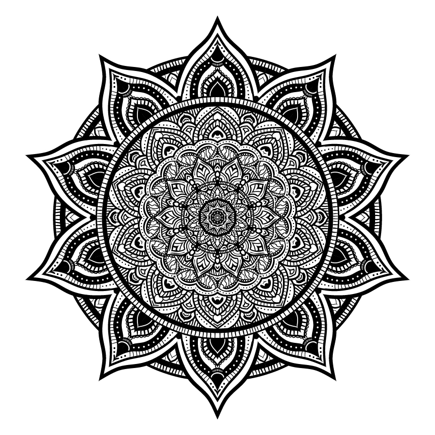
At the beginning of the project, I knew that I wanted to create a mandala that was very complex and saturated. I accomplished this by doing my best to fill every blank spot possible. Normally, this wouldn’t be a good idea to go by, but it works in this case. At times, I struggled with making the different parts seem like they “flowed”, where the major sections look like they’re coming out of the middle. It was also difficult to not be too repetitive in the techniques I used. If I could recreate this mandala, I would make a lot of the brush strokes thinner.
To color my mandala, the first step was to figure out what colors I wanted to use. I created a color palette of yellow, orange, and a reddish pink. Initially, I was going to do a gradient effect where the center was one color. From there, the color would gradually shift to others as it progressed outwards. After trying this, I decided I didn’t like how it looked. So instead, I used my 3 colors and distributed them throughout my design, which produced results that I liked much better. I love how all of the colors are very vibrant and the mandala seems to pop out of the page at you.
From all of the printing material options that we had, I narrowed it down to either the bamboo or tree log. After some quick thinking, I chose the bamboo. When I got the physical product in my hands, I was impressed with all of the minute details which came out clearly. But by looking at some of my classmates’ which were put on the log, I realized that the bamboo lacks a lot of contrast between the material and the actual engraving. If I could do this over again, I would’ve had it printed on the log instead.
Photoshop Art
In Digital Media this semester, we learned a lot more about Photoshop. Part of the time was spent on emulating watercolor and pastel art digitally. We also learned about compositing, which is essentially combining multiple photos into one. Throughout the multiple projects we did, I really enjoyed further exploring Photoshop’s immense potential.
Pastel Painting
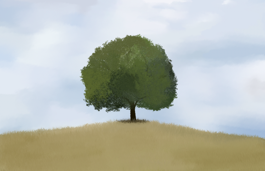
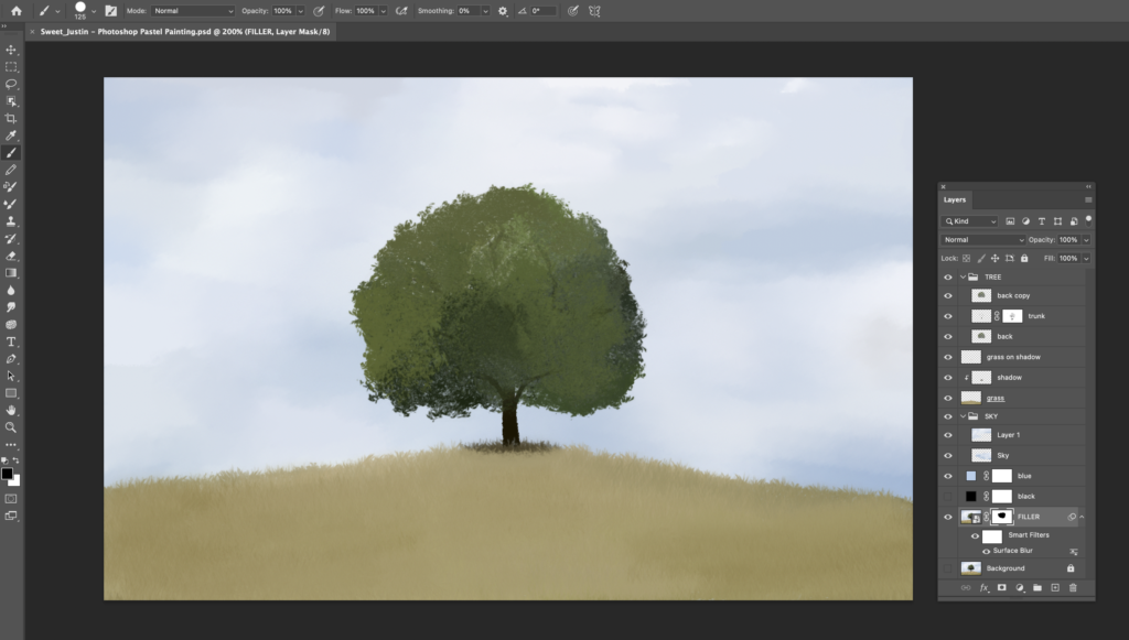
Overall, I had a fun time with this project. I really enjoyed exploring different types of brushes and techniques to give the artwork a pastel feel. My greatest difficulty by far was making the tree. I struggled to find a way to make it seem textured, instead of just being a blur or multiple shades of green. If I had the opportunity to redo this project, I think I would choose a different image to recreate. I feel like the one I ended up choosing was a little too bland and lacked anything interesting.
Watercolor Painting
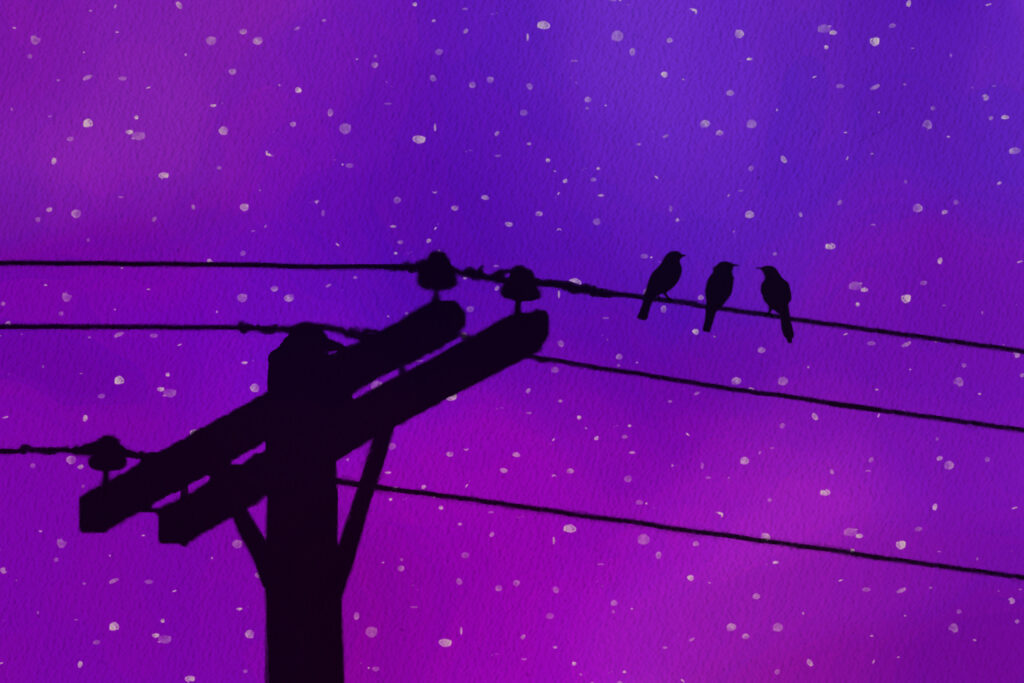
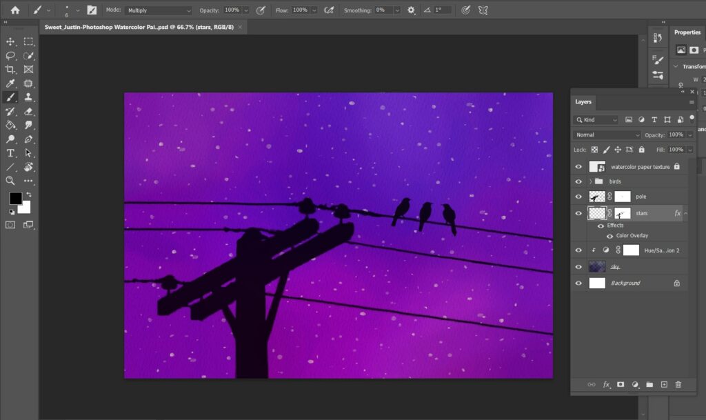
My inspiration for this project stemmed from a painting my sister has in her room. This project taught me about digital watercolor painting, as well as the power of negative space. The main struggle I encountered was the composition of the piece. I wasn’t sure how large I wanted the telephone pole to be, as well as where to place the birds. If I could do this project again, I think it would be a cool detail to have one of the birds flying off of the line instead of just sitting on it. I’m most proud of the background as I love the colors and how everything blends together.
Watercolor Effect
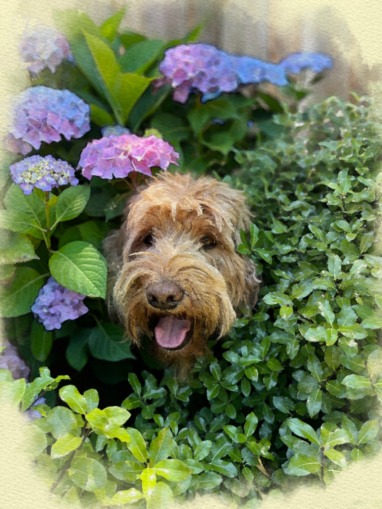
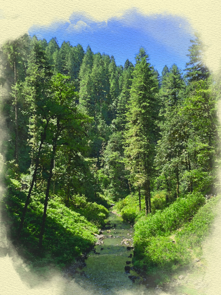
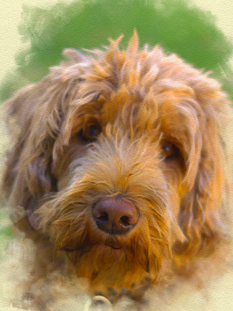
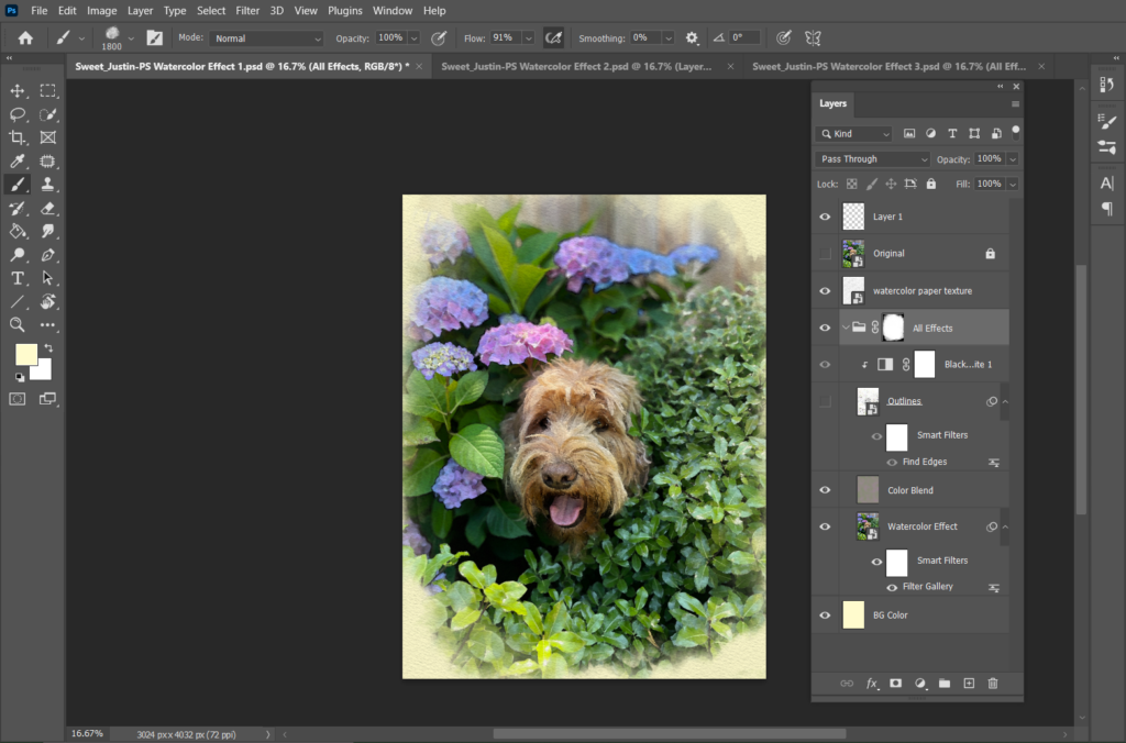
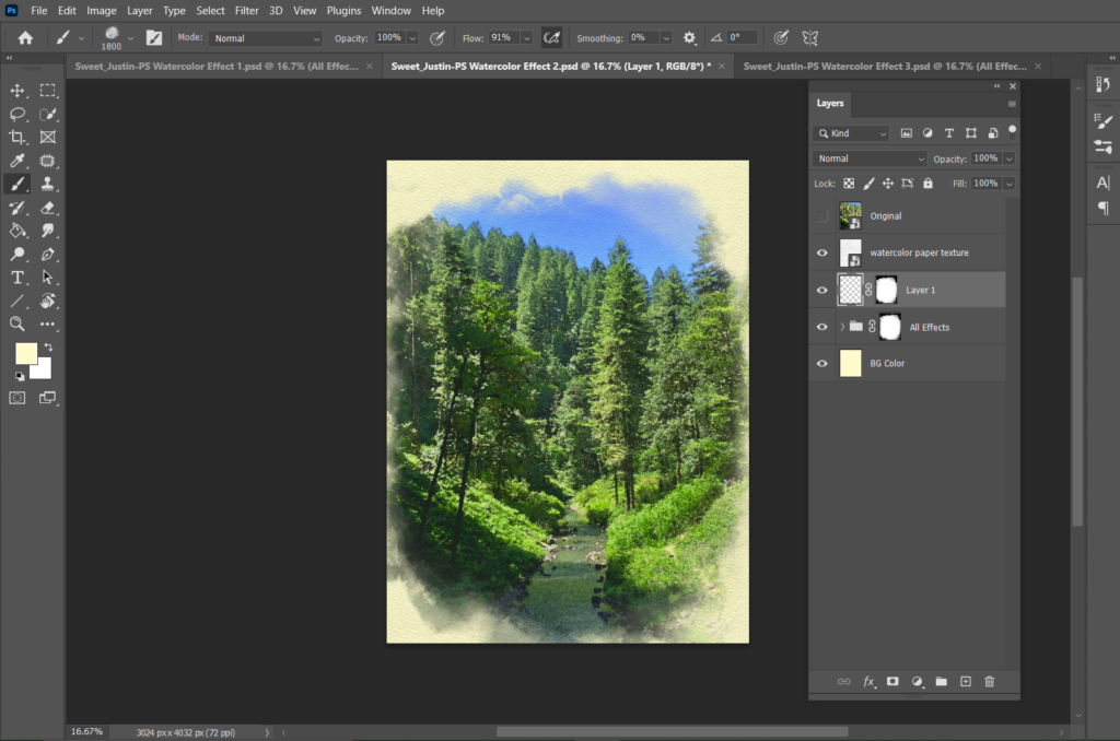
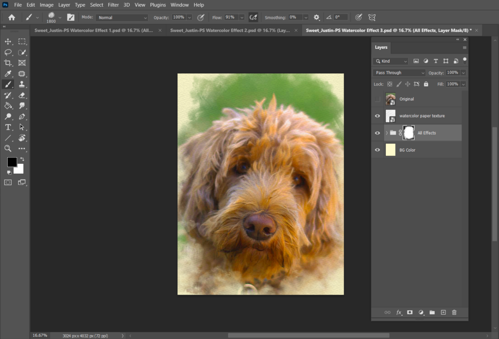
Going into this project, I knew I wanted to use pictures that had bold colors. I thought that doing so would help the final products look really good. Two of the photos I chose were of my dog Mochi, and the other was from a trail my family and I hiked in Oregon. I slightly struggled with making the borders of the images look natural, but found that it was just a matter of messing around with different brushes. I’m pretty impressed with how cool the final pictures look and I’ve gained a new appreciation for the power of Photoshop.
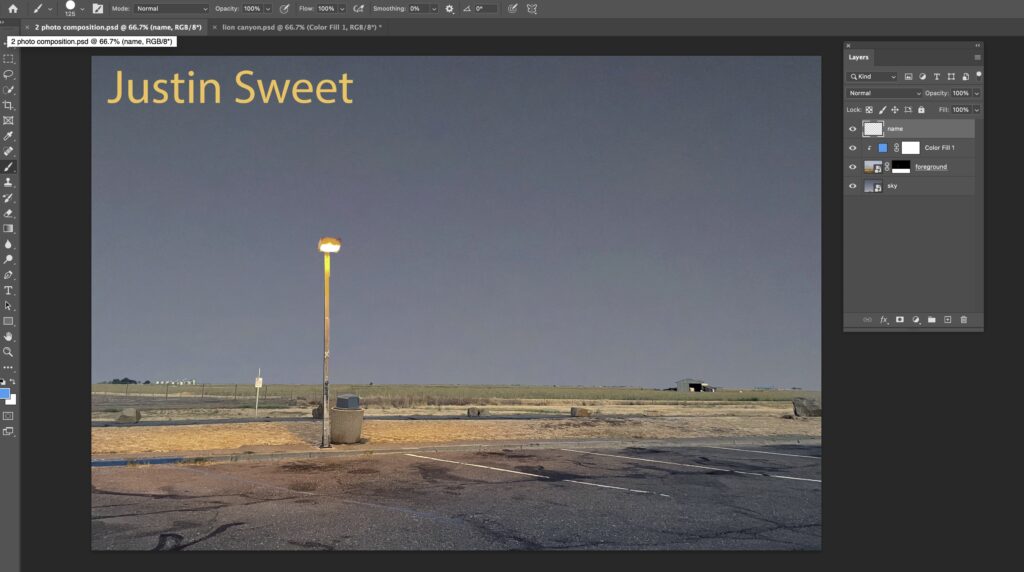
Two-Photo Composite
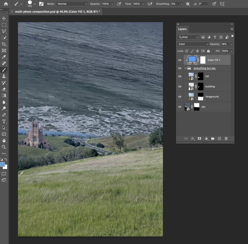
Multi-Photo Composite
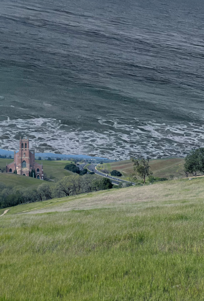
Surreal Art
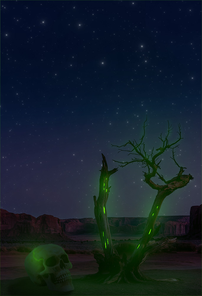
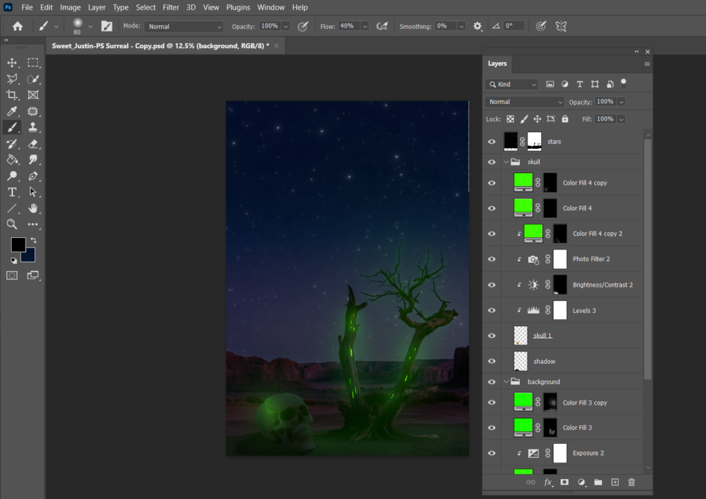
For this project, I took inspiration from the world that my partner and I are creating in English. The general premise is that after Earth is destroyed, survivors flee to Earthfall, a planet that resembles their previous home in many ways. Earthfall is a mix of jungle and desert, which is why this art piece features the desert. If I could redo this project, I would try to incorporate the jungle in some way. Earthfall also has poisonous plants, which I used as a loose inspiration for the glowing tree and skull. My largest struggle was with how I wanted to represent Earthfall in a surreal way. But for the most part, I’m happy with how my piece turned out.