For this unit, we created many productions in Design. For many of these projects, we created “mood boards”, which are rough visual representations of concepts, ideas, and inspiration for what we want to make. These are made before we start working on our actual project.
Product Logo
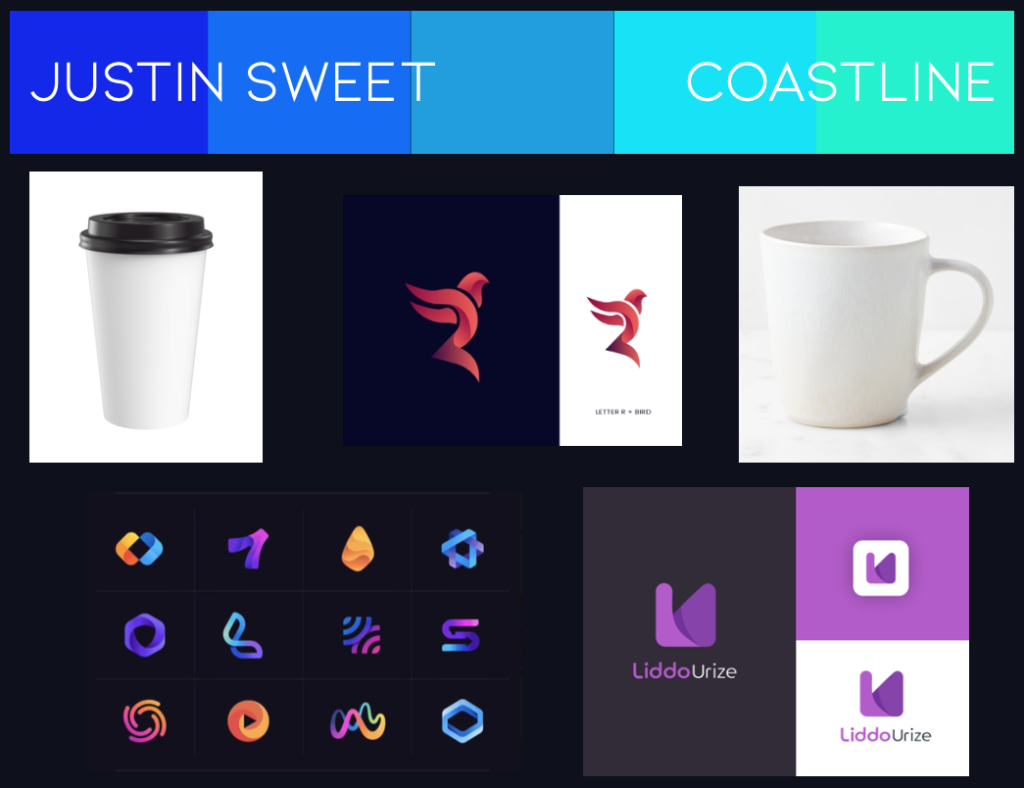
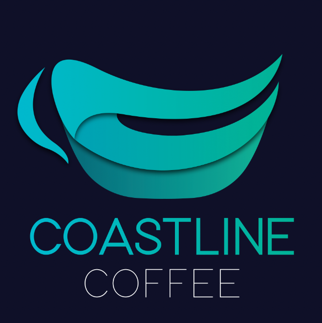
For this project, we created a logo for an imaginary company or product. I chose to create mine for a modern coffee company. Below are my mood board and final logo.
Product Label and Triptych
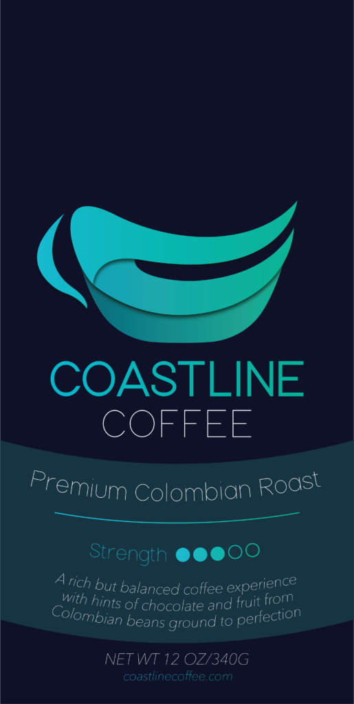
Piggybacking off of our previous project, we created product labels that included our logos. Mine was for a bag of ground coffee. After creating our labels, we used a mockup website to put our creations on actual products.
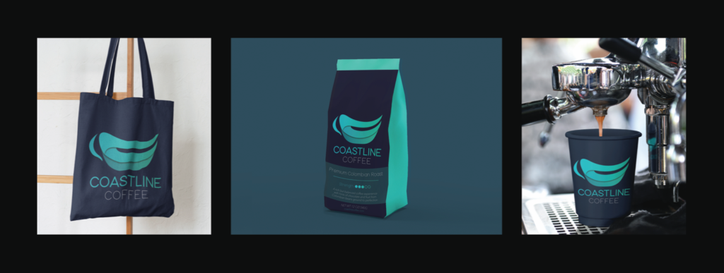
The image below is a triptych of three product mockups that feature a logo and label I designed for my imaginary company, Coastline Coffee. The image on the left is a canvas bag with my logo, and in the middle is a bag of ground coffee with a label that reads “A rich but balanced coffee experience with hints of chocolate and fruit from Colombian beans ground to perfection”. The final image on the right is a coffee cup that also has my company’s logo.
The first step in this process was designing a logo. I decided I wanted to design a logo for a coffee company which I named Coastline Coffee. Then, I took to my sketchbook and began designing different ideas for my logo. This was the hardest part of the entire process because I struggled with the feeling I wanted the logo to give off. After a lot of thinking, however, I chose to make it modern and sleek. In all of my designs, I tried to incorporate some sort of curves or waves to represent the ocean, hence the company’s name. Once I had a design I liked, I placed a picture of it in Adobe Illustrator and began tracing. I received a lot of helpful feedback, like making the bottom of my logo a little more round. When I had a final design, I began creating a label for a bag of ground coffee beans. This process included researching the necessary information for a coffee label, sketching it out, then designing it in Illustrator. I curved some of the text on the label to give it a flowy feel, similar to how I incorporated curves into my logo to symbolize the ocean. I then went to placeit.com, a website where you can upload images onto a mockup. I put my logo onto the bag and cup, while my label went onto the coffee bag. Afterwards, I used Photoshop to arrange the images of these products into the triptych that you see here.
Movie Poster
Once we had created a story in English, we created a couple projects in Design based on our worldbuilding. The first of the two was our movie poster.
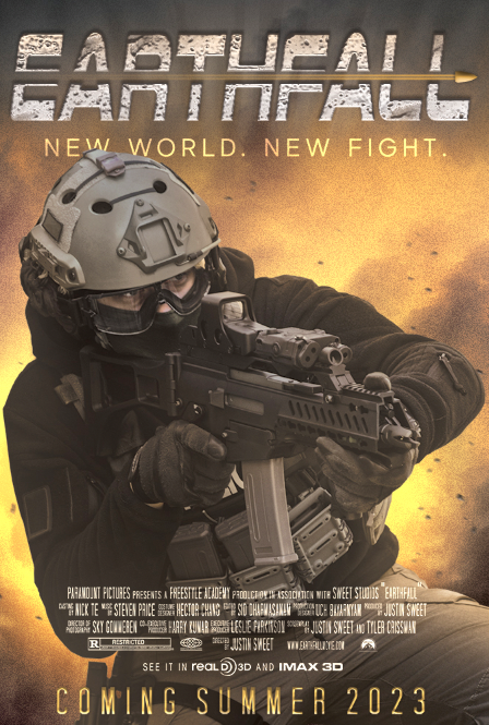
This poster is based on a story that I created in English with a partner. It takes place many years in the future after Earth was destroyed. The couple thousand survivors escaped to a planet called Earthfall (which is also the name of the story). The Coalition, a group of former military members, had prior knowledge of this planet. This allowed them to quickly settle in a favorable place, meaning they held most of the agricultural power and were able to maintain it because of their weaponry. The main character, Cameron, started off as a member of this group. But he soon saw their corrupt ways and escaped to the nearby jungle, where he began living with the Southerners. One night, Cameron sees someone running by his village, and it looks like they’re carrying canisters of gasoline. He deduces that this person must be from the Westerner camp, another jungle settlement. The next day, The Coalition invades Cameron’s camp, angry that someone burned all of their agricultural land. They threaten to kill members of the village if they don’t give up a name. When they do actually kill someone, Cameron says he saw someone. The Coalition knows Cameron and his valuable skills, so he’s offered an opportunity to help them find the culprit. If he succeeds, he and the Southerner camp will be free of torment by The Coalition. After a journey with a few Coalition members, they find the person responsible, but Cameron realizes it’s just a kid. He knows that he can’t turn the kid in, so he decides to fight for him, but also for the freedom of his people back at home.
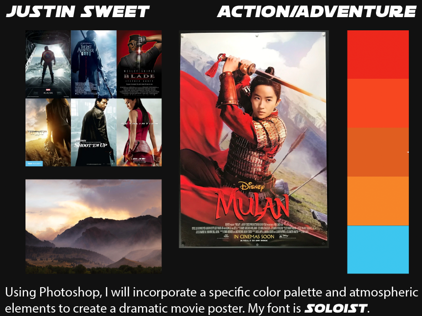
The first step in this project was creating a moodboard to feel out the general direction I wanted my project to go in. I explored many different styles and types of movie posters online, but eventually decided I wanted to use Photoshop and have one single subject taking up the majority of the space. The next step was to use Pexels, a resource for free and high-quality stock photos. I found this step to be the most difficult because I had a general image in my mind of what I wanted my project to look like. While this is usually a good thing, it meant I had to find a photo that aligned with my idea. But once I found a functional image, the rest of the project was pretty smooth sailing. While working, I received feedback that what I had so far was a little too monochromatic, and I’m very glad this was brought to my attention. To fix this, I opted to use a lot of orange in the background to contrast the main subject. For the billing block (all the text at the bottom), we used a template that was provided for us. Even so, I ended up changing the arrangement and content of it a bit. Overall, I had a ton of fun with this project, and it’s been one of my favorites at Freestyle so far.
Book Jacket
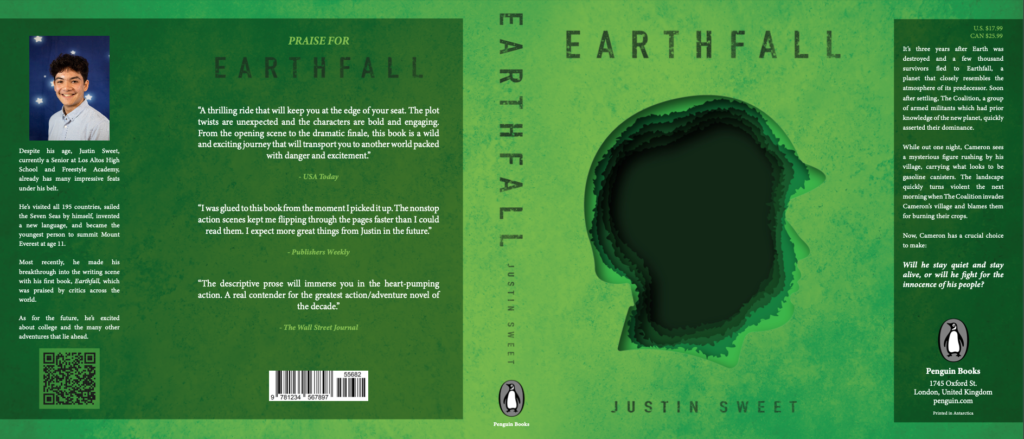
After the movie poster, we created a book jacket based on the same story we created in English.
Reflection
I gained a lot of valuable experience from this unit in Design. It was very cool to complete these larger projects, like creating a logo and an entire movie poster. I really enjoyed looking at inspiration from the real world and incorporating elements and techniques used by industry professionals into my own pieces.