Included is a collection of custom illustrations created specifically to provide a visual aspect to different assignments
Exquisite Corpse

In this assignment, we were put in a group of three people, without knowing what the other people were going to draw, and we were expected to make a drawing the connects through all 3 art boards.
Short Story Album Cover
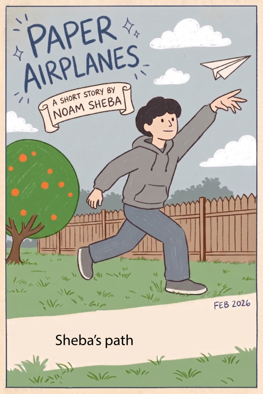
To create my album art for my short audio production, I started by blocking out the character and background using Illustrator’s Pen Tool. Once the core outlines were set, I used the Live Paint tool to fill in the distinct shapes with a flat, earthy color palette. I really wanted the artwork to have an organic, hand-drawn vibe, so I applied a textured vector brush to the strokes to soften the digital look. To bring the whole piece together, I dropped in the custom typography and banners to finish off the cover art.
Illustration Project Choice (T-Shirt Design)
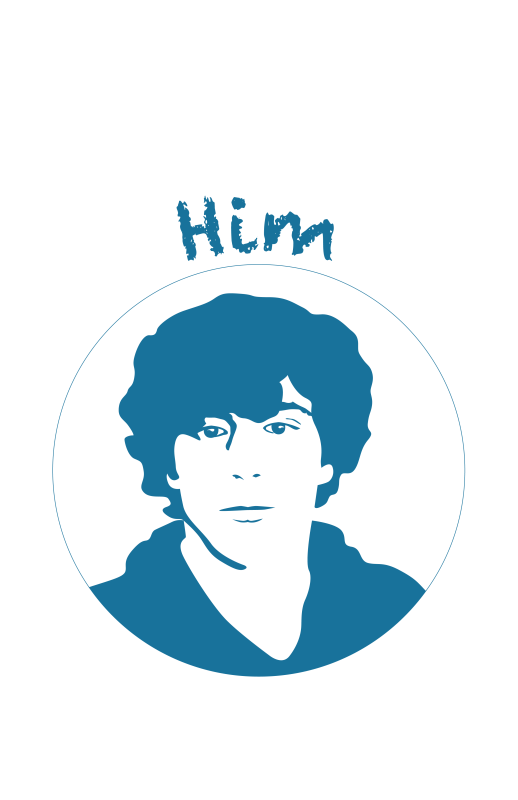
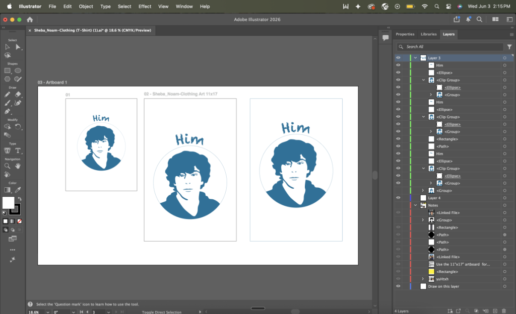
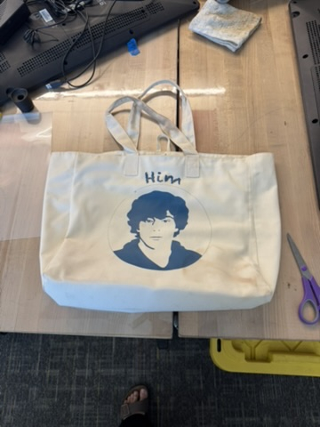
In this project, I aimed to make a minimal, sleek poster style portrait of myself in high contrast that could be heat pressed onto an actual cotton shirt. Made with very few colors (only shades of blue and white,) I fit my portrait within a simple circle with clean lines. As this image needed to be physical and placed on a shirt I made sure to keep it all as vector shapes instead of creating a raster image. If I created my image as a raster it would lose quality and have pixilated or fuzzy lines if I increased the size to be put on a shirt. But since it is all created with vector lines the image will keep its clean edges and professional look. I used the Pen Tool to create my entire image, drawing my self as simplified graphic shapes. I didn’t draw traditional lines with the pen tool, instead creating anchor points and bezier paths to create the distinct lines between shadows. Curving my direction handles enough to keep the hard shapes from appearing too angular I drew the outline of my curly hair as well as the details of my eyes, nose, and mouth.
Rather than creating detailed line work, I filled in my shapes to add visual weight to the image. I decided against detailed gradients or shading and used blue for the shadows and allowed the shapes to create the contrast on my face. I used a simple outline around the circle background to create a thin border. Typography is incorporated into my design as the word Him lays neatly above my circle background. I adjusted the path of the text to line up perfectly and scaled it to fit the design.
All together, creating my self portrait as a simplified vector graphic made me to pay close attention to the negative space in my designs and embrace a minimalistic approach. I had to balance the technical requirements of maintaining vector graphics with the visual impact of large shapes on a shirt, ensuring that every element contributed meaningfully to the overall composition.
Final Product:
Reflection:
Reflecting on the creative process, working in Illustrator feels fundamentally different from pixel-based apps like Photoshop because it’s all about manipulating vector paths. When you’re creating something that needs to scale perfectly without losing quality, like a bold character design that’s going to be heat-pressed onto a cotton T-shirt, Illustrator’s precision is unmatched. Using tools like the Pen tool and Live Paint forces a very structural, deliberate approach to art. You aren’t just sketching freely; you’re mathematically building shapes and layering them cleanly, which is incredibly satisfying when you need that crisp, polished finish.
On the flip side, jumping into Photoshop feels a lot more natural to me, and way more forgiving. Especially if you want to blend heavy textures, manipulate photos, or get messy with digital brushstrokes. It captures a gritty depth that vectors sometimes struggle to achieve naturally. Ultimately, the best part of digital media is figuring out how all these programs talk to each other. You can create sharp, scalable graphics in Illustrator, build up the mood and lighting in Photoshop, and then drop those assets into a clean InDesign spread to bring the whole project together. It’s really just about picking the right digital workspace for the specific visual story you’re trying to tell.