Product Design
While the preceding projects were very illustration based, the product design project felt very commercial: I could imagine experiencing a similar work flow in an industry job. I love the freedom we were given in choosing our product, I wouldn’t have been as passionate about my design if it weren’t for the liberty I was given. We were tasked with creating a label, product design, and advertisement, making this one of our longest projects.
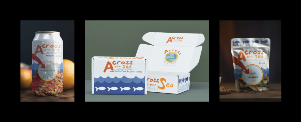
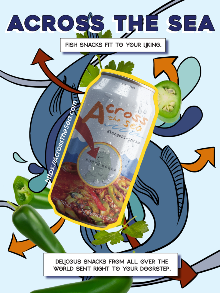
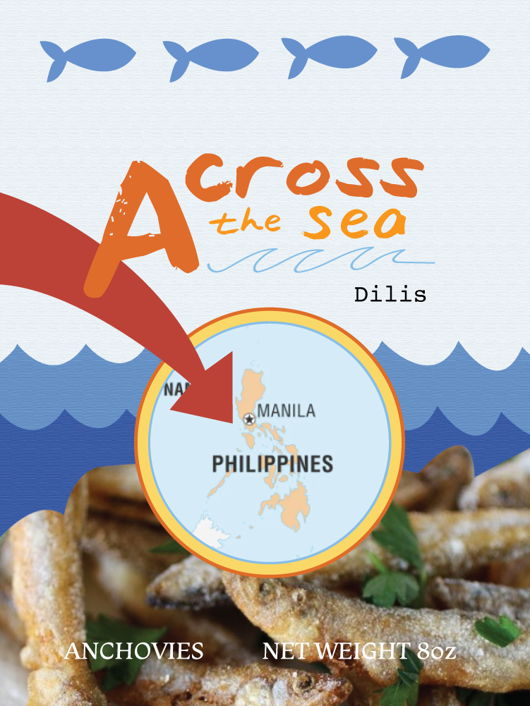
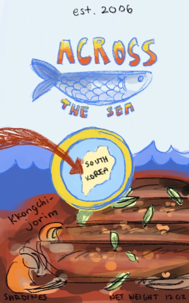
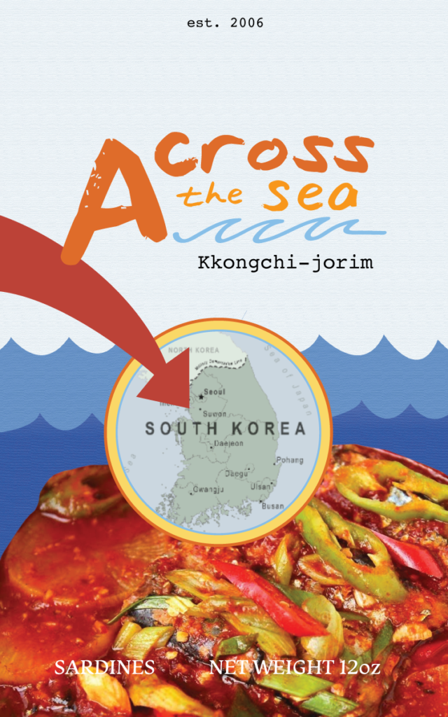
My product is a monthly subscription, in which you sign up and the product is shipped to your door every month. More specifically, it is a box full of a variety of fish based snacks, including fried fish, cans, and more. The title of the product is Across the Sea, as every month focuses on a snack from a different country. I chose this product because I wanted to create something that represented my culture. Food has always been the bridge between my two ethnicities, and I wanted to create a product that showed how powerful food can be as a connector. I chose fish because it is a stereotype that ethnic food is “stinky and gross”, and I wanted to twist that on its head, showing how fish–a commonly smelly food–can be tasty and delectable.
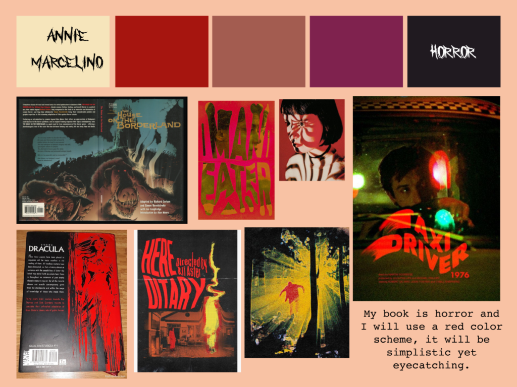
I chose a complementary color pallet for my logo, using blue to tie the logo to the sea and a reddish orange for high contrast. I struggled with finding a nice font for my logo, with my original design using bold block letters and a detailed fish. My second draft used cursive with a strong lean to mimic waves, but the logo wasn’t as readable as I wanted it to be. I ended up using a handwritten-like font, with a simple wave as the logo. This made my logo feel wavelike yet simple and easily recognizable. I’m very happy with the end result, and I learned how to use simplicity to my advantage with this project.
Book Jacket
The book jacket project was based on our narrative in English! I had previously designed a book jacket for an existing book, but this was my first time creating one based on my own story. We were assigned with utilizing one new Photoshop technique, and I chose an Escher style ribbon effect. I played around a lot with texture and noise, and I had a lot of fun taking photos with my classmates for the author photo. This is by far my favorite project from this unit!
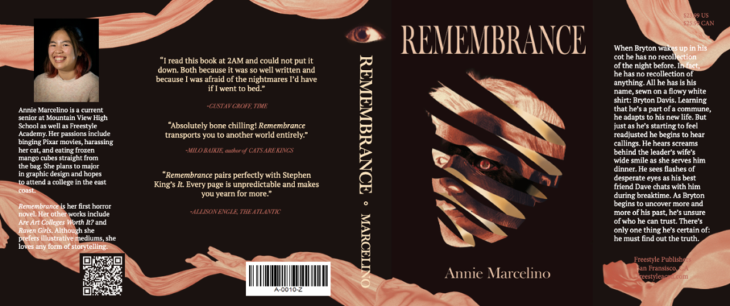
When Bryton wakes up in his cot he has no recollection of the night before. In fact, he has no recollection of anything. All he has is his name, sewn on a flowy white shirt: Bryton Davis. Learning that he’s a part of a commune, he adapts to his new life. But just as he’s starting to feel readjusted he begins to hear callings. He hears screams behind the leader’s wife’s wide smile as she serves him dinner. He sees flashes of desperate eyes as his best friend Dave chats with him during breaktime. As Bryton begins to uncover more and more of his past, he’s unsure of who he can trust. There’s only one thing he’s certain of: he must find out the truth.
Movie Poster
In addition to our book jacket, we were also assigned the task of creating a movie poster for our story. At first this seemed to be a very daunting task, especially when we were told that the posters would be printed on a large scale. However it was still very interesting, and once I started simplifying things and looking at the poster from an audience point of view I had a lot more fun with the project. I also enjoyed including some of my friend’s names for the credit block, it felt like a cute little easter egg.
When Bryton Davis wakes up in a commune with no recollection of his past, he has no choice but to get reacclimated to his new life. As his supposed best friend Dave shows him around, he meets Linda, the community nurse, Charlotte, a feisty member, and Catherine, the community mother. He slowly begins uncovering his memories by going to key places and finding key items. But as he does strange things begin happening. People begin disappearing, he begins fainting at random times. As he desperately scrambles for more memories he gets closer and closer to uncovering the sinister truth of the commune.
I created this movie poster in Photoshop, utilizing gradient maps and effects. I chose to highlight an eye in my poster as I had done the same with my book cover. I also used a similar color scheme for cohesiveness. Initially my idea was completely different, with a lot more illustrations and detail. However, my draft was becoming very muddy and crowded. I decided on a simpler poster, inspired by movies such as Silence of the Lambs and Tusk. I like how impactful yet stylistic their poster designs are. One of my favorite parts of my poster is the title. I found a tutorial on how to make a fading effect on text using a diffuse layer and field blur, and I loved how it reflected Bryton’s mental state as the movie progresses. He starts off blurred and confused, but as the story develops his mind clears.
Overall, I had a lot of fun with the world building unit! I’m so happy with the story I created with my group, and my designs would have fallen flat if I hadn’t been as passionate on the story we had created together. This unit was filled with a lot of large scaled projects, which really trained me to look at the grand scheme of things and stay focused when on a tight schedule.