Product Design
Our main project in Design Class was to simulate the product design process, from mood-board to triptych. I really enjoyed working on this project and getting the chance to design my own logo and product, a style of project that I hope to offer as a service in college/the future. Giving us full creative freedom to design whatever we wanted (within reason) allowed us to sample the experience of being a graphic designer that we may have to become familiar with if we want to pursue it as a career.
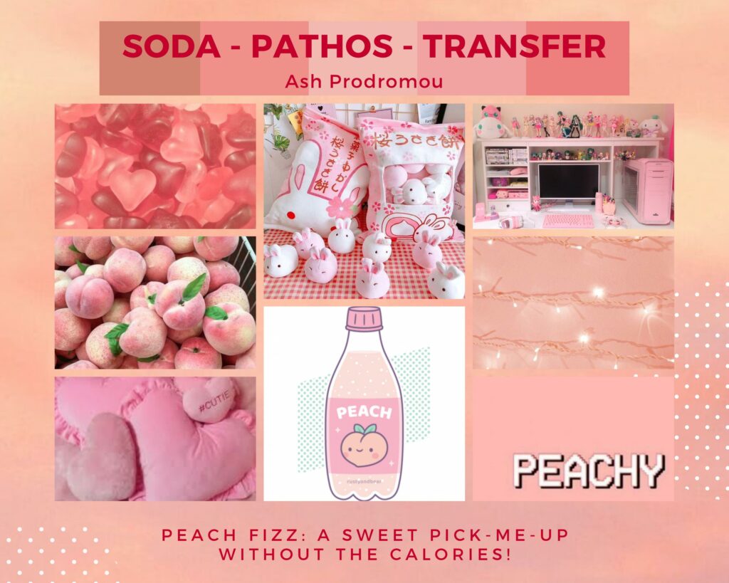
Moodboard
We started out by creating a mood-board for our product, or a collection of images used to organize what we wanted to be the general idea of our product. Since I was heavily inspired by Japanese sweets and drinks, I included photos of peachy snacks and things like that. We also created a color palette that we would continue to come back to as we got to working on our logos.
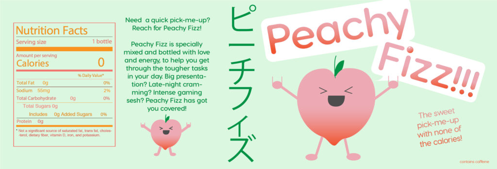
Product Logo
The logo I created, using my mood-board and other Japanese soda designs as inspiration:
Product Label
Here’s the logo expanded into a soda bottle label:
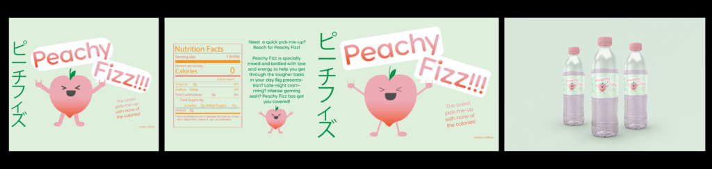
Product Triptych
And finally, a presentation of my product’s logo, label, and a mockup of the final product:
Artist Statement:
I chose to make an energy soda, similar to Monster Energy, for my product design. I also wanted the soda to be calorie-free, to differentiate it from the other energy drinks on the market. My inspiration for the logo design came from Japanese sodas and snacks – they usually have mascots advertising their product, with a reliance on cute designs and pastel colors. I chose to make my drink peach-flavored, since pink and lighter orange would be the dominant colors. My main demographic for this product was gamers, students, and other young people who enjoy energy drinks. I also wanted to market it towards people who like Japanese snacks and iconography.
For my magazine advertisement, I had planned to do a Tony the Tiger-style integration of my peach character into various scenarios when I expected people to enjoy the drink. For example, the peach could be wearing a gamer headset and holding a controller next to a kid doing the same thing, or wearing eyeglasses and a graduation cap next to a student studying for a final. It would be a cute eye-catcher, and create an association between the activities shown and the drink itself, which would hopefully inspire people to purchase it.
I had a lot of fun using Illustrator to create my logo and label. I utilized the color scheme I had created using Adobe Color and traced the simple shapes of my peach character based on my sketch. From there, I customized my main “Peachy Fizz” font to round out a few of the corners, and found a Japanese font online to incorporate some katakana into my design. The Japanese text was written in green, which I hadn’t initially planned on using for the font, but it worked well with the light green background and tied the design together well. I used a gradient for my main text, since neither pink nor orange were entirely dominant in a peachy color scheme.
Final Thoughts:
Now is probably not the time to hit one’s stride in a class, but I feel like I really got in the zone working on this project. I enjoyed getting to work on a project that allowed me to design freely and receive constructive feedback from my peers. I also became more familiar with Illustrator, Canva, and other design programs that I’d like to keep using in the future.