The Reflections unit kicked off our Senior year with a deep dive into self-reflection and a brand new set of projects to get us back into the Freestyle groove. The essential question for this unit was “Who Am I?”, an important topic to consider as we began applying to colleges and preparing for the most important stage in our lives. The assignments this year reflect (ha-ha) our exploration of this question, and our attempts to express ourselves through art and language.
We were tasked to create a list of 10 things that demonstrated our personality and character in a non-straightforward way. These items could be things from around our house, something we’d lost or left behind, or anything else we could think of. My list of 10 things was:
- My denim jacket,
- My gray shoulder bag,
- The novel Neverwhere by Neil Gaiman,
- A giant “Happy Birthday” sign from my friends,
- My signed copy of Peter and the Starcatchers by Dave Barry and Ridley Pearson,
- A birthday card from my friend Val,
- My lucky guitar pick,
- A black pair of socks with skeletons on them that glow in the dark and say “Creep it Real”,
- My guitar,
- and a small tube of e.l.f. lipstick in the shade Tea Rose.
Digital Media – Mandala
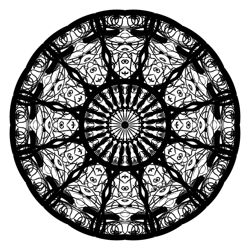
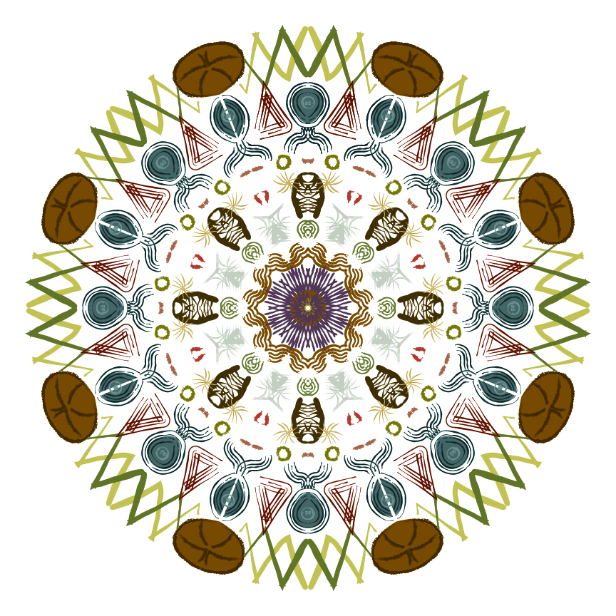
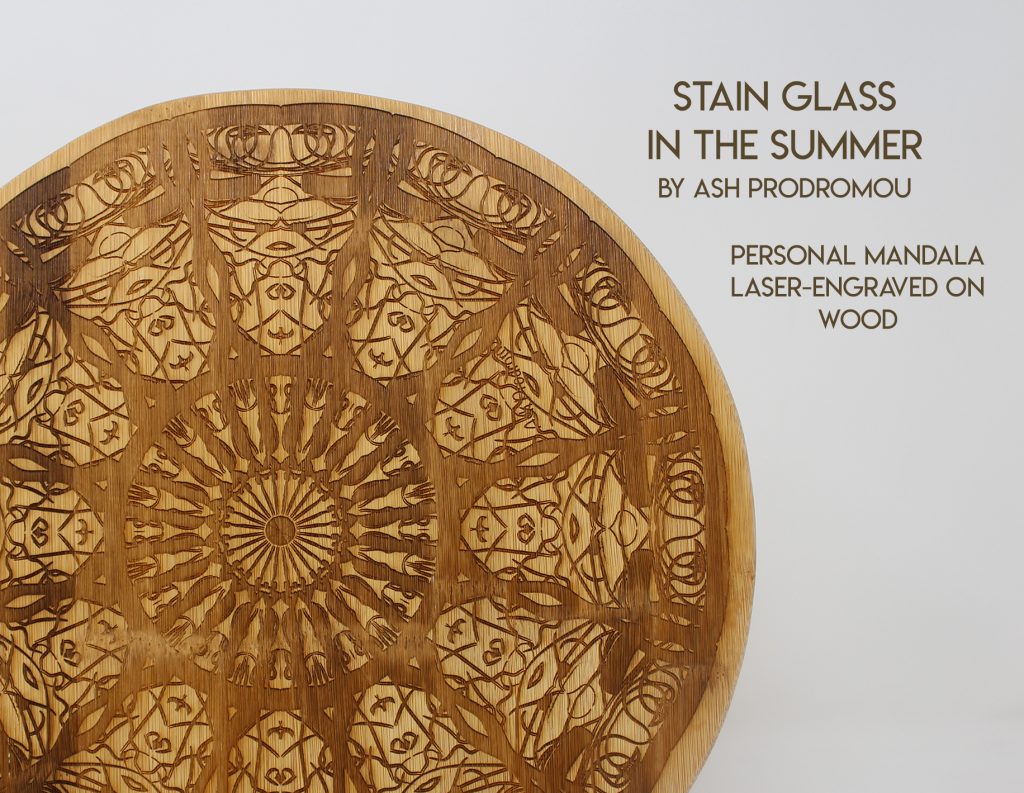
The first Digital Media project of the year was surprisingly relaxing: create a mandala in Illustrator by setting up a system where a slice of our drawing would repeat over the artboard and create a mesmerizing pattern. I had a lot of fun refreshing my knowledge of Adobe Illustrator, especially since I know we’ll be using it a lot in both this class and in Design.
Artist Statement:
When creating my personal mandala, I really enjoyed being able to create an abstract interpretation of an experience. The concept of an image being repeated over and over really lends itself to a lot of different ideas and pieces of art. I learned to draw on personal experiences, thoughts, and feelings to create art that allowed me to properly express myself. Since I’m new to Design, I was really worried about creating visual art and submitting it for a grade. This project has also alleviated some of my worries about future assignments.
This project, for me, mostly started out with just testing out the brush presets. I tried out brushes with multiple lines, thick brushes, thin brushes, etc…As I was fooling around, I created a small pattern that was a bird done in thin lines surrounded by a thick outline. It reminded me of when I had gone into the chapel at Stanford University and looked up at the incredible stained glass windows. It had been sweltering the day that I had gone to the campus, and as I looked up at the molded glass, I felt a bit dizzy. The colors and shapes swam before my eyes and seemed to blend into odd and disconcerting polygons. I was inspired by that feeling to create my personal mandala: a stained glass window that’s just slightly blurred and out of focus.
English/Digital Media -This I Believe Essay/Video
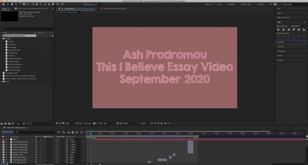
Leaning into the essential question of this unit (“Who am I?”), we read through various essays written for the This I Believe radio show on NPR. Then, based on our observations, we wrote our own This I Believe essays and created an After Effects video of us reading through them. I really enjoyed this assignment; it was very refreshing to just write an essay detailing something we were passionate about. That’s one of my favorite things about Freestyle English: it reminds me of the things I love about writing. I was able to explore an idea I was interested in and present it confidently through writing. The This I Believe essay got me hyped for the rest of our English curriculum. I really appreciated getting more practice in After Effects, since it’s a program that I’m not super familiar with.
Here’s my After Effects setup for the video:
This I Believe: The Power of Pink
I believe in the power of pink.
When I was little, I went through that phase that most little girls went through – the rebellious pink-hating phase. I scoffed at Disney princesses and Barbie dolls, writing them off as totally girl’s stuff. I, on the other hand, was cool. I liked Pokemon cards and Harry Potter. I read the Hunger Games and watched cool movies like Star Wars. I was decidedly anti-pink, and this made me better than everyone else.
As I got older and headed into middle school, my hatred of pink slowly morphed. I spent my time mocking the girls in my classes for buying clothes at Abocrombie and Fitch or for listening to the Chainsmokers. They were all clones, a hivemind, bimbos. My friends and I laughed at groups of girls when we passed them in the hallway, pointing out their matching shoes, backpacks, and hair. We listened to cool bands and watched anime (that’s right, before it was cool). Those interests, in our minds, set us apart and made us better than the Shawn Mendes-loving jerks in our classes. Most of all, we hated them because they were popular. We hated them because they were well-known and liked, based on the simple virtue of following the grain. They were the new pink.
Finally, looking back now, I can’t help but cringe at the person I was. The horrible hair decisions, the awkwardness, and worst of all, the obscene amount of sweaters…they made it obvious how insecure I used to be. I think the real reason I hated pink so much was because I didn’t have a color to identify with. I was still figuring out who I was, and I hated the girls who had already done it. Don’t get me wrong, there are still some pink girls who put you down for your color, but I always felt like I had judged the girls at my middle school too harshly. Now, pink has become my favorite color, but I still like purple, light green, and gold. And I understand now that the girls I used to make fun of in middle school feel the same way. In the end, pink should unite us, instead of pitting us against each other. We should all be believing in the power of pink.
Digital Media – Photoshop Art
For this assignment, we learned how to imitate various forms of physical art techniques (mainly watercolors and pastels) and then create a final product based on what we learned. I was having a lot of trouble with the watercolor brushes since they were very translucent and hard to see on the canvas, so I messed around with them a bit until I discovered a cool effect. This process is explained further in my artist statement.
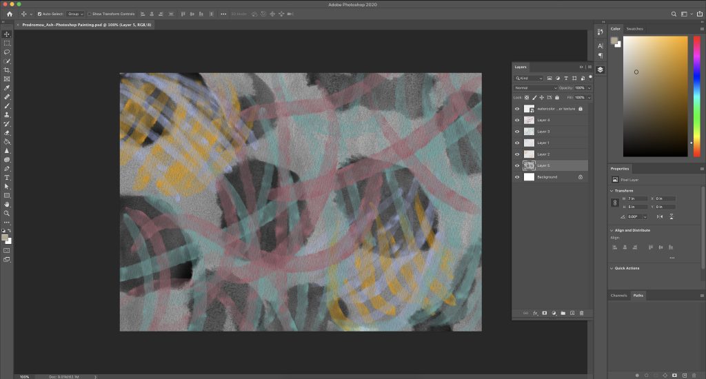
Here’s my Photoshop setup for this painting:
Artist Statement:
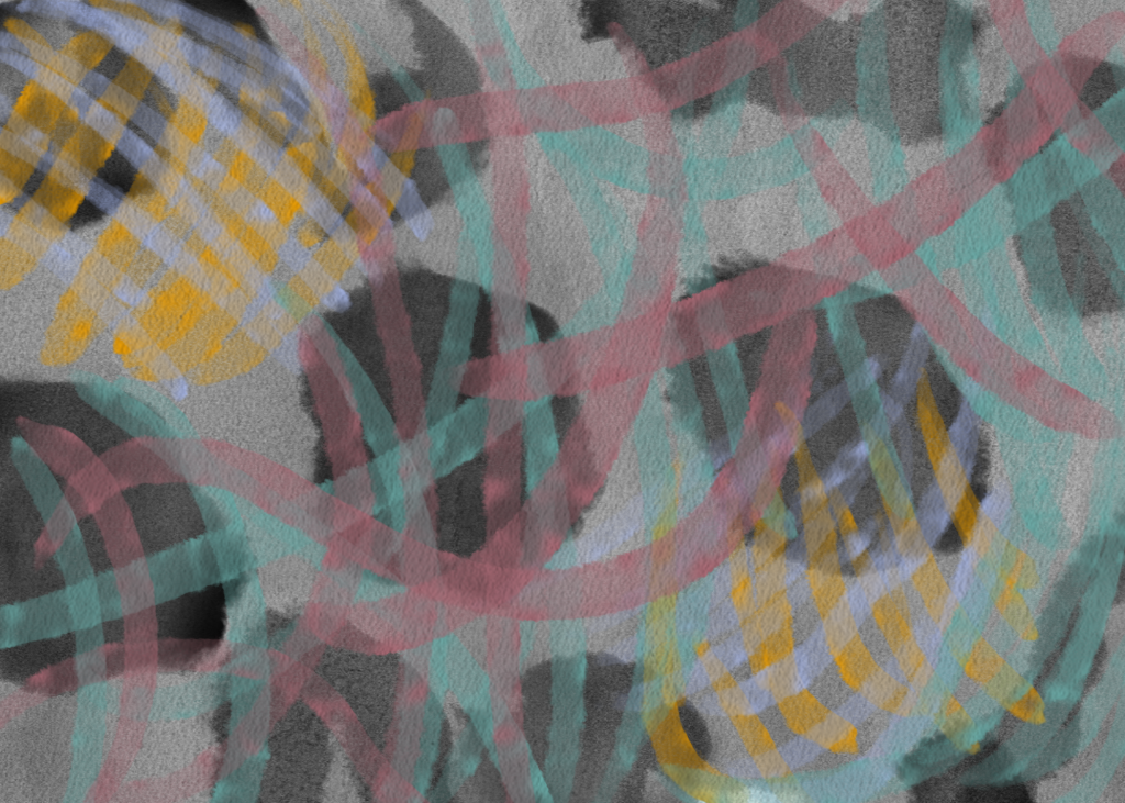
I spent some time messing around with brushes before I started working on this assignment, putting lighter colors over a black background. I found it really fascinating how the colors became dull after one layer of black watercolor, but turned almost brighter after two layers of the same shade of black. That strange technique inspired me to draw on a weird train of thought I’ve been exploring recently: the idea that our memories are often happier than what actually occurred. I’ve been musing about times that, looking back, feel like some of the happiest points in my life. However, if I look at them with a critical eye, I also remember feeling anxious, unhappy, and worried that the happy times weren’t going to last. It’s so strange how we always view the past as better, and take our happy memories out of context with the bad parts of it. I used brighter colors that I thought would go well together (pink, orange, cyan) and covered everything with a background of black, adding in another layer at certain points. The intention of the brighter splotches were meant to represent the parts of our past that we remember and look back fondly on, while the grayer parts represent the full extent of our memory. There are brighter parts not highlighted by the black splotches, and duller parts of the painting are highlighted by the splotches at other points. I had a lot of fun creating this project, and I’d like to use art and Digital Media assignments to put my thoughts and feelings on “paper” in the future.
Digital Media – Watercolor Effect + Photoshop Compositing
Watercolor Effect
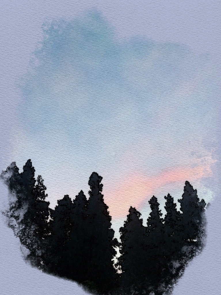
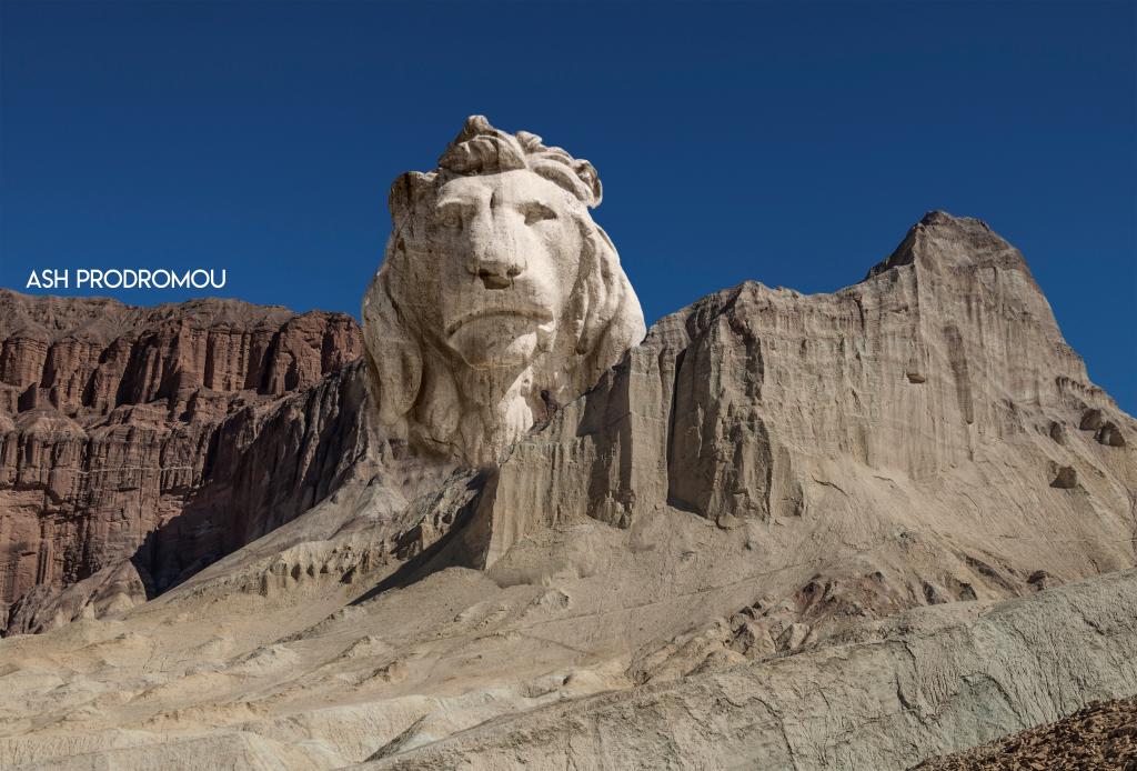
This assignment was one of my favorites to do this unit. We were tasked to take some of our own photos and make them into pieces of art by applying the signature watercolor effect. I enjoyed adding a little spice to my own photos, especially the one I chose to present on this page. It makes it into a really gorgeous work of art.
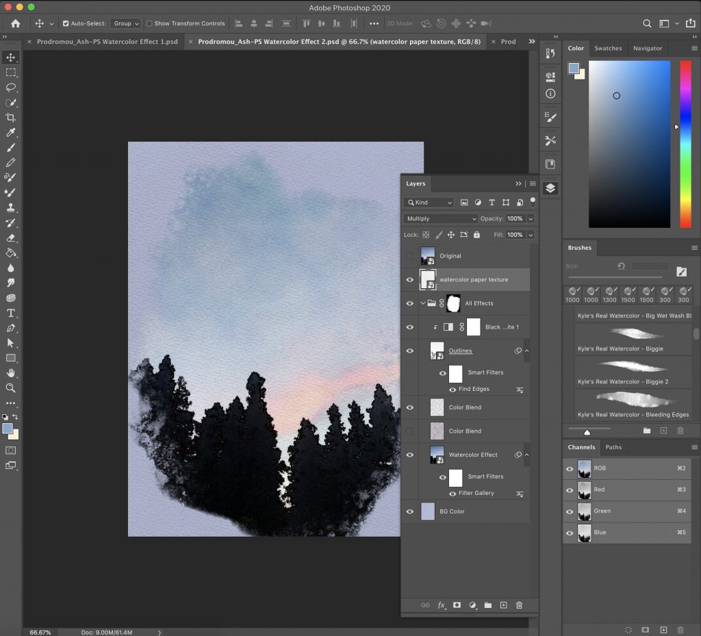
Here’s my Photoshop setup for this project:
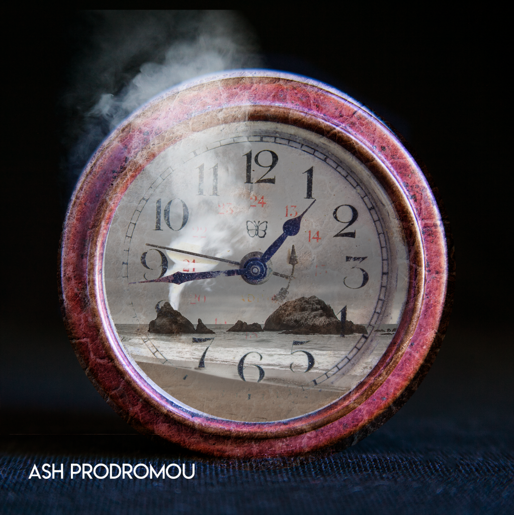
Photoshop Compositing
This was another interesting project that transformed simple photos into works of art. When I think of “Photoshop”, this is the project that comes to mind, so I was really excited to use all the different parts of the program and create something incredible. We actually created about 8-10 different compositions, but I picked my three favorites to display here.

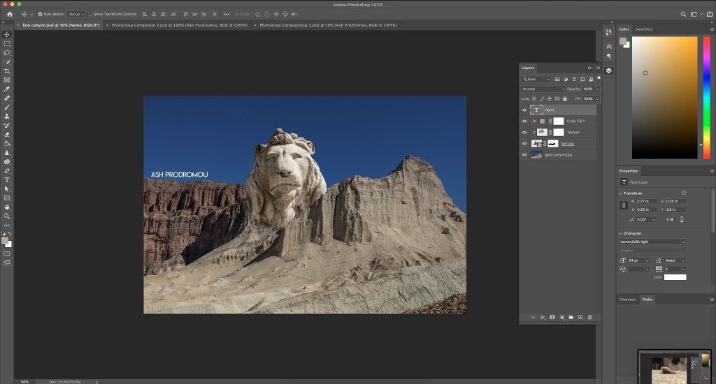
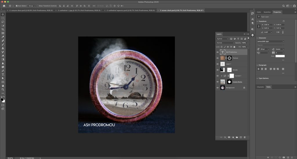
Here are my Photoshop setups for this project:

English – College Essay
This assignment was probably the biggest lifesaver of my senior year. All throughout high school, I had been told that my college essay might make or break my future. Coming into senior year, I was pretty terrified to even attempt a draft of the most important essay I would ever write. Then I learned we would be writing our college essays for credit and peer review in English, and it was like a giant weight had been lifted off of my shoulders. I was able to share my drafts with fellow students, read and take notes from College Essay Essentials by Ethan Sawyer (the College Essay Guy) and come up with an essay that I felt perfectly demonstrated my core values to the colleges I hoped to apply to.
All-Nighters and the Art of Academic Language
Ever since I was around 12, I’ve pretty much become fluent in “academic language.” For example, here’s a quote from my freshman year “To Kill a Mockingbird” essay: “This quote best exemplifies the community that Scout has grown up in: one of intolerance, prejudice, and fear.” Lots of fancy words, commas, and complex sentence construction. I lived and breathed academic language on every essay, pulling “although”s and “similarly”s out whenever I got stuck on a sentence. While this may seem a bit like a blessing, it’s also a bit of a curse.
See, the big problem when you’re good at something is that you tend to save it for last. I’d finish up my math homework, take some time on chemistry, and then…well, I’d have time. I could finish my essay later. This, ladies and gentlemen, is what led to the infamous all-nighters. I’d stay up late, drafting and editing lengthy essays that were usually due the following morning. Over time, I perfected my improvisation skills and was still able to create a thorough and interesting product. With academic language on my side, I could write a solid A- essay in under an hour. At the cost of my sleep schedule, of course.
Over time, the sleepless nights began to take their toll. The whole experience started feeling more and more like a chore. Crank out an introduction with a tried-and-true hook, follow the formula of background, quote, analysis, then hit them with a “so what?” conclusion. I was writing the same stupid essays over and over, and my grades were shifting to show it. The A- essays become B+ essays, and then just B essays. I needed to find a better way.
That’s when it hit me. Duh! I was rushing the process, following the same formula over and over and over again. I needed to add some more variety, and spice up my essays to get them back to their proud A- status. And I knew the perfect way to do it. I started putting my own thoughts and phrases into my essays, instead of the ones I knew my teachers were looking for. Rather than looking for the easiest answer, I started reading the text more critically: why is Scout’s community rooted in prejudice? How is that affecting her growth and her interactions with the world? Over time, my English essays began to read in my own voice. I learned that my thoughts, ideas, and opinions mattered, and that I could use my voice, instead of blending in with everyone else. It didn’t really matter anymore if I was writing the perfect essay, with impeccable academic language. I was writing for me, instead of for a grade. Of course, the essays did get better scores, but I wasn’t striving for that anymore. I knew that as long as I loved what I was creating, I would be fine.
And that leads us to the present, as I’m writing this essay. I want to let you in on a secret: This is the second draft of my official essay. The first draft, using a technique from a college essay book, talked about an old pair of socks that I had bought when I was a kid. It was confusing, wordy, and dripping with academic language. And, as always, I had finished it at the last minute. It didn’t feel like me, and I knew the person who read it would be able to tell. So, instead of turning it in and hoping for a proverbial A-, I scrapped it. I rewrote my essay as a peek into my brain that’s much more authentic, interesting, and far from formulaic.
Design – Public Service Announcment
Our first big task in Senior Design was to create a public service announcement based on the topic of our “This I Believe” essay/video. We used this framework to learn about color theory, the elements of design, and advertising techniques like ethos/pathos/logos. This was a super fun introduction to Design as a course (since I’ve transferred in this year) and I loved the opportunity to stretch my creative muscles and present a physical product that I can be proud of. I enjoyed picking out the colors I was going to use, establishing a design, and free-handing (from a reference) certain aspects of my PSA to produce something that was wholly my creation.

Artist Statement:
Four hands of different colors (green, blue, purple, and yellow) extend from the four corners of the artboard, drawn in chalk. In the center, there’s a small ball of pink, almost like a soul or a fire. The hands are surrounding it, maybe reaching around it or forming a circle. Underneath this scene is a message, sketched out and shaded in: Believe in the Power of Pink. I wanted to use my PSA to show different groups of women working together and being united in their womanhood. From this, I devised the idea for the “power of pink”, i.e. the small pink ball in the center of my PSA, as a short-hand for the combined power that women and girls carry in them. I wanted to include an aspect from my essay as well: that everyone has their own color regardless of their pink-ness. That was why I made the hands surrounding the “POP” different contrasting colors: to emphasize their individuality. The importance of pink was represented by my changing the color of the word in the tagline. I wanted it to pop out and be the first word that someone saw if they were walking by a poster version of my PSA.
Everything drawn for my PSA was done freehand (admittedly in Adobe Illustrator), sometimes using a reference image (like for the hands). I was really excited to draw something freehand for the first time, since for most of my previous Illustrator projects I had traced royalty-free graphics from the Internet and then combined them in new ways. I was a bit nervous about drawing hands, as I had heard that they were super difficult to draw. Don’t get me wrong, they still definitely were, but I was so proud of my freehanded (heh) hand when I finally completed it! It felt way cooler to say that I had drawn something on my own, without tracing or copy-pasting an image. That being said, I still did use a reference image, but I hope to work my way up to drawing things completely on my own, from my own imagination.