Video Editing Work:
I have been an editor or co-editor on various youth theatre projects with Peninsula Youth Theatre. Each production was privately screened to virtual ticket-holders so I am unable to present any footage. However, credits are shown below:
I have also completed additional editing projects completed as class projects in Freestyle Academy.
A chase scene:
An experimental film:
A documentary film covering the various forms of virtual connection being used during the COVID-19 pandemic:
A video essay comparing the work of contemporary experimental directors:
Adobe Program Designs:
I have created various collages/design mockups in association with Freestyle Academy.
A surrealist composition:
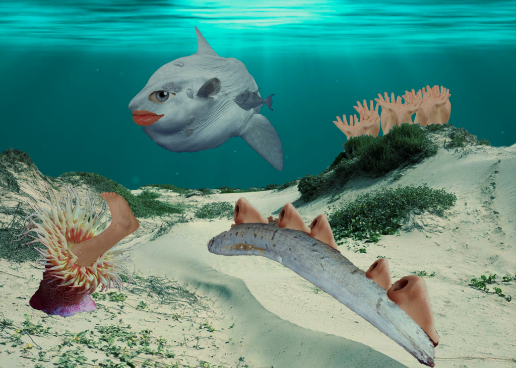
I was motivated to express myself for this project, to create an image able to convey a feeling I wasn’t sure how to put into words. I tried to invoke the feelings of dysmorphia and absurdity I felt towards my own body. It often felt like I was trapped inside the skin of some repulsive animal, like a fish. I created myself as the sunfish in the center of the piece, with big bulging eyes and lips. I also wanted to demonstrate the way small things like features of our face can become twisted and warped over time, reflected by the oarfish covered in noses. Finally, I tried to replicate the overwhelming and unrealistic expectations for beauty with my foot sea anemone and hand anemones in the background. This piece was very cathartic for me, and I’m really happy to say that I’m proud of it.
A mockup of a movie poster:
I mostly used Photoshop to create my poster, with an emphasis on solid color blended layers and a burnt orange color palette. I blended in images of the historical figures from their time periods in order to create a sense of dissonance between the different illustrations and photographs. It was suggested that I use brown font for both my credits block and the various logos, which I think ties in really well with the rest of the poster, where black font would stand out and clash with the rest of the color scheme. I wanted to emulate a femme fatale with the painted red nails holding a cigarette on the bottom of the poster, something very reminiscent of the heist and espionage thriller movies I want to emulate. I chose the Iowan Old Style font for my tagline since it has a vintage, yet timeless feel. Finally, since Ocean’s 11 was distributed by Warner Brothers, I used their logo at the bottom above the PG-13 rating.
A product design triptych depicting a logo, label, and product mockup:
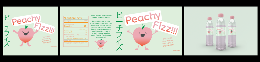
I chose to make an energy soda, similar to Monster Energy, for my product design. I also wanted the soda to be calorie-free, to differentiate it from the other energy drinks on the market. My inspiration for the logo design came from Japanese sodas and snacks – they usually have mascots advertising their product, with a reliance on cute designs and pastel colors. I chose to make my drink peach-flavored, since pink and lighter orange would be the dominant colors. My main demographic for this product was gamers, students, and other young people who enjoy energy drinks. I also wanted to market it towards people who like Japanese snacks and iconography.
I had a lot of fun using Illustrator to create my logo and label. I utilized the color scheme I had created using Adobe Color and traced the simple shapes of my peach character based on my sketch. From there, I customized my main “Peachy Fizz” font to round out a few of the corners, and found a Japanese font online to incorporate some katakana into my design. The Japanese text was written in green, which I hadn’t initially planned on using for the font, but it worked well with the light green background and tied the design together well. I used a gradient for my main text, since neither pink nor orange were entirely dominant in a peachy color scheme.
A public service announcement:
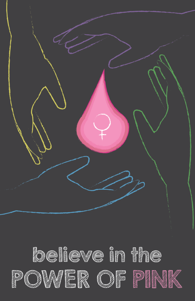
Four hands of different colors (green, blue, purple, and yellow) extend from the four corners of the artboard, drawn in chalk. In the center, there’s a small ball of pink, almost like a soul or a fire. The hands are surrounding it, maybe reaching around it or forming a circle. Underneath this scene is a message, sketched out and shaded in: Believe in the Power of Pink. I wanted to use my PSA to show different groups of women working together and being united in their womanhood. From this, I devised the idea for the “power of pink”, i.e. the small pink ball in the center of my PSA, as a short-hand for the combined power that women and girls carry in them. I wanted to include an aspect from my essay as well: that everyone has their own color regardless of their pink-ness. That was why I made the hands surrounding the “POP” different contrasting colors: to emphasize their individuality. The importance of pink was represented by my changing the color of the word in the tagline. I wanted it to pop out and be the first word that someone saw if they were walking by a poster version of my PSA.
Everything drawn for my PSA was done freehand (admittedly in Adobe Illustrator), sometimes using a reference image (like for the hands). I was really excited to draw something freehand for the first time, since for most of my previous Illustrator projects I had traced royalty-free graphics from the Internet and then combined them in new ways. I was a bit nervous about drawing hands, as I had heard that they were super difficult to draw. Don’t get me wrong, they still definitely were, but I was so proud of my freehanded (heh) hand when I finally completed it! It felt way cooler to say that I had drawn something on my own, without tracing or copy-pasting an image. That being said, I still did use a reference image, but I hope to work my way up to drawing things completely on my own, from my own imagination.
Here are some progress screenshots for some of these projects:
Dreamweaver HTML Products:
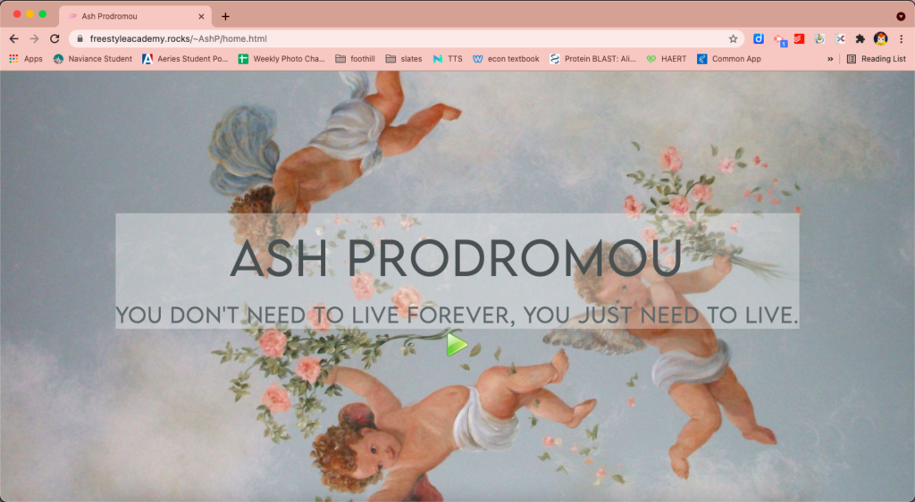
I have created my own landing page for this website, complete with a music player and interactive format that takes you to my “About Me” page, shown below:
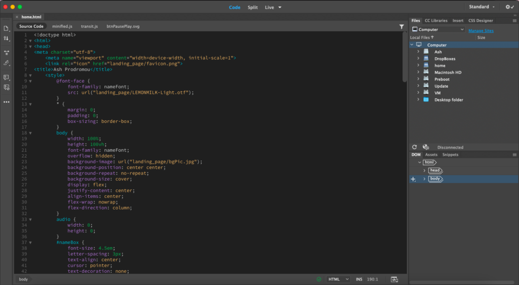
Here is a screenshot of my Dreamweaver Page: