I learned so much in Design this year because we did a range of projects. We started off by practicing photography and I was able to learn how to take macro shots of things and edit them in Photoshop. We also worked in Illustrator to create a PSA about the theme of our personal essays. We had to take photos of the subjects and then use image tracing and other tools to create the overall poster. Another project we did was aboriginals where we used our zodiac and other symbols to create a piece that represents us. Overall I learned so many new skills and got to explore my creativity and who I am.
Micro Macro Miniature Photo Final
Interface Screenshot
Artist Statement
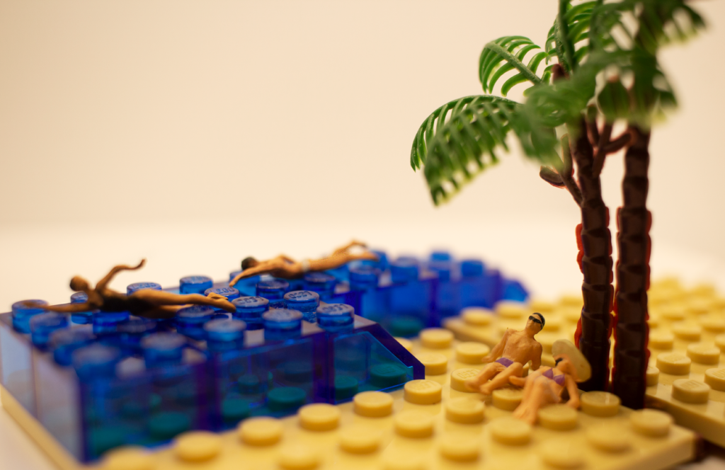
For my first project of the year in design, we did miniature photography and my micro shot is a relaxing beach scene. It includes a couple laying out underneath a palm tree on the sand while two people swim in the ocean. I love the ocean so I wanted to create the image of a beach day. The two parts of the beach, water, and sand come together in the middle and host different people doing different things.
As I was researching online I came across so many cool examples and ideas. I originally was drawn to doing a farm scene with animals and plants so during practice shooting that’s what I set up. As I tried that scene I didn’t like how it was turning out. The next time we shot I tried something different. I had brought a bunch of legos from my house so I picked out the blue ones and created a pool. I used some swimmers and created a pool scene. Those images were better but I knew I could improve. The following week I brought in more legos of different sizes and color. I used the swimmers and palm trees and set it up into a beach scene. I arranged the two people to layout underneath the trees on top of a big flat yellow lego which looks like sand while two other individuals were swimming in the ocean of blue legos. After I got a shot I liked I brought it into Photoshop where I saturated the colors, did a photo tint for some warmth, and changed the curves. I also added color to the bathing suits of the people laying down. Then I sharpened the image slightly and saved it to the folder.
Public Service Announcement and Moodboard
Progress Screenshot
Artist Statement
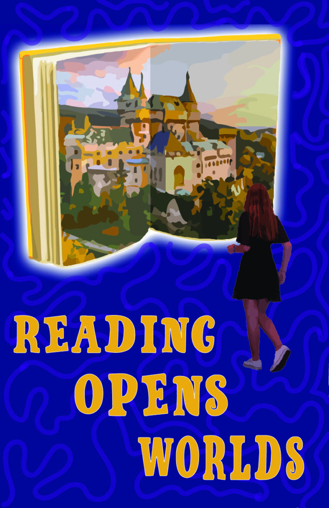
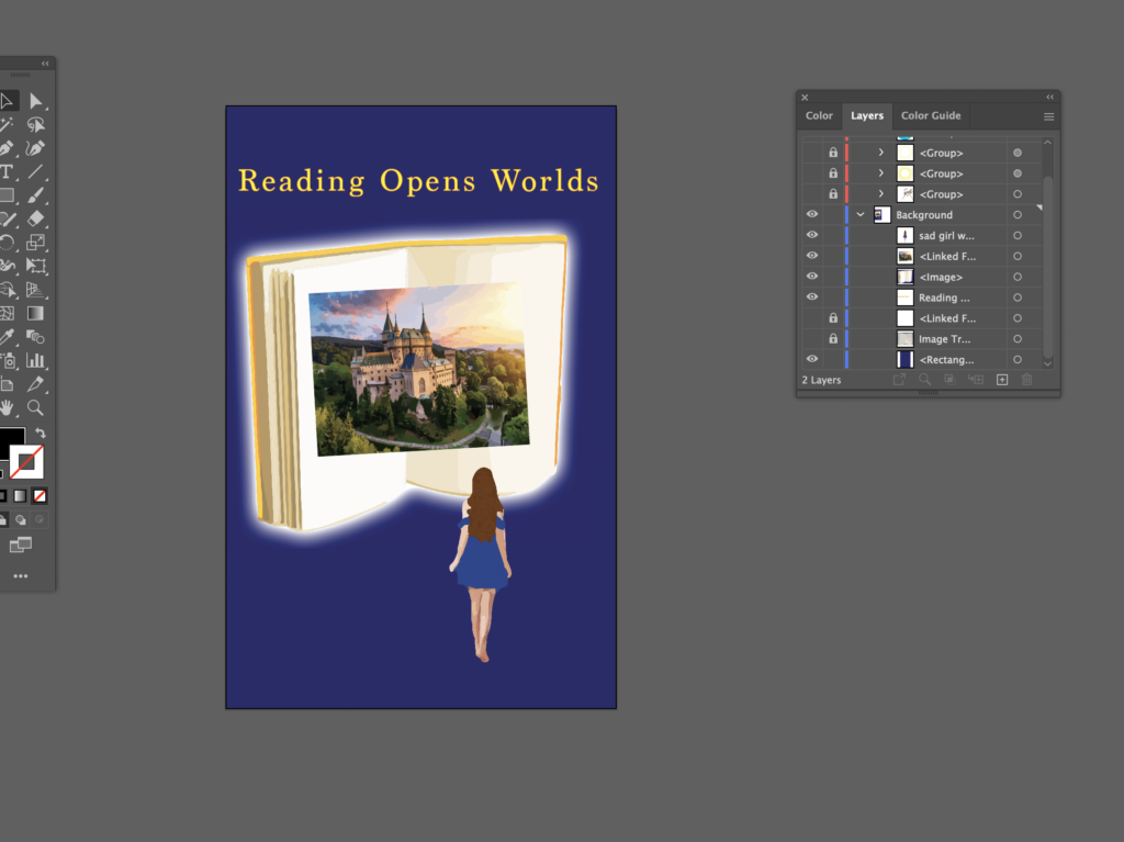
My PSA has a contrasting color scheme of dark and light with a dark blue background with purple swirls waving through the back while we see a girl walking towards an open book. The book is warm-toned and glowing. The statement I chose was “reading opens doors”. This means that by reading you can enter a new world different from our own. You can escape from your problems and go to a place of new knowledge and joy. I choose the darker colors to show the problems that could arrive in life and the turmoil people may go through while the brighter and warmer colors show a new opportunity and an escape. The purple swirls represent the confusion that arises in our lives.
To create my PSA I first gathered inspiration and compiled a mood board of images, other PSAs, and color schemes. I sketched out some possible ideas in my notebook using the mood board. I chose one and started by taking photos, then I brought them into photoshop to crop them and isolate the subject. then I image traced and recolored them all. Along with this, I used an image of an open book, which I image traced then put a glow behind. I also cropped, image traced, and recolored a picture of a castle which I put within the book. I put all of these components together on top of a dark blue background. After they were arranged I took the paintbrush tool and drew purple swirls and lines around in the background. Lastly, I added the text for the tagline. A big issue I found was figuring out how to put the castle image on the open book and make it look real. I had to image trace the whole thing erase the edges so that it fits into the book. Then I took it and split it down the middle and recolored one side to be darker to make it feel like a real book. I think it turned out very well and was worth the extra effort and steps I took.
Aboriginal Art
Interface Screenshot
Artist Statement
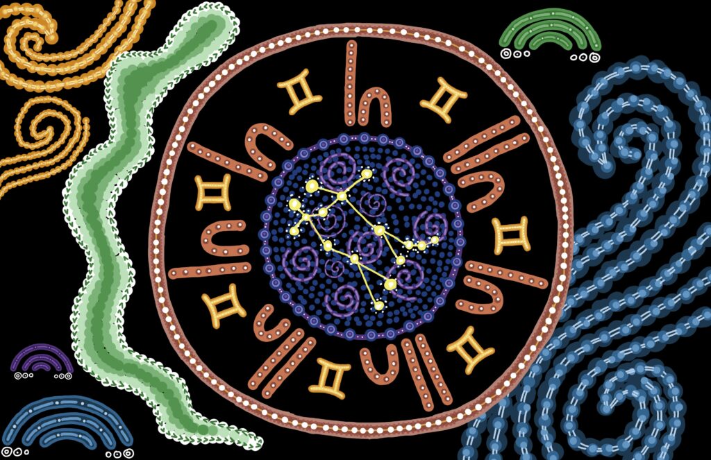
For my aboriginal, I tried to incorporate many different symbols that all tied together to create who I am. In the center, I have the main symbol, or the focal piece, which is people gathered around a table. These people are my family. There are 7 people in my family and I represented each of us as the corresponding gender. In between each person is the sign for Gemini, which is my star sign. The table, or the very center of the piece, shows the constellation for Gemini. It has the night sky shown with swirls and darker blues and purples. Along the sides are other symbols. The blue and yellow swirls are to symbolize air. Gemini’s are air signs and I feel like this connects to my patient and easy-flowing nature. There is also a snake along one side as I love animals and my family actually has a pet snake and I think nature is very interesting. Lastly, there are clouds scattered around to represent air but also to show my love of the sky and the importance of trials in my life.
I created this piece first by brainstorming and gathering inspiration online. There are so many different ways one can approach the aboriginal so I wanted to see lots of ideas before I started. Then I chose black as my background, researched my star sign, and identified which symbols I wanted to emphasize. Then I sketched out the rough layout in grey. On top of that, I began to draw dots and shapes in order to create symbols and images. I ran into trouble as I added color. My colors were in separate quadrants and my project seemed structured and controlled. I solved this problem by expanding the colors and adding the same color on the opposite side so there was less division and no dominant color. If I could do anything differently I think I would have started by putting in a muted pattern of dots or swirls in the background and then putting the symbols on top so that there was less negative black space.