Product Design
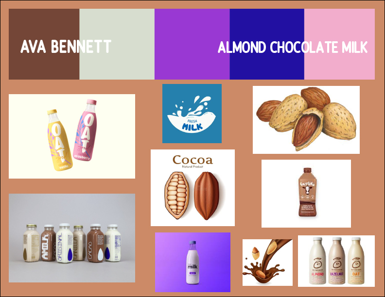
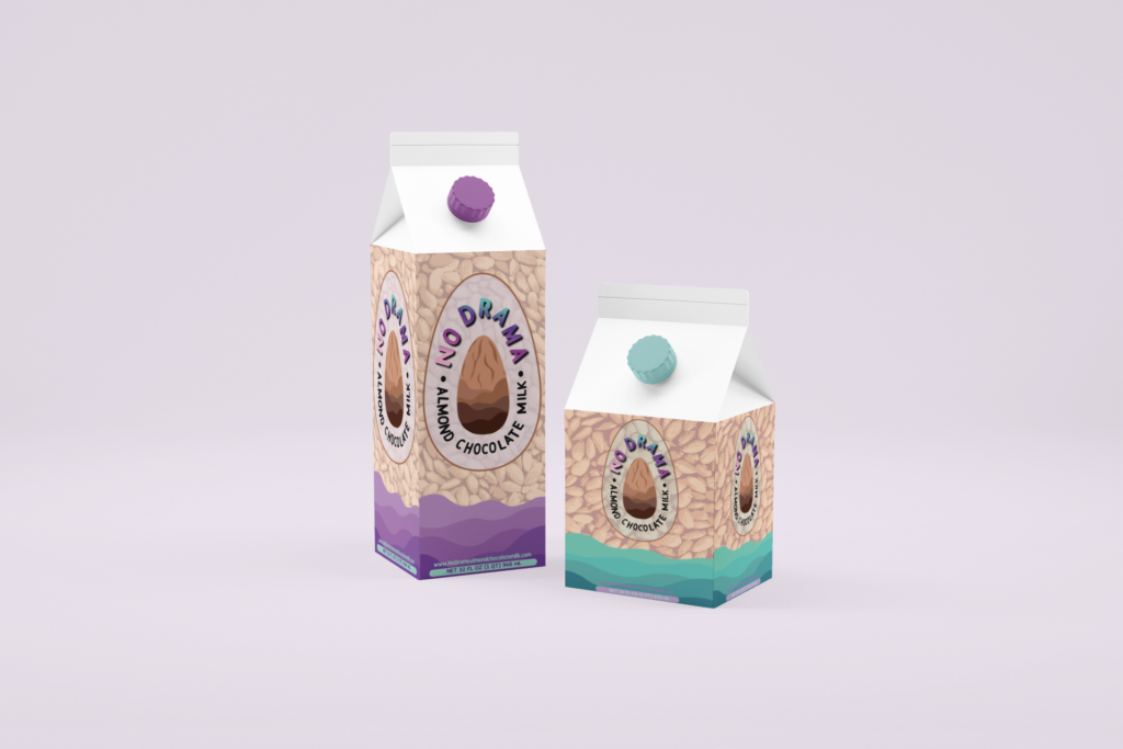
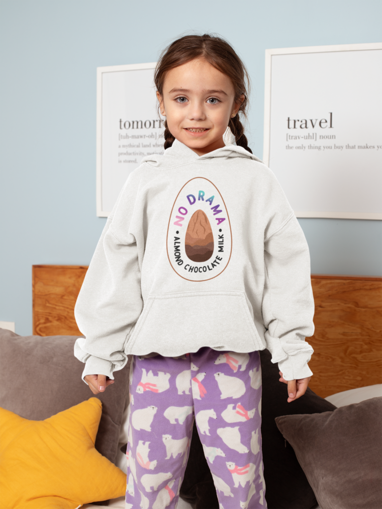
Below are the components of the product I designed. We first had to choose what food or beverage we wanted to create and I choose to create almond chocolate milk. Before we could begin any of the projects, we needed to make a mood board. Moodboards are when you find a bunch of inspiration images and components you want to incorporate. Then you find the font you want to use and the color pallet you will be aiming for. All of those things are put into your mood board. After that, we moved to the logo. This was our overall logo for our product and it would be used a lot in the future. I put my brand name and product and had a chocolate-dipped almond. Once that was completed, we made a label that would be used in our mockups. The one you see below was used to go on the side of a milk carton and is what I imagine it would look if it was packaged.
Moodboard, Logo, and Label
Product Triptych
Product Logo and Label Artist Statement
For this project, I created almond chocolate milk for my product. It is a dairy-free option of chocolate milk. My market is families and mothers with younger children. This product is a fun and healthy alternative for families or kids that are lactose intolerant or concerned with animal products. I am targeting the demographic of mothers because they are often the ones buying the food for the family.
If I was going to make a magazine article for this product I would focus on the idea of catching the person’s eye and appealing to my audience. I would use bright colors that are tied to my logo’s color scheme. I think another thing I’d do is maybe put a kid drinking the product in the ad so that mothers and families are likely to buy it.
We used Adobe Illustrator most of the time while creating this project. We used the technique of sketching our ideas, scanning them in, then using the pen tool to recreate them online. The pen tool took some practice to understand and get good at. We also used mockups to create real-life examples of our label which was really interesting. It took some time to take my logo and turn it into a label though. Lots of trial and error until I got it right and looking good. This project really helped me develop my Illustrator skills but also my marketing skills. Having to think about our target audience, what needs to be included, color schemes, and the theme of our product were all things that we took into account while creating a great product.
Movie Poster
Movie Poster Artist Statement
The premise of my movie is that the main character, a senior girl, has written a journal in the form of letters. She never intended these letters to be sent to anyone so she addressed them to California. She lives in the midwest and has always imagined herself going to the coast. She gets into multiple colleges but she doesn’t know what to choose. She wants to go out of state while her family wants her to stay close by. She decides on the closer college but regrets it inside. While packing up her stuff, her mom accidentally sends the letters and it ends up being sent to people all over California. She can’t believe that her private emotions have been spread all over the place and need to go after them. She runs away and travels all over the state meeting new people and trying to retrieve her letters while finding herself.
In order to create this movie poster, I started by finding inspiration from other movie posters and art. I was very inspired by coming of age movie posters and the film photo aesthetic. I began by taking photos at the beach and a golf course nearby in order to capture a photo of a lone person and the vibe of the story. I brought it into Photoshop and extended the sky of the image because originally the girl was in the center of the image. I made it so that she was further down the image and had more room for text. I also edited the image so that it was brighter and more saturated. Then in Illustrator, I started to create the text and other factors. I worked on the title and choosing fonts for a long time and researched how movie posters are formatted and what components were needed. The title was changed many times but I chose one and went with white text. I created credits down below and fake names for the actresses and actors for the movie. I came up with a tagline that fit the story and put that on the poster as well.
Reflection
This semester’s design projects were a lot of work but also a lot of fun. I learned so much from completing these designs. I got to understand marketing strategy and how to target an audience with my logo and label. I also learned how to format and set up a movie poster. Making these projects was stressful to me though because it is all about aesthetics which makes every choice important. I went back in forth about colors and texts and layout for days and days. I really like how both projects ended up and I am proud of all the new skills I learned.