Introduction
Hello! My name is Ava Bennett and I am a design student at Freestyle Academy. I am a first-year senior in Freestyle and I am also in ASB/leadership at Mountain View High School. As I grew up I did a lot of physical art with painting in all sorts of mediums. I have loved the opportunity to learn new ways to create. It has been so interesting to switch from physical to digital art and projects.
To showcase, I chose my magazine spread, movie poster, and my surreal composition. I wanted to show my product magazine spread because a lot of work went into the overall branding of the product and it all culminated in the full spread of the magazine. I want to emphasize that I incorporated the mockup of the milk and tied it to the theme of the product. I specifically chose my movie poster because I am proud of how it turned out and came together. I feel like this project was very simplistic looking but I like the style of it. Lastly, I chose my surreal composition from digital media because I think it encapsulates my brain and creation style. This was a very fun project that pushed me as a digital creator.
Next year I am going to Brigham Young University and am undecided on my major. I would like to have feedback about what majors would be good to pursue and if I will be able to do those majors based on the work shown. Also, I would like to hear feedback on what my weaknesses are in my designs.
You can reach me at avabennett1@gmail.com for any further information or questions
Product Design
We made up a product and then created a logo, label, mockups, and then a magazine advertisement.
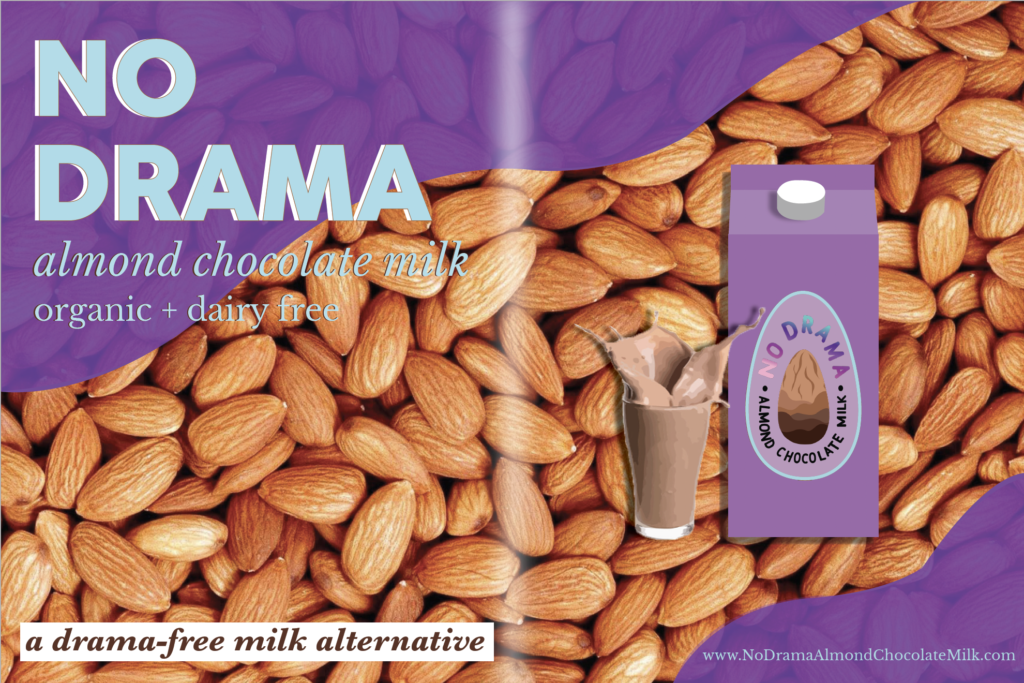
My product was almond chocolate milk and I tried to create an organic and family-friendly product. My logo is almond-shaped with a chocolate-dipped almond. The label was a purple milk carton which I incorporated into the magazine ad. I made the choice to keep the branding very simple and organic. This product was geared to families and moms who have younger kids. I grew a lot as a designer from this project. I had to use photoshop and illustrator to create the base and ideas and then we learned Indesign to put together this magazine ad. I never have used Indesign before or had to make executive decisions about how something is visually designed. I wanted this whole project to seem clean and professional and I feel like I have achieved that to the best of my abilities so far. I want to continue expanding my style into something more unique and interesting. This project was a really good way to see where I am at in my journey of learning how to design and I feel like I can always improve. I loved being able to explore branding and marketing as an avenue of design and the practical uses of art.
Movie Poster
For this project, we came up with a plot of a movie in a chosen genre and then made a movie poster for it.
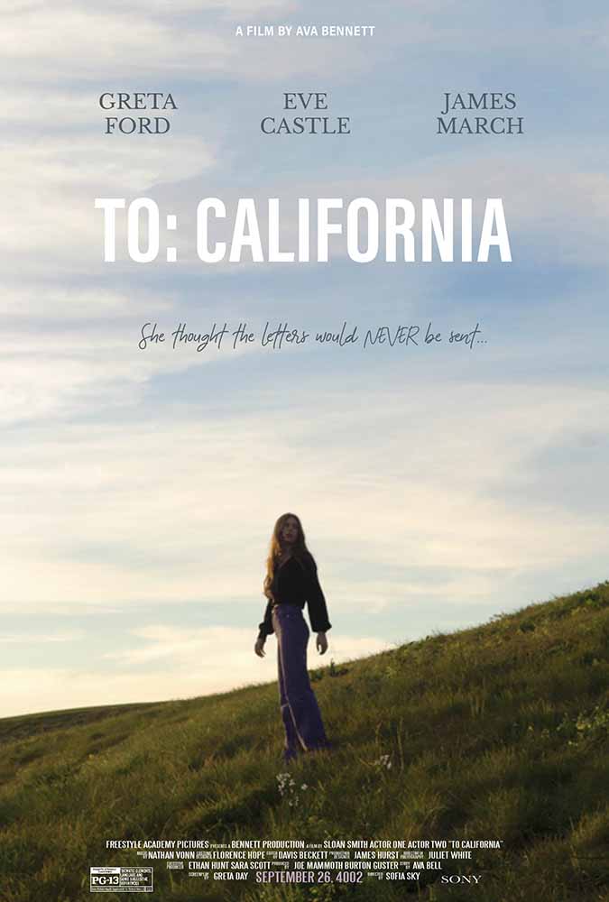
In order to create this movie poster, I started by finding inspiration from other movie posters and art. I was very inspired by coming of age movie posters and the film photo aesthetic. I began by taking photos at the beach and a golf course nearby in order to capture a photo of a lone person and the vibe of the story. I brought it into Photoshop and extended the sky of the image because originally the girl was in the center of the image. I made it so that she was further down the image and had more room for text. I also edited the image so that it was brighter and more saturated. Then in Illustrator, I started to create the text and other factors. I worked on the title and choosing fonts for a long time and researched how movie posters are formatted and what components were needed. The title was changed many times but I chose one and went with a white text. I created credits down below and fake names for the actresses and actors for the movie. I came up with a tagline that fit the story and put that on the poster as well.
Surreal Composition
In Digital Media we learned how to combine images and created a surrealist composition of photos.
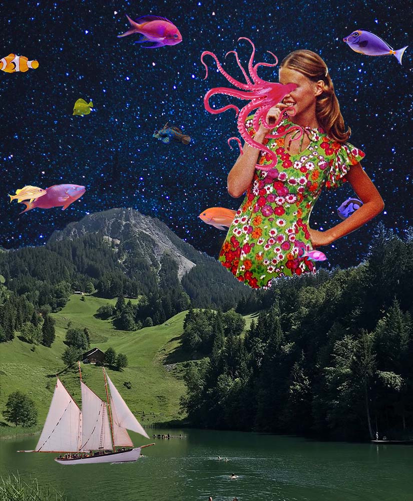
For this project, we had to begin by learning how to compose images together so that they seemed real and plausible. After we got to choose multiple different images and Photoshop them together. I loved having complete freedom with how this piece went. It could be humorous, crazy, or very simple. I wanted to create a retro psychadellic-looking image that flipped the world upside down. I really enjoyed completing this project because of how detailed you needed the clipping masks to be and how outrageous they could be. I made the sky nighttime but the land day. And I also made the stars into an ocean of sorts. A lot of my inspiration for this project involved eyes and people’s faces so I wanted to do my own take on that and make the octopus come out of a girl’s face. I feel like Digital Media and Design collided with this project as I had to figure out how to fit all of the images and ideas together to create one larger image.
Reflection of Growth
I would say I have had a very transformational year. When I came to Freestyle at the beginning of the year I was so nervous and intimidated but I have come to completely love the people, classes, and work. I had never used any Adobe apps or done any digital art so my skills definitely expanded and grew a lot. I got to learn how to take and edit photos, paint in Photoshop, design posters, market products, and so much more. I built an entire website, became proficient in many Adobe apps, and made new friends. I love how by joining this new community I have been able to learn valuable skills on the computer but also for life. I grew as a person while at Freestyle as well. I have become a lot more confident in my creative choices and work. I have felt unsure and insecure most of my life, especially when it comes to art, but as I have built up new skills and exercised my creative muscles I was able to grow into my style. I can not be more grateful for all that I have learned at Freestyle and how fun and engaging every single class and project has been.