Reflections
Introduction
In the Reflections unit, we were asked “Who Am I”? At first, I had no idea how I could show who I was through my art. Then, we started on the Mandala project and I quickly learned that to show who you are, you can simply show small details about yourself or things that you value, and that will begin to display your character and personality through your art. For example, in the mandala project, I decided to use bumblebees because they represent a specific part of my childhood when I felt very connected with nature.
I also felt that in Design, I learned to express myself through my art through things that one might not normally associate with self-expression. For example, in the collage project, I found myself using colors and images that showed how I recognized my own personality and interests. In the Aboriginal art project, I was able to incorporate my spirit animal (a jellyfish), my star sign, and my favorite color.
In this video, we learned to use Adobe After Effects to produce a short video with spoken audio, to show the core values that we hold. In English class, we previously had multiple discussions about the meaning of core values and explored why we think these values are special to us as individuals. (this is not my video, but I’m using it as a placeholder until i get mine finished)
Mandala
For this project, we used Adobe Illustrator to create a symmetrical mandala using clipping masks. We started by creating blank templates for options with various numbers of “slices”, which show how many times our drawings will be reflected around the center of the circle.
Black & White Mandala Artist Statement: For the Mandala project, I really enjoyed starting the year off again with Adobe Illustrator. It is my favorite Adobe platform, so it was fun to re-learn how to use it after summer and jump back in. I really struggled with filling all the space on this project. Towards the end, I felt like it was getting a bit repetitive so I really had to push myself to use creative designs to fill the space in a way that was unique. I’m really proud of how I managed to incorporate personal elements into this, and I think the bees are my favorite part of the project because they add a lot of character.
Colored Mandala Artist Statement: For the colored mandala, I found this extension of the mandala project to be really calming and therapeutic. I decided to use my pre-made black and white mandala and add color to spaces that I felt could benefit from it. I really liked this because it took the project to another level, and makes it more interesting to look at. I think I like it more also because I didn’t use too much color, just slight bits of color here and there, with the majority being black and white. This makes it so the pieces of color that I did add were emphasized more.


For the build reveal video, we created it on Adobe After Effects. We did it by slowly revealing each layer of our Illustrator Project, screen recording that process, and inputting it to After Effects, adding different effects on the video like the title and fade in/fade out, and also audio manipulation.
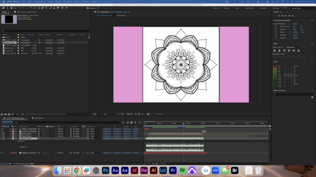
Here is the behind-the-scenes of what the work process looked like to create that video.
Overall, the mandala project was really fun to do because we used one art creation and were able to apply it to different mediums and multiple Adobe applications to make many projects with one overarching theme. I appreciated that this project pushed us to think outside of the box in a more creative way to represent our values and show our personality through art.
College Personal Essay
For the personal essay, we also followed the theme of “Who Am I?”. I really found it helpful to work with Mr. Greco on our college essays, as it releived so much stress for me. It helped give me structure and feel more confident in the writing process. At first, this essay was really difficult for me as college essays are extremely open-ended, which is difficult for me to write.

Design
This is my first year in Design after switching from Film, so honestly, this was an intro unit for me. Although I feel comfortable enough with Illustrator and Photoshop from my learning in Digital Media, there is a different side of them that you need to understand for Design purposes. But, I feel like I quickly caught up and my peers helped me a lot. I ended up being really proud of all the things I made this unit, and I really feel like I was super creative on each project.

This first project was the Summer Collage, made using Photoshop. I really liked this as an intro project, as it refreshed me back to learning the basics of Photoshop. I really enjoyed making a color pallette, with the pops of blue and orange as contrasting colors. I really struggled not with the technical skills of this project, but more of the creative thinking process. I have multiple failed versions and drafts of this project that I ended up scrapping because I wasn’t proud of them.

I used many symbols in this piece, including the Aboriginal symbol for star and smoke. In the bottom left and top right corners, you can see two squiggly lines representing the smoke, which I decided fit my star sign, Aeries, which is a fire sign. I also used the star symbols because I loved how they looked and also felt that they matched the underwater theme along with my jellyfish. The jellyfish is my spirit animal, I’ve always found them so interesting and unique, and I find the way that they move through water mesmerizing.
I created this piece in Photoshop, using the brush tool. An issue that I had with this project is that in Photoshop, once you place a drawing, you cannot change the color of your drawings. It made it extremely difficult because at one point I was struggling with my color palette and wanted to change it, but this feature of Photoshop made it so that wasn’t possible. I ended up having to apply a Photo Filter to that specific layer to change the colors, which was still much more difficult than being able to simply select my drawings and change the fill color. I also felt like my piece was pretty busy, so I ended up removing lots of other drawings I had, including the aboriginal symbol for “people sitting” and a more detailed version of the background. Now, I am really happy with how it turned out, I feel like the background is enough to keep it dynamic and interesting, but not too busy that it distracts from the focal point. Overall, next time I wish I had another contrasting color to make the piece more interesting, but I’m still so proud of how it turned out.

In my PSA, we can see an emancipated polar bear in the Arctic, surrounded by oil spill infested waters. My idea behind my PSA was to choose an animal that most people associate with climate change (polar bears), and show it in an environment that has major environmental issues that are human-caused. The audience I wanted to reach with this is young people, because we are the ones that have the responsibility to care for the environment and our ecosystems, as we will be living here for much longer than the older generations. I hope that it inspires people to make a difference and gives them a bigger picture for how our actions affect the world around us. The colors I used were shades and hues of mostly blue, with details in red and white. The oil spill represents how humans have the tendency to ruin natural ecosystems just because they crave money or power. In the long run, having money or power will not mean anything in the long run if we don’t have an environment to live in.
To make this, I mostly used the pen tool Adobe Illustrator. For techniques, I used multiple layers to create a shadowed effect on things like the icebergs and the oil. I tried to also use the Brush tool to create details to make the oil look more realistic with texture. I originally really struggled with utilizing the Brush tool. The problems i found with the brush tool is that it creates hundreds and thousands of anchor tools, which makes it extremely difficult to edit shapes smoothly. I then realized that the Pen tool is a much better thing to use that makes it much easier to create and edit shapes. Although the Pen tool is more difficult and time consuming to use, it makes much more sense in the long run for editing designs.

All in all, I am super proud of all the things I have done in Design so far. It was a really fun intro, and I really learned how to be creative with the help of collaboration and feedback from my peers. I think usually people have the temptation to just copy other people’s art with their own “twist”, but with this project, I felt that I came up with this on my own. I’m so excited to see what else I create in Design this year.