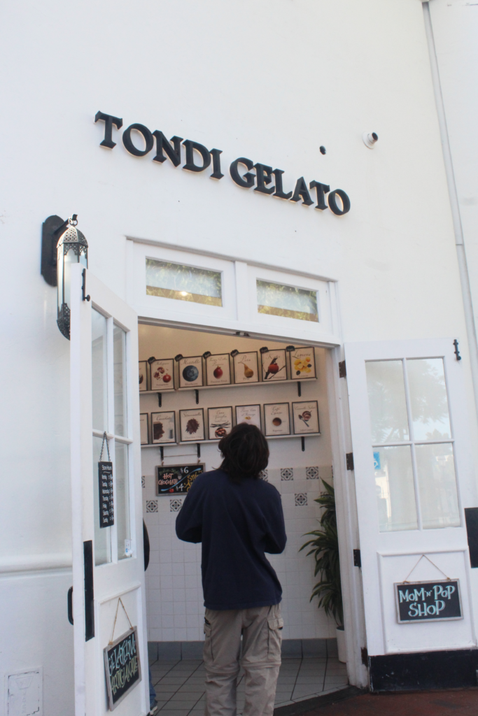
When I first found out what the theme of this weeks photo was, I was a bit confused. My first thought was “How can you take a picture of weight? It’s not something you can really see,” Even after I read an article about photographic weight, I still was not sure of how to take a “weight” photo. In the article, the thing that popped out to me most was the part where different elements were assigned to weights. For example, darker objects were seen as heavy, and lighter objects were seen as light. Another part of the article I found interesting was the part where they mentioned how high contrast makes things heavier. Using these two tips from the article, I decided to take a photo with two contrasting colors. The photo I ended up taking had a white background (the shop) with a black subject (my brother) in the middle along with other black elements in the photo (signs and logo). When I looked at this photo, I felt like my eyes were immediately drawn to the black elements of the photo. With the high contrast, it helped emphasize the subject and draw it attention. Realizing this, I felt that I started to understand what visual weight meant. Although the objects themselves don’t need to be heavy, different elements like color can help make them pop and give them “weight”. Even though there are still things about visual weight I don’t understand, I was able to utilize a new technique in my photography.