~Narrative Visual Perspective in Design~
In Design for the narrative unit we did two projects one regarding product design and the other a movie poster. For the product design project, I created branding for a tea company that’s goal was to soothe and reduce stress targeting mothers and hardworking women. I called it “Sip”, with the tagline “sip the stress away”. My movie poster was for a spy/assassin thriller, called Morning Sun, about a strong independent woman finding her place in the world. Both of these pieces were meant to tell stories and I am so incredibly proud of the final products for both of them.
Moodboards
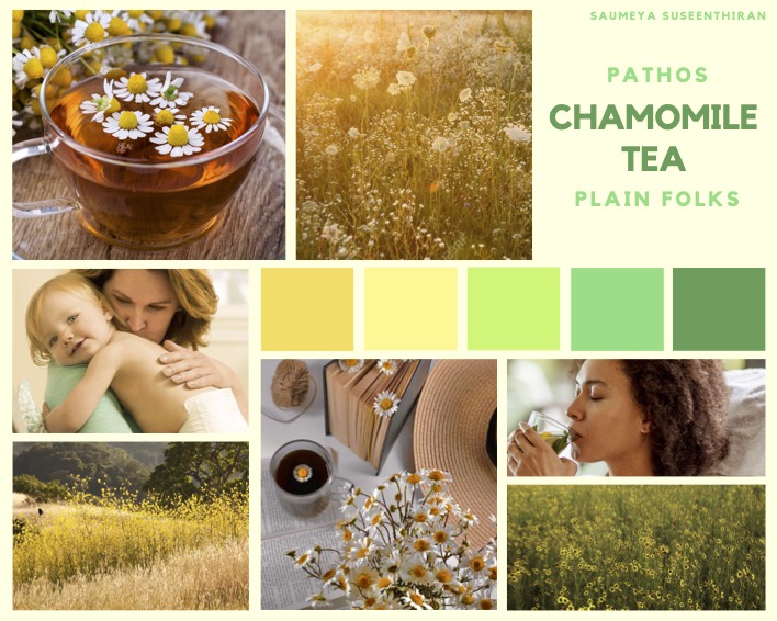
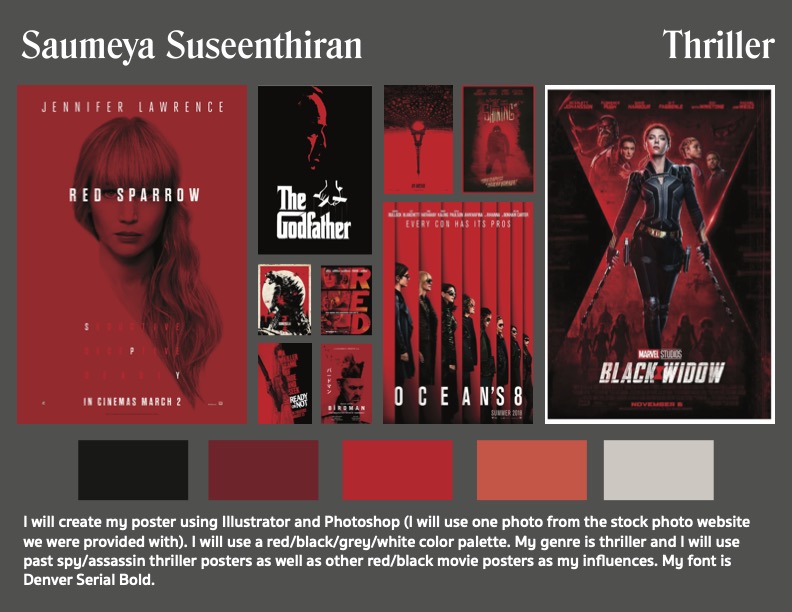
Before starting on any piece we created mood boards that provided color photo and general inspiration for what we were aiming for. It allowed us to get our general thoughts together about the feel and look of our design overall before diving right in.
Product Design
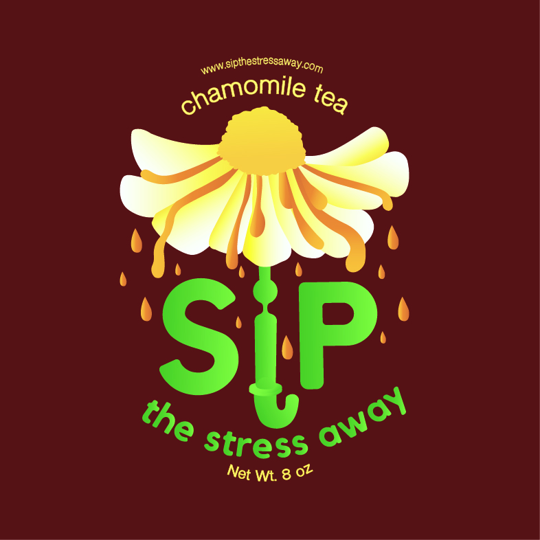
Here is my product’s final logo:

The final label for my product:
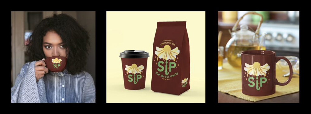
The triptych for my product:
Artist Statement:
My product is chamomile tea marketed towards stressed working mothers. I wanted to make my product appealing towards a middle-class group of people who are so hardworking and deserve to take the edge off with something that soothes and relaxes. Chamomile tea is one of the most well-known stress-relieving teas synonymous with soothing sensations and proven to reduce anxiety. It also helps enhance sleep by relaxing the muscles and emotions of irritability. This product is for the people I find the most important to give them a sip of sanctuary and peace in their busy day of being superheroes.
My magazine advertisement would use a plain folks appeal and a pathos persuasive technique showcasing a hardworking mother’s story. After giving her kids a hearty bowl of spaghetti and meatballs for dinner, she would be finishing up a work assignment, sipping some of my product with her eyes closed, truly relieving her stress in those moments. It would appeal to those mothers who can relate to her position, having illustrations of normal kitchen staples, mugs and other objects that the general middle class uses and simultaneously warm the hearts of the viewer.
In my label, I chose to include a chamomile flower umbrella that symbolizes a downpour of stress. The “stress” flows off the petals of the flower umbrella protecting the imagined hard working mothers underneath it. The umbrella handle also functions as the “i” in Sip, my product’s brand name. I used many gradients to make my logo feel as 3D as possible, sticking to my yellow, orange-brown, and green color scheme. I struggled the most with finding simple, clean fonts that worked with my messaging and with the “i” umbrella handle. I also struggled greatly with displaying these fonts in a precise curved manner. Overall the product exudes warmth, relaxation and empathy for the wonderful audience I messaged it towards.
Movie Poster
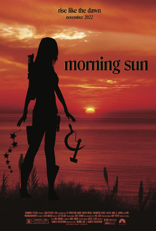
This is my final Movie Poster:
Artist Statement:
My movie is about an assassin originally from Egypt working for a Soviet spy organization during the mid-80s. Khepri’s parents were said to be killed in a mugging, and she was orphaned at the age of eleven. Her mother was religious and had strong morals that she taught her daughter, but when they were supposedly murdered, Khepri ventures into a life of crime. She eventually becomes a Soviet spy/assassin at sixteen, and she is made into a weapon of destruction. She receives her mission to assassinate the president and meets the president’s son. While she had wanted to use him, she instead falls for him. Khepri abandons her mission and remembers her morals, attempting to save the president and his son. Everything starts to unravel when she discovers her Soviet employers were actually working with part of the United States government who had hired the Soviet Union to kill the president, throwing potential investigators off their track. Khepri’s name means morning sun, and her journey demands her to rise like the dawn as she attempts to save her love, his father, and herself, culminating in her uncovering the truth of how her parents really died and if both of them are even actually deceased.
Khepri, as a child, is told the meaning of her namesake. She is taught that she is the sun and to never let anyone overshadow her when she shines, but at the same time, when given the opportunity, she must choose to use her inner shine to help others just as the sun allows us to live and grow. My movie’s name is Morning Sun for this reason, so in my poster, I wanted to display a sunrise. I used a stock photo I found and edited it on Photoshop using red gradient overlays to make the sunrise closer to the bright red and black color scheme I was aiming for. I then worked on her silhouette in Illustrator, adding in guns strapped to her legs and back. Khepri’s silhouette lets go of a sickle and hammer from one hand and a string of stars from the other, symbolizing the two countries at the center of the plot. Her action of letting them go is significant to the movie’s climax and conclusion. Although this is a story of adventure and love, this narrative at its core showcases an independent woman remembering who she is, standing alone yet tall and strong against enemies who will regret the day they ever attempted to cross her.
Reflections:
I valued the idea of telling stories and making pieces that emulated real art as much as possible. I was very fixated on professionalism with these pieces, in creating a product that could be used and sold in the real world and a movie poster that was entirely realistic down to every detail in the credits. I am so proud of the final products and am confident they could function in a real world setting and I valued the process of creating work that could do just that. I also valued the back and forth of criticism and editing to make it as perfect as it could possibly be and I hope to do that with every piece I do in the future. Overall I am extremely happy with these last few projects to wrap up the year.