Introduction to reflection Project
Art Curation for Personal Museum
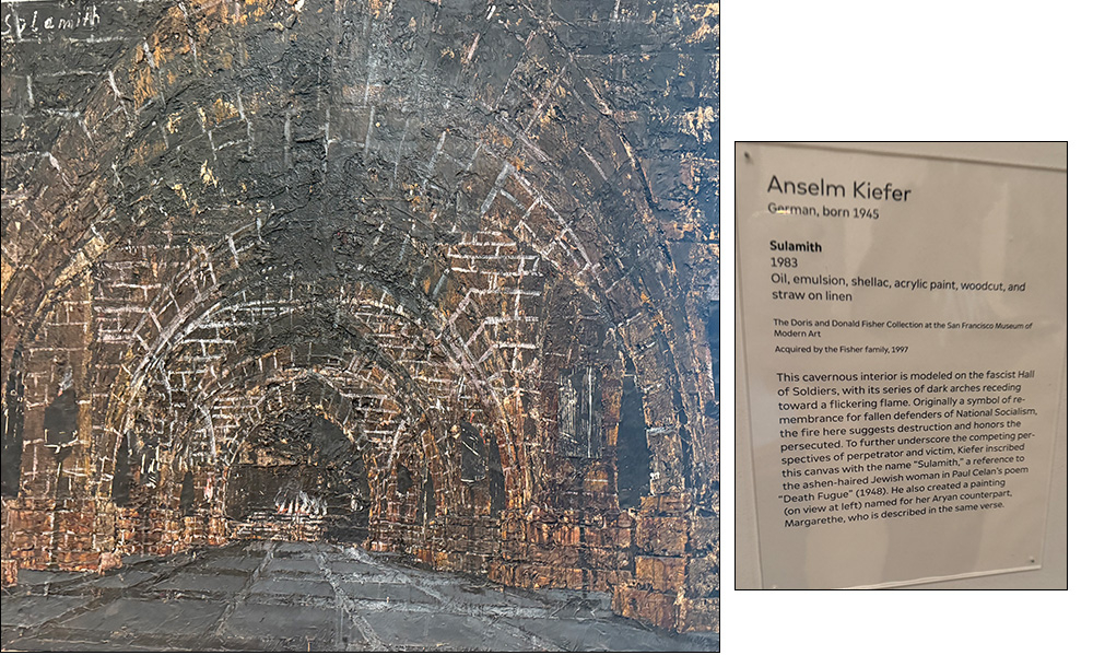
For this assignment we had the opportunity to go to SF MOMA as a field trip and take photos of art we would add to our own museum and ones we would exclude. The pieces that attracted me where ones that brought feelings of home or comfort. I was attracted oil painting with warm colors, or wooden sculpture that reminds me of my grandfather. As well, I looked for texture whether that was through layers of paint, glitter engravings.
3 Art Pieces I would ADD
to my Personal
Museum


2 Art Pieces I would EXCLUDE from my Personal Museum
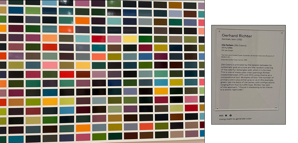
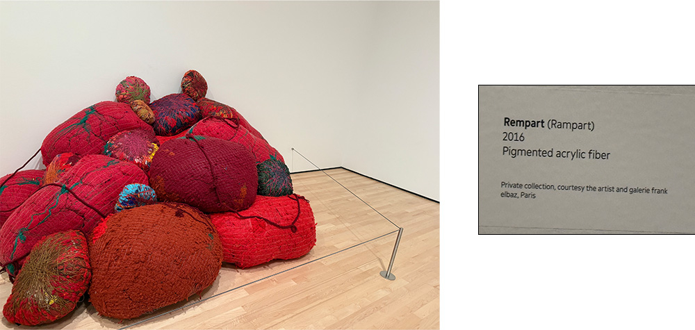
As an artist and the criticism I put on others, I realize we all have our own taste and that is the beauty of art. One pice that makes my Museum might not make someone else’s and that’s the amazing part. That’s the reason why art is so diverse, and the world is colorful. What I like about art is the feeling of comfort, and use of varying textures–and that parallels the pieces I chose. Overall, this expierience has taught me to add more texture to make work, and always think of a feeling you want to convey when making a piece.
My personal Mandalas
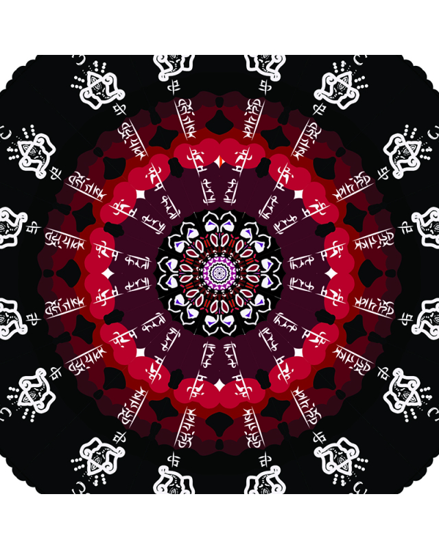
To answer “who am I?” I used the technique of varying the width of strokes because I wanted to showcase emphasis in different ways. For example, in my traditional Marathi text, which is a translation of “I love you,” I used finer strokes, most commonly used when people of the native language use them when writing. On the other hand, for emphasis, I used a thicker brush, round and stroke to make the elephant pop. Another technique I learned was custom art strokes from the library. I never knew you could add more brush tips, till Mr. Flo guided me to upload more from a folder into Illustrator. This allowed me to use more creative strokes with varying textures for a more realistic look, to even test out brushes that were in the shape of a flower. For the type of art I produced, I produced an artpiece that intersects cultures. As an Indian-American child, it has been very challenging to figure out how to blend my identities, especially since I do not speak any Indian languages. I took advantage of this project to research my culture, adding traditional script and learning how to write letters in Marathi. Then I took it a step further, starting to read pieces about Indian gods or special symbols to make my piece showcase the various beauties of this culture.
Instructions:
If the images do not display below,
On a Mac, press Command + (plus) then press Command – (minus)
On a PC, press the Ctrl + (plus) then press the Ctrl – (minus)

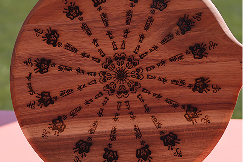
My initial reaction to seeing the final laser engraved mandala on the pizza board was surprising because I cannot believe it became something tangible. I thought it was amazing how the laser cutter could cut with such great detail, cutting complex designs like the elephant head, and marathi script. This piece on the pizza board answered “Who am I?” because it took parts of my culture and brought it to the kitchen. My dad is very close with his mom and enjoys cooking so this is a mix of something that is a part of our cultures and serves as a reminder in our daily lives in our kitchen. My choice of a pizza board for my laser-engraved mandala best represented me because the people in my family cook. A pizza board in my mind could be used as a cutting board for our daily needs. My mother could use it when she makes her salad, or my father could use it when he makes his traditional Indian recipes. I felt that the pizza board would best answer the question “Who am I?” Because of my mixed identity being Indian, and white, while also living in America, I can appreciate my Indian culture at home. When I cook, I can look at the traditions, and written words in marathi and enjoy a culture that normally feels so far away.


In my color mandala, I went from various color schemes. I started with a very bright, rainbow mandala that included very pretty colors separately, but when they came together looked off. A classmate gave me feedback and told me that it looked like too much was going on. Instead of giving up, I converted all my layers and changed the color scheme. My reactions to seeing the final mandala were joy and sadness. Sadened to see a piece of art may raise questions in your mind, but it wasn’t the art. It was the fact that my grandmother died before I got to show her. The goal of the piece was to continue bridging the divide between cultures and the language barrier we had, so knowing I can never show her made me feel very sad, and working on it reminds me that she is now gone. However, I did have some joy. I was proud of her culture and the beautiful life she lived. As well, I was happy that I continued fighting and working to hold onto a piece of Identity that could have been lost because of the language divide. The color scheme in my piece represents light, death, beauty, and pain. Reading those, you may feel that many of them juxtapose, and that is true. As my grandmother died a few days ago, emotions were high. Anger, sadness, and pain consumed me; the darkness fogged my mind. This led me to create the outer rings black, yet leaving some red and purple colors in the middle, and the overall text black. I chose black to color, and white text to visually represent that although pain may consume me for a while, my grandmother will always bring color, and her culture (in white) will always bring light into my life. By using such a contrast of color, it showcases the importance of culture in someone’s life. For me, culture will be one of my only ways to connect with her in her afterlife. Through prayer, rituals, and participating in my culture, I will be able to continue to honor her life and show her that I care and value her.
Working with color changed my artistic technique as it posed another challenge: how would things match? Like I previously mentioned, I completely changed my color scheme. I went from very bright colors that didn’t match to a whole different layout. The first challenge was motivation, when it started looking bad part of me didn’t have the motivation to even fix it. Firstly, I was worried that I would get even more behind in class, and part of me wanted to submit it as I didn’t know what to change. As I was losing motivation, a peer gave me a critique, and that fueled me to try something new. I started playing around with colors and realized the darker colors looked more cohesive. This assignment helped me learn about various color schemes and to keep testing things out, even when motivation is running low.
Here is my Mandala build video. Throughout this process, I learned a new editing software: After Effects. Although I have had experience with editing videos in my past, After Effects tested my knowledge by working in a frame-by-frame layout. This pushed me to focus on small parts of my piece and vary the speeds/ pace. Hope you enjoy seeing the process!
Through this project, I can apply color schemes to my designs in the future. My dream is to be a fashion designer, and with this, I am going to have to blend multiple styles and colors of fabric together. I will need to think of the proper color schemes and figure out whether I want to be more monochromatic or have colors that pop for emphasis. I surprised myself in an important but negative way. I realized that I can give up somewhat easily and need to keep myself in check. If I were to give up and submit my very bright colored mandala, I would have been submitting a piece I was not fully proud of. This is a sign that I have to keep pushing, even when I am faced in front of conflict or a lack of motivation. Now I know that if these feelings come up, I need to take a few deep breaths, take a sip of water, and play around with my art. Because after all, it’s not about completion, it’s about creating meaningful pieces for yourself and others to enjoy.
I can apply my new perspective on color to all my future designs.I can now truly appreciate other’s dedication to the small detail, studying color theory to even planning out a color layout before the start. Before this project, I didn;t value color and thought it was the final-least important step. Now I feel like color is one of the most important steps that tie in someone’s full piece, without noticing the small details like every color you cannot make your design invoke feeling. Now when I see other people’s art, I can imagine how much thought people put into creating a conceived piece of colorful art—it’s pretty amazing how every detail matters.
Specifically I can use my new illustrator skills to my fashion brand. It has always been a dream of mine to create pieces, and have a luxury clothing brand. In the world of fashion, you need to have designs that can be manufactured. In order to manufacture pieces, many times these pieces are outsourced, and need to be communicated digitally. Overall, I’m excited that I am now piecing together the tools to digital design, and am excited to implement them into my career in the future.