August 2021 – October 2021
“I am exploring the feeling of adoration through sharing a space”
Introduction
For this project, I learned how to overcome the obstacles I faced as well as take creative risks. In English, I was able to push myself as a writer, poet, and analyzer, starting with the poetry unit to push myself to unpiece the complex poems we were given and the ones we wrote. In Digital Media, we learned how to create our own website, and work with a lot of different applications such as Photoshop, Premiere Pro, and Pro Tools. As well as Design, which is a class full of exciting activities to help us learn even more about Adobe programs. I am learning to approach things differently, especially with photography.
I have learned so much this semester, and I can’t wait to learn more in the future. In English, I have learned different ways to express myself, and it is all thanks to my peers. Digital Media was hard for me, but I have learned to push myself even more and learned things I never thought I would learn. In Design, I valued learning to see the world differently, in photos, and drawings, and applying color theory to explain why color patterns are chosen. I enjoyed writing artist statements because I was able to explain in detail why I chose some things I did as well as getting to reflect on some things I may have done subconsciously.
Haiku Photo and Video Production
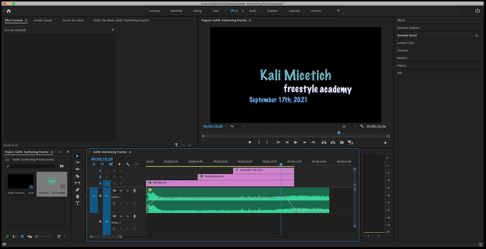
In English, we were assigned a statement that contained a feeling and an experience. We were then assigned to create a Haiku, which consists of three lines and follows a syllable structure of 5-7-5, and an image to help support our piece. It was really easy to come up with ideas for my haiku, but it was quite difficult to come up with words that fit the haiku structure. After peer review and presenting our haikus in class, we started to produce an audio recording along with our first Premiere Pro project, where we added an animated photo to our poetry audio and image. It was really fun to pool our knowledge together from both classes to create something.
When I think about sharing a space, I thought of a community space and came up with the idea of a bus or bus stop. Many people use buses every day, and I thought it was a perfect example of sharing a space. The first line in my haiku reflects the feeling of adoration, sharing how I am happy with my seat. The second line, “I step out into the cold,” makes the reader think. Why am I going into the cold if I am happy with my seat? The next line helps us see that I got off the bus for an elder to be able to have a seat on the bus. For the photo, I chose a photo of a street, and I think the sidewalk with the pole in the distance is a good way to make people imagine that the bus is there, and not being too literal by putting a bus in the photo.
Although learning Premiere Pro was challenging, I really enjoyed learning it. I was able to focus on fun little details while producing this short video. I had so much fun making and learning how to make this video, however, if I were to do it again I wish I changed some colors and fonts of the video to make it slightly more fitting. In the end, it was really fun to see the final product.
Poem Photo and Recording
In this unit, we wrote poems inspired by things in our lives in many different styles. We wrote poems inspired by sound, Haikus, and Free Verse. Our Free Verse poem could be anything we wanted, we could revise a previous poem we did so far, or write a completely new one. I chose to revise a poem that we were prompted to write about our lives and the sounds in it. I wrote about the sounds in my room when my friend stays over, something that is very important in my life. Writing this poem was super fun because I got to relive memories of when she comes over. For the photo, I used a picture of my bed and blankets, which created a good frame for me to place my poem.
Intention Statement for “Home”
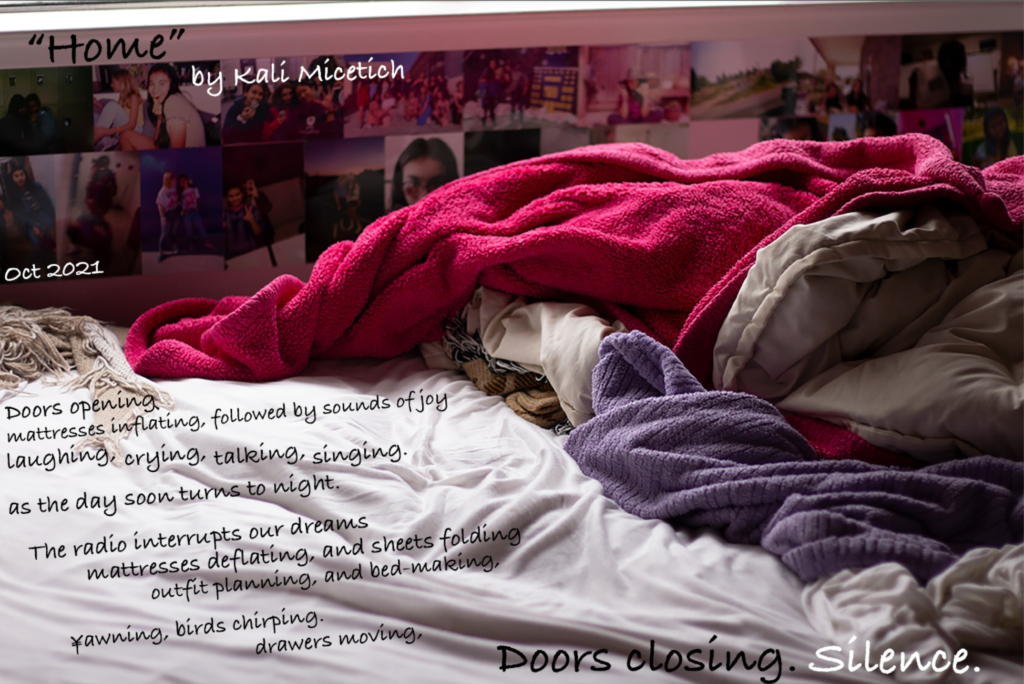
Home is a free verse poem about my best friend sleeping over. She lives far away from school, so some nights she will spend the night instead of needing to worry about driving home late and waking up early. This event has turned into an essential part of my living routine and my weekly habits. Since it is now an important part of my life, I wanted to write a poem about it, using the sounds that come with each time she comes over. This idea originally came from the sound experience poem prompt, but this took a while to come up with. I was going to write a poem about my room and its sounds, mainly because of how colorful and loud my room is. I realized that my room would not be as vibrant if it wasn’t for my friend, not only does her energy make up my room but so does the things she brings in to decorate it. That is how I ended up making a poem not only about my room but more specifically when she is in my room and the loose habits we do. I had a hard time deciding who the speaker in this poem is, but in the end, I like to think that the speaker is my house itself. The poem beginning and end of this poem are very similar, which was inspired by the poem Mujer Negra by Nancy Morejón. This poem does not begin and end the same, however, it uses similar language throughout the poem to bring it together which I enjoyed. The first stanza of the poem describes my friend coming over, starting with the doors opening. The next lines, “sounds of joy Laughing, Crying, Talking, Singing,” are to help the reader understand what is going on throughout the night, and sets a scene. Whenever we hang out, we usually sing songs, catch up on the few hours we spent apart, and laugh so hard until we cry, and I wanted to make sure to include some important sounds in my life. The line, “crying,” could also be seen as a double meaning, that some days we are so tired and we express our emotions by letting it out, or it can also be seen in a joyful and happy way. The first stanza ends with the day ending and us going to bed. The second half of the poem represents when we wake up, and head to school or whatever activity we have planned for the day. Mornings are usually very quiet and peaceful, and I wanted to express that in this part of the poem. I included more silent actions like “bed-making,” “yawning,” and, “outfit planning,” to show how we are still busy in the mornings but how slow-paced we are due to just waking up. I wanted the poem to end with “doors closing” instead of “silence” because I wanted to portray how silent and groggy we are in the mornings, but after peer review, I realized that it ends with “silence” was the way to go. Not only does it give more emphasis to the story that is being told, but when remembering that the speaker is the house it makes more sense in the end. Since the speaker cannot move and come with us to our activities, once the door closes in the story that is all the speaker knows and has to end the poem.
I really enjoyed taking this photo, I was nervous because I was taking it on a cloudy day and there wasn’t going to be enough sun, but it turned out perfectly. Also, I have a photo wall and I have one row dedicated to my friend, which you can see in the photo which I think was a nice unintentional touch. I did not have to edit the lighting of this photo at all, but I added the text using Photoshop. I drew lines on my photo and then attached the text boxes to it, so it wasn’t just straight text on the diagonal space provided.
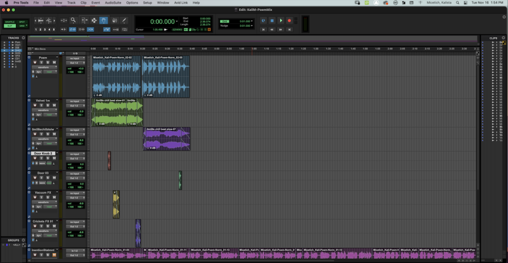
For audio editing, we were required to find 5 sound effects to apply to our audio as well as a background song. I had a lot of fun scrolling through different sound effects Freestyle provided for us, and I like how the finished product turned out. I had some struggles understanding Pro Tools at first, but after this project, I think I was able to get into a good groove and build my knowledge of this program.
Photoshop Blend Modes
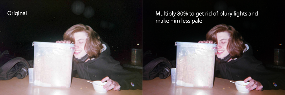
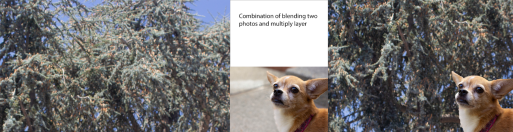
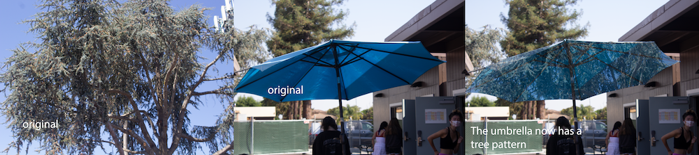
At the beginning of the semester, we started to work with Adobe Photoshop. We learned how to use 3 blend modes, multiple, screen, and overlay. The Multiply blend mode helps us darken the image, and the Screen blend mode helps us lighten the image, and blends the non-white portions of the top layer onto the bottom layer. The Overlay blend mode lightens and darkens the image so that the darker areas become darker and the lighter areas become lighter, mixing together the Multiply and Screen blend modes. We also worked on mixing two photos together, making collages, and replacing parts of an image with another one.
I really like blend modes and how you can edit the whole image with just a dropdown menu and makes something that may seem like a complex photo really easy to edit in the end. I am excited to bring this knowledge back into my design class for future assignments. I also value learning about Photoshop Blend Modes because they are really helpful to know if you take an over/under-saturated photo you are able to fix it instead of needing to reshoot the photo again in different lighting.
Design Projects
In Design, we learned how to use Adobe Photoshop, work with positive and negative space, and Color Theory. We worked on thinking outside the box with our conceptual project, learning how to use and blend pastels while using color theory, and combining what we already knew about Photoshop from Digital Media with what we learned in Design. I had a lot of fun editing photos and creating physical drawings in this class, and I can’t wait to keep mastering Color Theory throughout the rest of the year.
Alpha Name
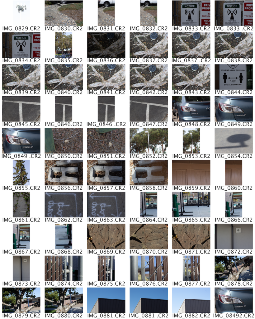
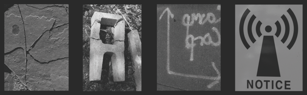
For this project, we were encouraged to go out into nature and find letters that spelled out our names. We started this project very early in the semester, so we were still learning to use our cameras and build our photography skills. After we found the letters, we made contact sheets, where you put all the photos you took on the same document, to be able to have a quick view of what you are working with. We learned how to turn our photos black and white using Photoshop, and also how to put multiple photos onto the same document. I had a lot of fun looking to find letters for this project, but finding the “K” was definitely my hardest challenge.
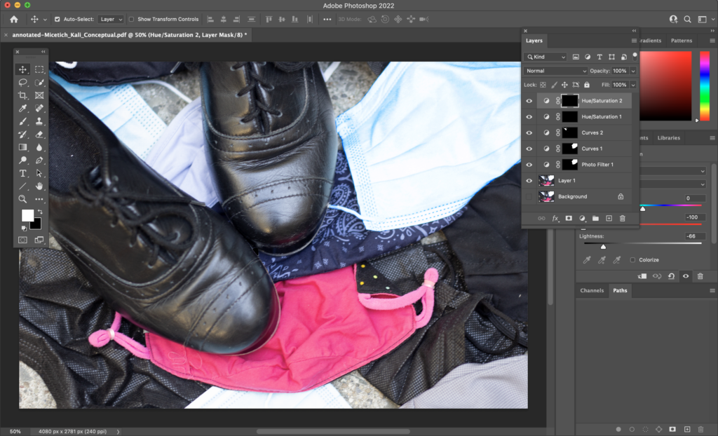
Conceptual Photo
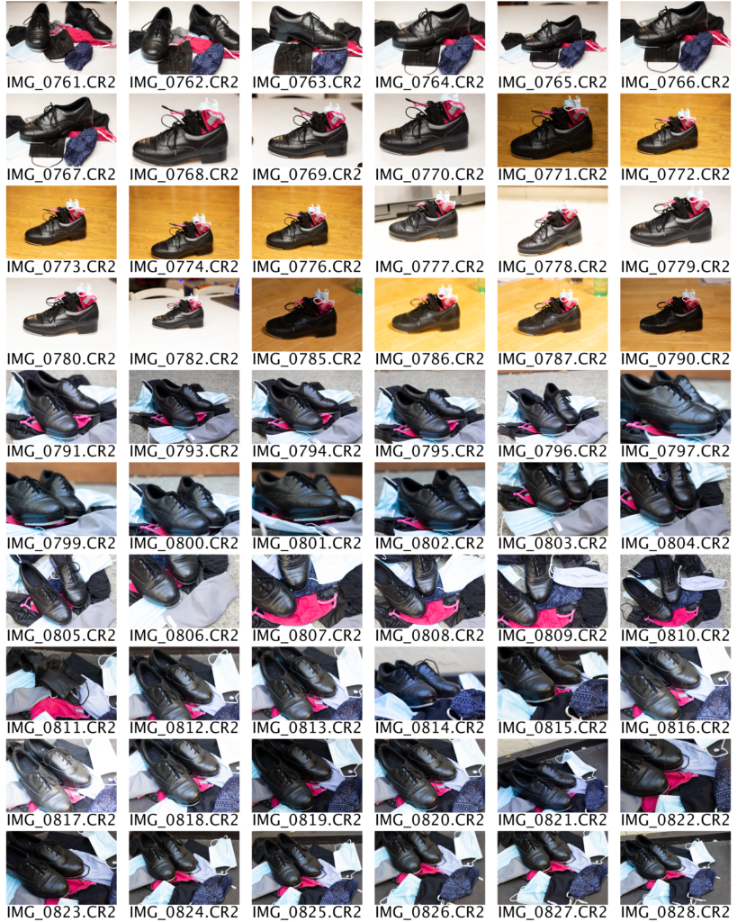
Using the statement we got in English, we were assigned to take a photo that also fits the statement. We did a lot of brainstorming in class to bring in more ideas on what we were going to photograph. This assignment was really fun to do because I was still learning how to take and edit photos during this project, and now I feel a lot more confident in my Photoshop skills. Before we started to edit our final project, we made contact sheets to be able to get feedback on all of the pictures we took before narrowing it down to our final photo.
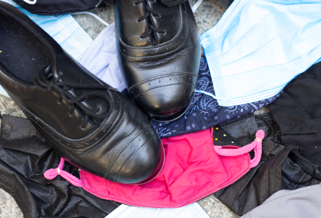
In my image, I used tap shoes to show the feeling of adoration and masks to portray sharing a space. To me, I view adoration as something that you have deep love and respect for. I love to dance, and have been dancing for almost 14 years. After dancing for so long, it is something I respect a lot and enjoy doing. For the masks, nowadays it is almost impossible to share a space without wearing a mask. Masks are crucial to socialize with others and are very important in everyday life. I used the masks as a background for the photo and put the tap shoes on top. I shot the photo outside and shot from a birds-eye view, bringing it all together.
Editing my photo helped me learn a lot about Photoshop. Due to shooting outside, the blue masks I used became very oversaturated and looked white to the camera. I learned how to use the curves option to bring back the original blue color. Also, the quick selection tool helped me out a lot with bringing the blue back into the maks and not the whole image. I learned more about feathering and how it affects the photo as well. The image was also cropped a little, I cut some of the bottom parts of the image. I did this so a folded mask would line up better when applying the rule of thirds.
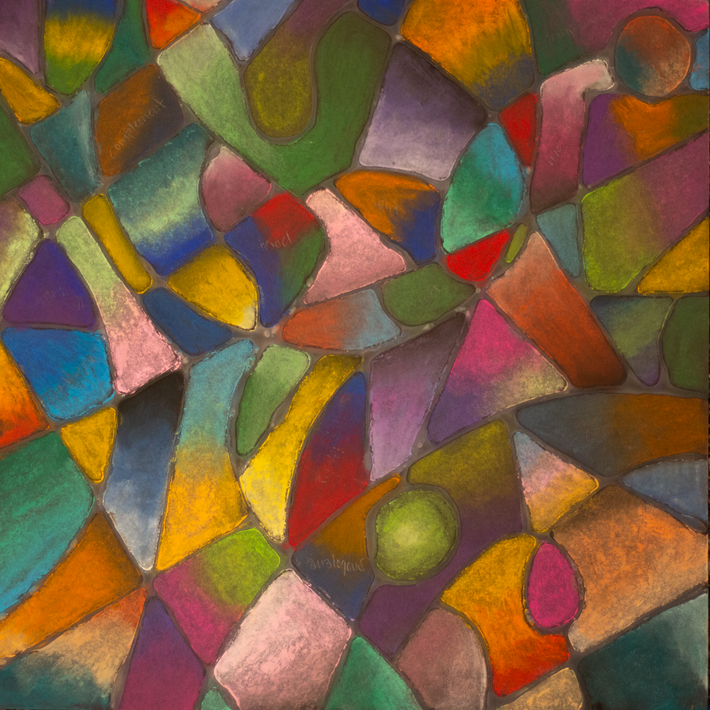
Color Theory

We started to learn Color Theory, which I think is my favorite thing that we have learned so far. Color Theory is when you mix together different color palettes to make new ones that are satisfying to your eyes. There are many schemes, but we focused on monochromatic, complementary, analogous, triadic, tetradic, and split complementary. Once we understood these, we applied them to our drawing project. We started out by drawing shapes with glue and then filled in all the shapes we made using pastels. Each shape we made had to use a different color scheme. I struggled a little with this project because I made my shapes a bit too small and it took me a lot longer to finish it as is. However, I am really glad about how this turned out overall, and can’t wait to keep using Color Theory in the future.
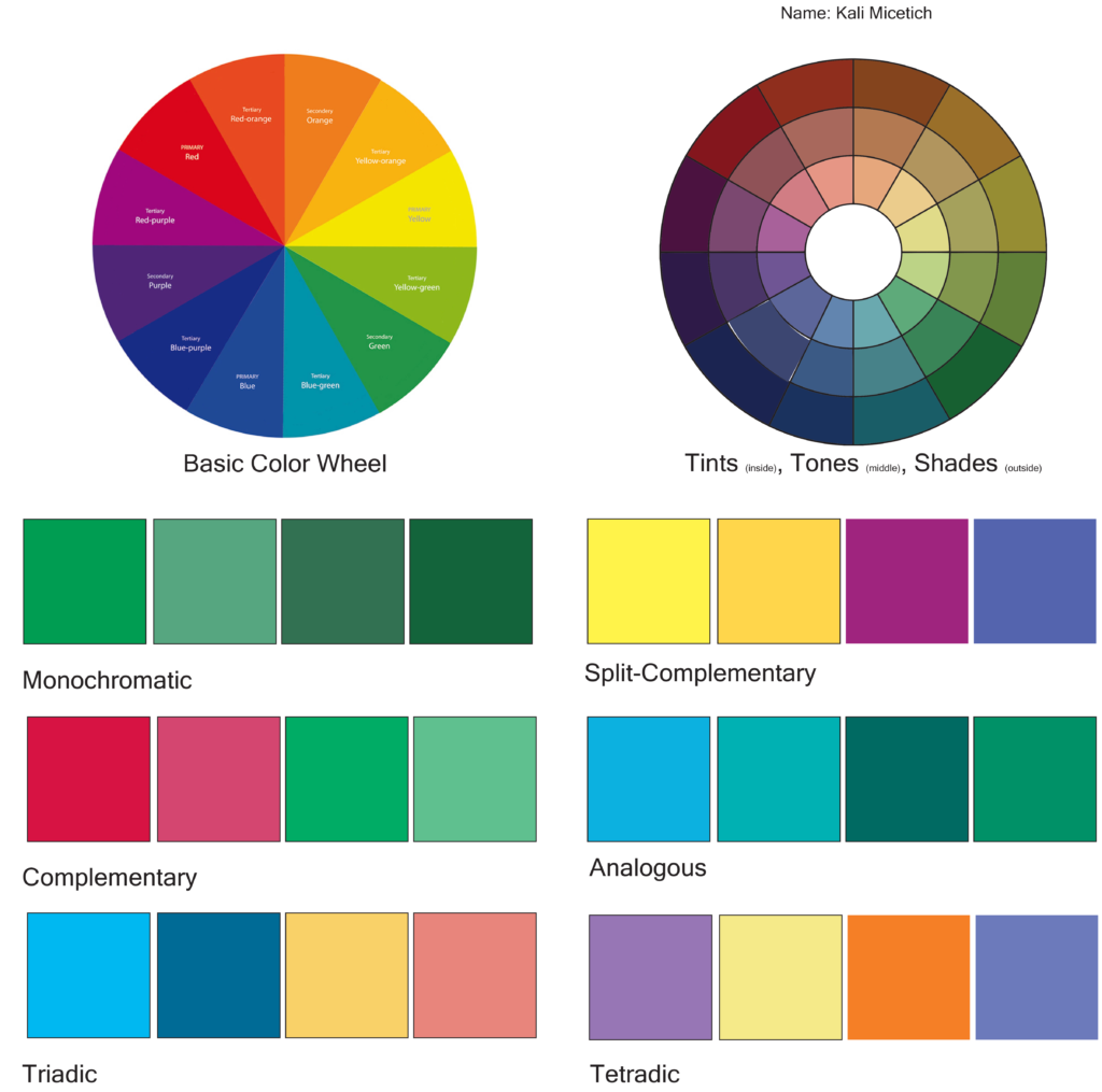
Before we started drawing, we had to make our own color palettes using the color schemes we learned in class. We also learned about tints, tones, and shades, when you add black, white, and gray to the color to make a monochromatic color scheme. Complementary is when you take two colors that are opposite from each other on the color wheel, the contrasting colors are satisfying to the eyes. Analogous is when you take three or more colors on the color wheel that are next to each other, like blue and green. Triadic and tetradic are when you draw a triangle or square on the color wheel and take colors from the points to make a contrasting palette. And lastly, split complementary is when you take a complementary color scheme and take the color from each side. For example, if you are making a palette with blue and orange you would take blue, red, and yellow and make a new palette.
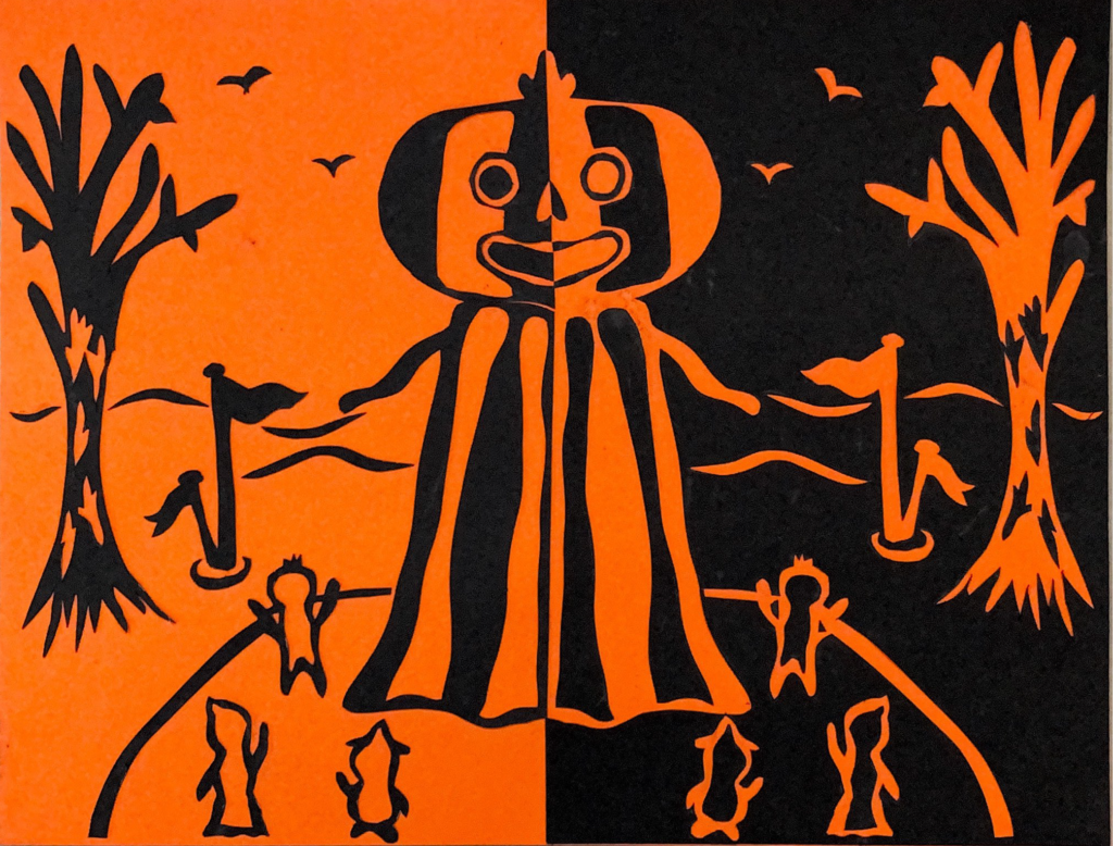
Negative and Positive Space
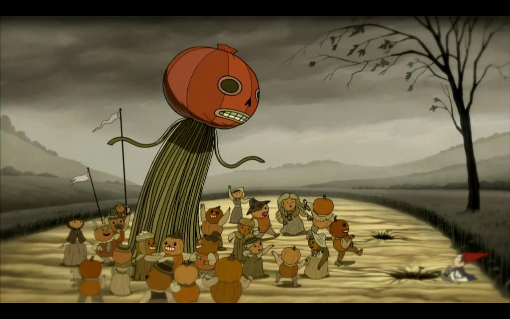
This project was probably my favorite one from this unit. The assignment was to help us understand the importance of negative space and to hopefully apply it in later projects. Since this was during October, we were encouraged to make a Halloween-related picture. For this project, we drew half of a drawing on a black piece of paper, and then cut it out and flipped it on an axis to create the other half of the picture. My piece was about Over the Garden Wall, which is a Tv show that takes place during Halloween. I knew some people would not understand, so I included a scene where they come across a skeleton town, who dress up as scarecrows with pumpkins on their heads. I had a bit of a hard time lining everything up properly and had a scary moment where I had to remove a piece that I already glued down and put it somewhere else. In the end, this was really enjoyable to create, and I really like the finished product.