Introduction
Throughout this unit in Design, we focused around using Design to tell a story, whether that was from a marketing standpoint in creating packaging for a product or highlighting important creative aspects of storytelling through a movie poster and book jacket. Through each of these projects, I further developed my skills in Adobe Illustrator, Photoshop, and InDesign. Additionally, this unit gave me the chance to expand on my Worldbuilding narrative project from English, which was a creative challenge, but definitely a valuable experience. This has definitely been one of my favorite units in Freestyle so far because of the creative freedom I was allowed to have and the quality of my finished pieces.
Product Design
The first project of this unit was the Product Design project. I had to come up with a product and its company and create accompanying logo and label designs. I’ve always loved milk, so when this project was introduced, I immediately thought it would be the perfect product to expand on and have fun with. Celestial Dairy Milk is built off of my love for milk as well as outer space.

To start this project, I had to create a moodboard that contained images and existing products that I planned to draw inspiration from. Additionally, I included the color palette that I planned to use in my design.
When I initially started brainstorming for this project, I had a very different style in mind for how I wanted my logo and label designs to look, so my moodboard isn’t very representative of my final project. When I actually started to work on my project, after trying out various fonts, colors, and effects, I settled on my current look. I had originally planned for my product to be plain cow’s milk, but after some experimentation, I decided to go with chocolate milk instead.


Although I didn’t end up using any of my initial sketches exactly as I drew them, I did incorporate various bits and pieces from each of them into my final design.
For my logo, I used simple illustrations and text with a drop shadow to create a simple, yet charming design. Because I decided that I wanted my product to be chocolate milk, I chose to use a monochromatic palette of brown shades.


Final milk carton labels
For my label designs, I used my logo along with accompanying graphics for each mockup I made. For the milk cartons, I created the chocolate dripping effect and nutrition facts to give the product a professional, cohesive look.

I had a lot of fun with this project and I learned a lot both in terms of desing and marketing. One thing thing that I had a lot of fun playing around with was the 3D tool in Adobe Illustrator. With it, I was able to make previously flat shapes appear to have volume and dimension. I ended up using the inflate setting to make the chocolate drips as well as the actual word “chocolate” appear as if they were made of actual chocolate on my milk carton labels.
Movie Poster
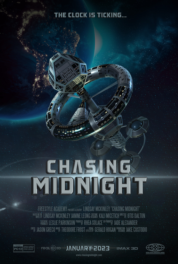
Our next project was to create a move poster based off of the narrative story idea we’d outlined in English.
In English, I worked with Janine Leong and we decided that we wanted our project to be science fiction theme. Our story is set in the year 2056 and begins at the grand opening of the Polaris space station, a luxury “space hotel” owned by billionaire Otis Dalton. Rhea Solace, a 20-year-old kitchen worker, and Jade Alexander, a 22-year-old mechanic both work on the space station. After Rhea inadvertently learns that Polaris, for reasons unknown, has lost all communication with Earth, including a source of resources, she is forced to join forces with Jade and work toward staying alive and getting out before time runs out. In my movie poster for Design, I chose to feature Polaris in its orbit of Earth.

I created a moodboard for the project using multiple other movie posters and images that I wanted to take inspiration from. When first brainstorming ideas for my poster, I was heavily inspired by other science fiction and fantasy posters, specifically those from Star Wars and Marvel movies. I wanted my title text to exhibit the metallic characteristic that was present in many of the professional posters I looked at.


In Adobe Illustrator, I experimented with the 3D tool to extrude and bevel my text and add shading so it would appear metallic. I applied these text settings to my main title as well as my tagline and release date. For my background image, I found a stock image on Pexels of Earth in its orbit photographed from space. Unfortunately, the bottom of this image was cut off. However, I was able to use the content aware fill tool to extend it to fill the entire poster area. For the space station image, I found a high-quality PNG online and slightly altered the colors to better fit my theme. I used Adobe Photoshop to compile each of these elements onto my poster. Ultimately, I’m very happy with how my poster turned out, and I learned a lot from this project.
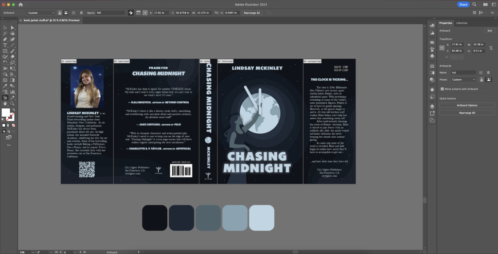
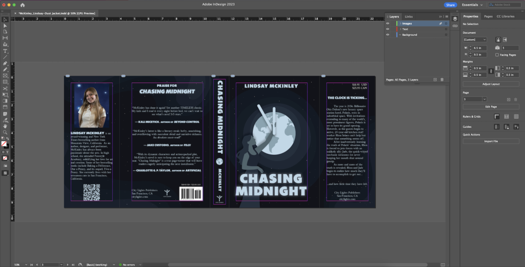
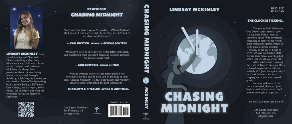
Book Dust Jacket
The final part of the Narrative Unit was to design a book dust jacket again using our English worldbuilding projects.