Design
Intro
In Reflections for Design, we pushed ourselves out of comfort zone by challenging ourselves to partake in projects with our previously learned techniques. We were challenged to become more independent problem solvers. Sure we have guidance but we are about to set on a new part of our lives and this was the start.
Design
Public Service Announcement
SUNSHINE!
As a accompaniment to my Personal Essay, in Design, we created a Public Service Announcement that would transmit the message in our essay. Using a combination of Photoshop and Illustrator, in my Public Service Announcement, I wanted to evoke inspiration and positivity for all viewers. In sync with my Personal Essay for English, my message revolved around following your dreams.
PSA Moodboard
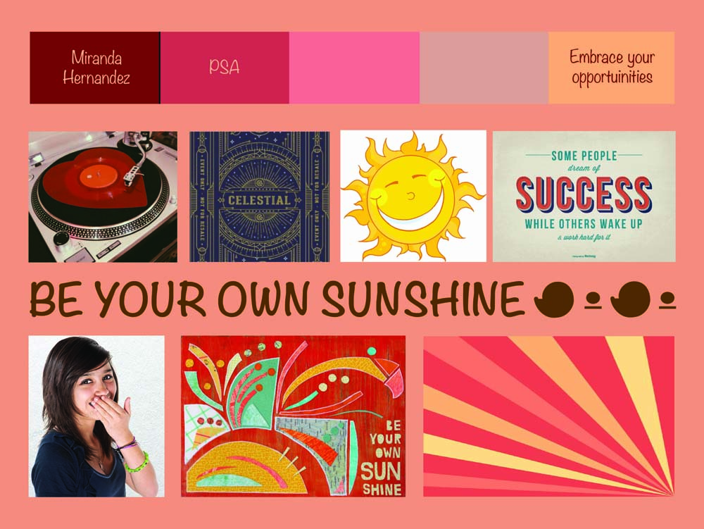
To transmit my message, I used warm colors (red and yellows) to mimic sunshine qualities. I arranged my PSA by setting stormy clouds surrounding the overhead while at the bottom, I placed an image of my sister with her eyes closed and hands entwined, placed on her stomach. Coming from the various grey clouds, I placed two shadow arms reaching towards the closed eyed girl. This is meant to symbolize unexpected difficulties that accumulate over time and that affect one more than not. However, the red halo behind the girl represents the inner strength everyone carries. Going outwards, the rays of light coming from the halo and girl displays the choice to apply the inner strength to real life situations, which as a consequence helps build greater resilience and confidence. This is demonstrated by the cutting through of the shadow arms by the rays of light.
PSA
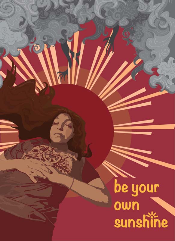
Using Illustrator, I used Live Paint to transform the photograph’s details to instead have a paint-like quality. By discovering how to change the same colored objects uniformly, I was able to escape the tediousness of changing. It helped speed my progress since the image was broken into smaller shapes. In addition, on Illustrator, I continued adjusting the colors until there was enough contrast to distinguish between forms. I used the Pencil tool and Curvature tool to create thorny storm clouds. Using shades of grey, I wanted to create apprehension in the viewer. With sparing use of bright red, I created contrast in order to make the viewer feel empowered and energized.
Micro Macro Photo
“Birth of Love: Reunion at Sea”
In Design, our teacher Ms. P always makes sure to remind us that we are in the business of visual communication. One of our first projects was to precisely capture tiny little figurines in a staged scene.
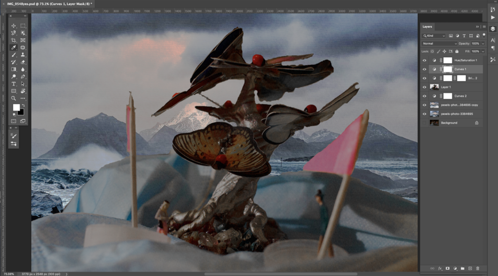
My Micro scene is the reunion to tragic lovers who all though meet, will never be reunited. However, when they see each other, they still remember the moment they first met, their love is as strong as when they first met.
When I began to develop this scene I only knew I wanted to involve a pair of lovers-how? I wasn’t sure. However, as I saw mask after mask filling my house, I thought I lived in a sea of masks, hence their use in my photo as waves. Additionally I collected 2 water caps to create their sailboats and a toothpick to create a mast while I used part of a sticky note to create the main sail. As I set the scene, keeping the figurines standing became a challenge for me, eventually being easily fixed with glue.
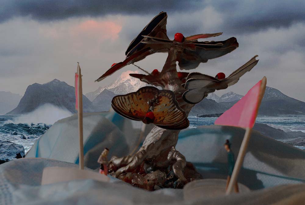
Once I had all the items I realized that the couple needed drama so I attempted to make violent waves, at its center a butterfly tree which was intended to illustrate the butterflies they felt when they fell for each other and create the illusion of hope. Using Photoshop I was able to erase the original background and replace it with a vast ocean at night and change saturation and contrast with Curves
Since the photo shoot was at my house, I struggled with creating a environment free of yellow light. To eliminate this Photoshop, I de-saturated different shades like yellow and orange and red to determine which was right. This accidentally removed coloring from the butterfly tree which was perfect I wanted to create a classical love of the 1940’s – 1950’s types. The accidental de-saturation offered reminiscence of black-and-white TV. Lastly, I added texture onto the image to make it appear more vintage.
Aboriginal Art
“Starlit Path”
For this project we were prompted to gather inspiration from the Australian Aborigine. I created this piece on Adobe Photoshop. I started my idea which I used as reference for my stippling in Photoshop.
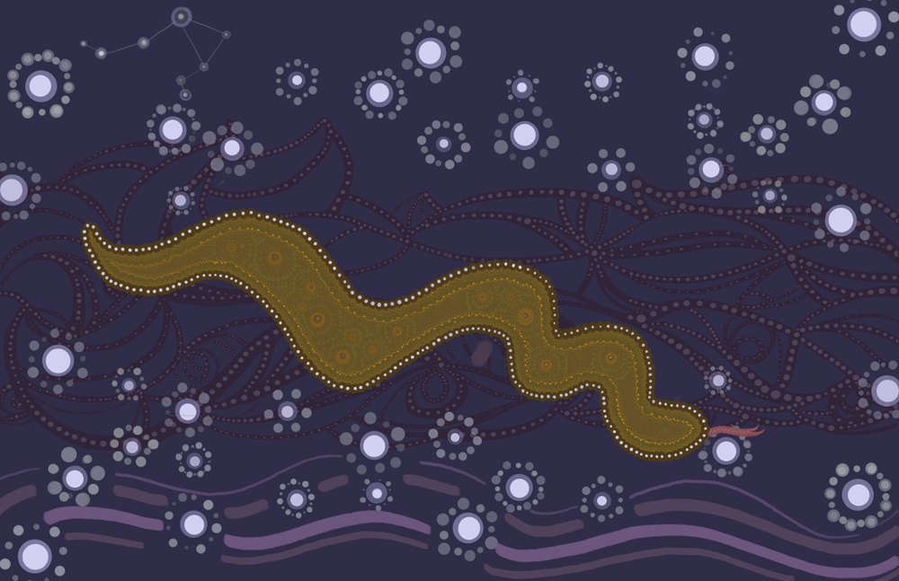
I immensely enjoyed the Aborigine Art Project! As we explored the Dreaming of the Aborigines of Australia, I was inspired by the fact that during the creation, mystical beings impacted the Earth which is what shaped all natural elements one is able to see. As a result in my piece, I included a snake in order to represent their presence. I used purples to provide a night-like theme and create a sense of intimacy. I incorporated shades of green because I thought it provided a good contrast between the different levels or ground and sky.
I also included my astrological sign, Libra, in order to represent myself. The stars I included were due to my appreciation of the night sky and love for nature. I placed stars above and below to prevent my artwork from being too literal, since the art style of the Aborigine is mainly from an overhead perspective. Under my snake, I too created various swirls which represent mountainous regions and their shadows. Another element I included was rain because it is another one of my favorite things. By combining these symbols, I hoped to transmit my appreciation for what most take for granted. Most may view nature as something wild but I view it as a source of peace.
Micro Photo Practice
These above wasn’t my only images; I also had fun experimenting with a couple of other shots . I took these all for practice, but I think they look pretty cool.
“Mining Chaos”
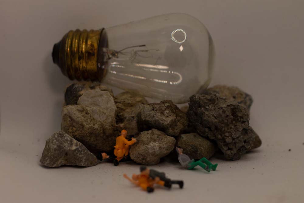
This was one of my first shots, I attempted to create a cave-in. I thought it could be result in interesting shots. I arranged a person being weighed down by the rocks and someone trying to help, a drunk, and a 2 people on the ground fighting.
“Mining Cave-In”
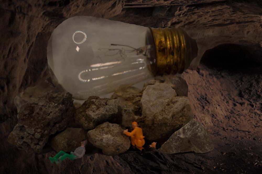
In this image, I Photoshopped the above image into a cave. I removed the original background of the image. Then I created some tinted clip masks to help make it seem natural.
“Las Vegas Heist”
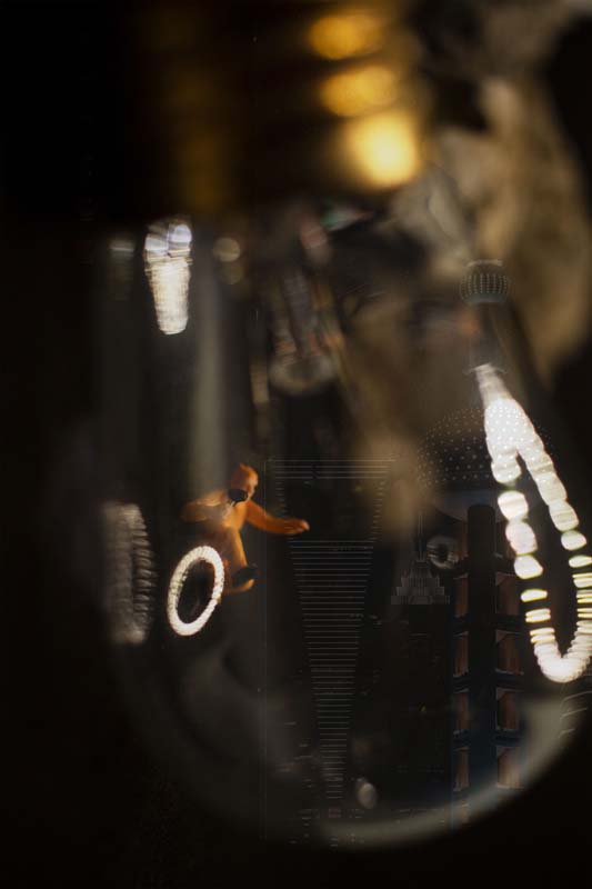
In this image, I had some more fun with the lightbulb! As I experimented, I staged a person climbing up the lightbulb. This was a bit difficult since glue wouldn’t hold, I chose a black background to help trick the eyes and make it seem the person was breaking in. In the background I added some some buildings to give it a more realistic feel.