Visual Perspective Design

Intro
For this unit, we were tasked with creating our own company! (An imaginary one though), nevertheless, we did the same things real ones would do. We did this by focusing on a food item and conducting our research.
We wanted to be able to create a brand identity and inspire loyalty in customers. From the beginning, this project was so much fun and offered a taste of the future We began by creating a logo to capture the essence of what we wanted to transmit. That later inspired product packaging and a magazine.
In the end, we concluded by researching a genre. of our choosing to create a movie poster for it. Scroll down to see!
Product Design
Logo
For my Logo, I decided to take inspiration from the location where my product is sold, a Cafe & Bakery. I focused on constructing a wondrous and charming image. I began sketching various ideas, later choosing one to outline my design in Adobe Illustrator. I wanted my logo to appeal to the heart by using light, warm colors. I especially focused on light browns, and yellows, and limited my use of pink in order to attract viewers’ eyes. I did this to maximize recognizability.
Moreover, I wanted to make sure that my design could appeal to all age groups. Since my main product being sold is hot chocolate, I was invested in transmitting its warmth and richness. Since a piece of advice I received from my peers was to embrace the cute aspect of my logo design. Therefore I embraced the nature and delicateness of romanticism. I did this by adding a single butterfly to transform my design from cute to beautiful. For the brown background I chose for my, I added swirls in order to soften its image. Additionally, I made sure to add dashes of pink to be consistent.
During this process, I was hindered by personal problems that negatively affected my overall academics. This encouraged me to hold myself accountable to my deadlines. Additionally, since the Cintiqs at school were not properly synced, the image on the Cintiq was highly saturated in contrast to the actual image on the computer. To compensate, I reselected the colors to match the image I was forming.
Label
for this project, we had to do our own research. after picking an area of food to create an advertisement.
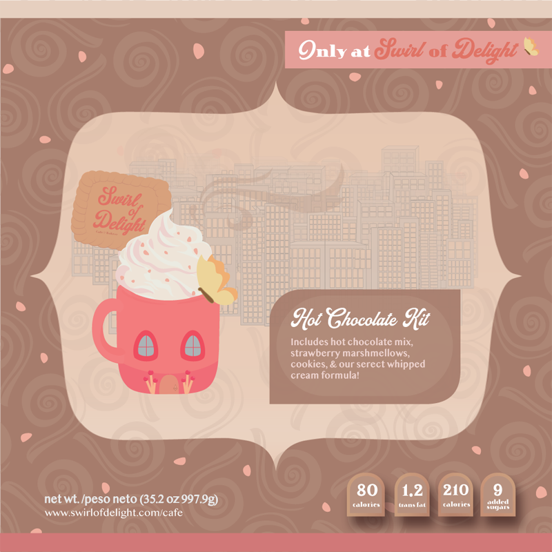
The strongest persuasive techniques I uses included the Magic ingredient where I state that there is a secret recipe/formula,
Transfer which are the images incorporated in the label stating this was based on ‘grandma’s recipe’ which adds a personal touch. And finally, Bribery – I hinted on the label that you get more (supplies+special recipe→ more united image).
For Persuasive Patterns, I included building personality and conditioning. It was super interesting to learn about. Moreover, I used logos to encourage people to be won over by the good price and lots of chocolate. It could be used as an incentive for gift-giving, to people on a budget. I also used Ethos because, in addition to visual incentives, I needed to focus on creating credibility
Product Ad Video
On Place-It, the platform we used to source all of our images to hold our logos and designs, we found that it allowed us to create a short clip of a video
Magazine Ad
Triptych
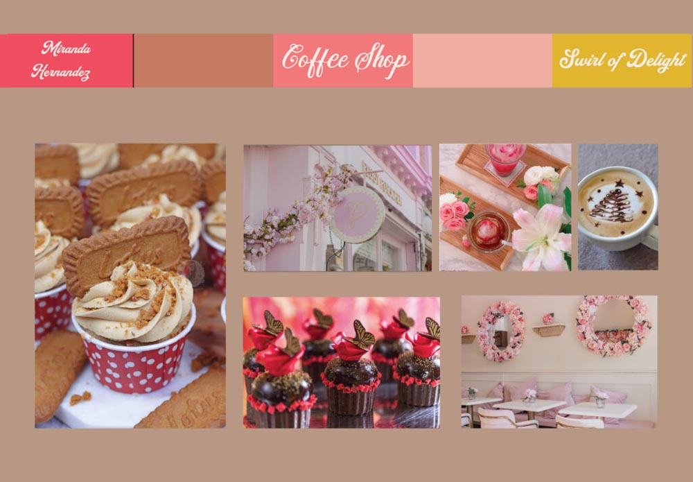
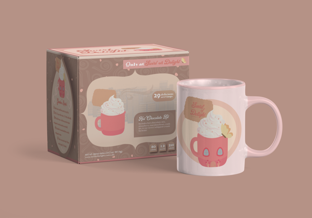
In Photoshop we created a triptych with includes three images that best represent our product. First is the Swirl of Delight Cafe & Bakery sign. In my second image is a mug with my hot chocolate kit design. Lastly is a baby with a onesie. I wanted to make sure that Swirl of Delight was inclusive to all ages drawn to cute things. That included young people, middle-aged females, curious children, and older people who like gifts, collecting limited editions.
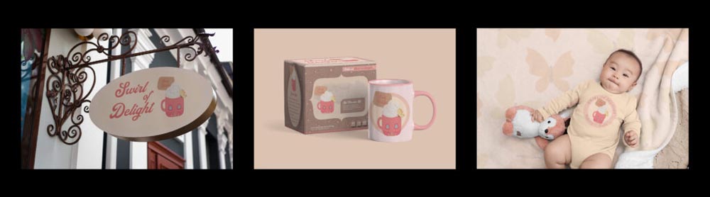
I used this as a basis for my magazine later on.
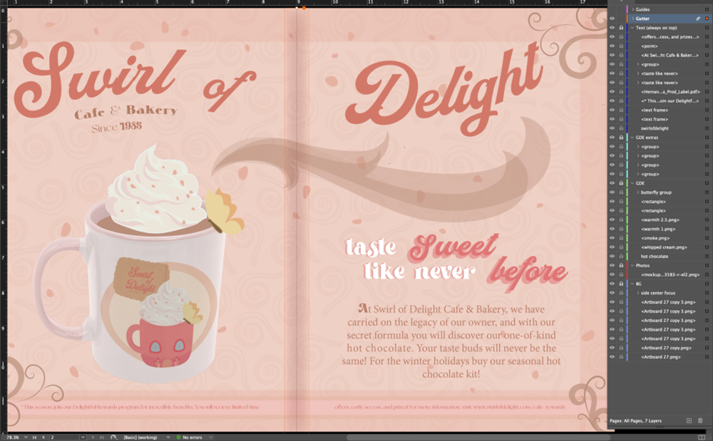
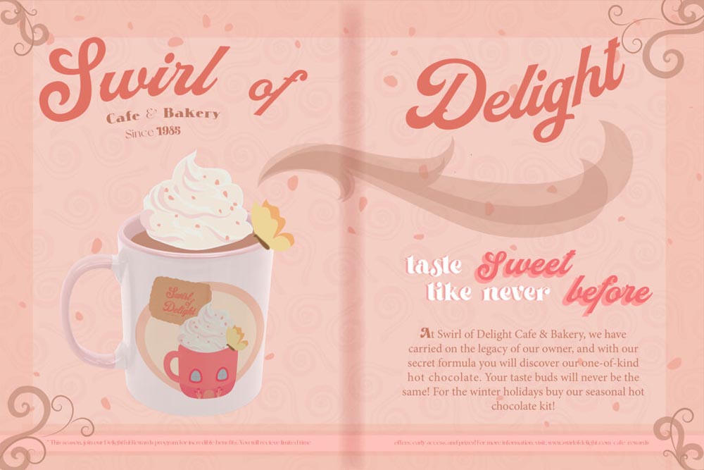
Swirl of Delight Ad
In Illustrator, I readjusted the design of the swirls I used for my label for the background. The graphics I use depict warm pink hues, browns, and yellows. I created sprinkles for my foreground and swirls to frame my layout. I continued by using Photoshop to delete the foreground of my cup. In Indesign, I maintained space for the gutter and added a fade. I adjusted the images in Indesign. Since my hot chocolate kit is already visually appealing, I used the Magic ingredient and Transfer persuasion techniques to add emphasis. Moreover, I continue building brand personality by creating a swirly plume of warm air rising from the cup of hot chocolate.
We got these printed and I was so excited to get them mounted and ready for exhibition/. It was very fun to do, but because I had acrylics and am short using the cutter proved to be a bit difficult. I had to get on my tippy toes to make sure the cutting got enough inertia. Tough luck!
Movie Poster
Lagrimas del Sol

My movie poster is mainly inspired by Mexican heritage, in this project I sought to explore it. Since young, I have been passionate about telenovelas, especially since they focused on the intensity of love and drama. The lead, Maria Guadalupe, is the daughter of a poor, struggling family in Mexico. For that, she must marry Enrique, the son of one of the most powerful men in el Pueblo. On the eve of the Mexican Revolution, she runs away with her forbidden beloved to join the revolutionaries. She is caught and forced to proceed with her arranged marriage. Little did she know her unhappiness would grow. Enrique turns abusive simultaneously realizing she is with child. When Maria snaps, she has to find it within herself to overcome all odds. Even if it means going against her very family, society, and even her heart.
I started by researching similar genres. Once I settled on my inspirations, I looked for images that I combined on Photoshop. I used a combination of clipping masks, the curves tool, and adjustments to saturation to form the image I wanted. I then moved my image onto Illustrator and with image trace recolored the pieces. I wanted to make sure that I captured the timelessness of pre-revolutionary times, specifically the resilience of the women during these times. They’re oftentimes ignored or distorted in retellings. For that reason, I chose to showcase Maria Guadalupe carrying her baby on her back while holding a gun. It represents her physical and emotional resolve to defend her beliefs. I added a hint of delicateness through the design of her dress, to depict her growing into maturity. Moreover, I picked red to represent the power of love and passion. I chose to showcase Maria Guadalupe carrying her baby on her back while holding a gun. It represents her physical and emotional resolve for her beliefs. and ferocity too. This especially contrasts with the background since it is meant to reflect the inner and outer turmoil surrounding her life.
Reflection
I’ve learned so much that I can already see the difference from when I first started Freestyle. I feel so much nostalgia already. I’ve had so many things going on in my life that I wish time would run a little slower so that I can savor and truly, truly give my best. I know though that I will have to do the best with what I have though. What’s next?