Introduction
The Reflections unit of is all about answering the question of “Who am I?” We worked on a variety of projects across classes from personal mandalas, to personal essays that could be used as college essays. In Animation, we created our own we learned the basics of creating 3D art, created our own character models, then learned to animate them. All of these projects pushed us to create artworks that reflect ourselves using many different forms of art.
Digital Media:
My Personal Mandalas
In Digital Media, we used Adobe Illustrator to create a mandala that reflected who we are as a person. Our mandalas would include imagery of aspects that reflect our lives and personalities. We started by creating a template using different features in Illustrator, including clipping masks, symmetry, and perfectly straight lines. Then, we used Wacom tablets and pressure-sensitive pens to actually draw our designs in black and white. After drawing it out, we made a copy to preserve the original design, then went in a added color to reflect the images we included in our mandalas. Once these were complete, we moved on to Adobe After Effects to create a build/reveal video of our final designs to show what our process was like and show the steps leading up to the final artwork.
If the images do not display below,
On a Mac, press Command + (plus) then press press Command – (minus)
On a PC, press the Ctrl + (plus) then press the Ctrl – (minus)


It was very satisfying to see my engraved mandala in person. I chose to have the lines engraved in white on a black background, and I’m very happy with how the contrast looks. I thought this would have a darker effect on the piece, and fit the theme of bodily images. When I was creating the artwork in Adobe Illustrator, I added a lot of detail in the center that worked well in my opinion, however, when it was printed, a lot of that detail got lost and looked somewhat messy.
Initially, I wasn’t very excited about the mandala project, especially during the first few stages of creating the templates, which was very tedious. However, going through all the steps was actually a lot of fun for me. Coming up with a theme for the design was challenging at first, but after brainstorming some ideas and deciding on a main focus for much of the lines, designing it was very enjoyable. Adding color to the original black and white design was a fun way of giving the lines a different look, and added even more uniqueness to my art, making it feel more like mine. Finally seeing all the steps I took and the final printed mandalas in person was extremely rewarding. It was exciting to see everything come together after working on all the individual steps for so long. The skills I learned creating the mandala were very technical, but now gives me opportunities to be more creative with my art in Adobe Illustrator. Creating the evenly spaced lines, concentric circles, and clipping masks lets me explore different ways to use these technical tools. I’ve come to appreciate and understand how others create their mandalas using technological tools, and greatly value other mandalas that might be hand drawn.


Using a copy of my black and white mandala, I continued to use Adobe Illustrator to add color to my lines and fill in some areas. It adds a lot more depth to the previously colorless lines, and gives people a better picture of what I was trying to create with my lines. The designs mimicking a mouth, for example, looks a lot more like an open smile with the lips colored red and the teeth a light gray. Many of the colors were meant to make certain lines look like blood or anatomical aspects like bones. Because there were several parts that were meant to imitate a ribcage or hip bones, I decided to make the background a dark gray so they would contrast better. I considered making the background completely black, however, some of the darker colored sections weren’t standing out as much as I’d liked, and the pupils of what were supposed to be eyeballs looked like holes in concentric circles. So, I found a balance and went with dark gray.
When adding the color, I started with the parts that I had a clear idea of what colors I wanted them to be. I colored all the bone and teeth aspects a light gray, and blood veins red and blue. I used preset palettes in Adobe Illustrator to make sure the colors worked well with each other. After coloring the parts I had clear visions for, I moved on to coloring some randomer lines that were sort of filler designs to connect all the pieces. I tried to add contrast while keeping the entire color palette cohesive and pop against the dark background. Seeing the printed design was very satisfying. It’s different seeing the color when it’s on a screen versus on a surface in real life. I enjoyed seeing something I made digitally printed in high quality on a surface other than paper. The sheen of the acrylic and clean lines in Adobe Illustrator made the artwork look very professional.
I’m very happy with how the ribcage part of my design worked out in the colored piece. I like the way I was able to make it pop against a darker background to make it stand out, and how well the lines work to surround the heart in the middle. It’s also one of the larger parts of the design, and I’m happy with the way it surrounds the rest of the mandala’s designs. Generally, I love both the black and white and the colored mandala designs. I’m happy with the ambiguity of the lines in the colorless one, and how the added color in the second version makes it clear what was really drawn out.

Personal Museum Curation
In August, we took a trip to the San Francisco Museum of Modern Art, the SFMOMA. Here, we were assigned to curate our own personal museum using works we both liked and disliked. I was drawn to a variety of different works, from Yayoi Kusama’s brightly colored pumpkins, to the monotone, dark work of Louise Nevelson. Meanwhile, I didn’t enjoy the more metallic, industrial artworks like Park McArthur’s metal street sign. Generally, it was fun to explore and consider what kind of artwork I would want to include in a museum curation instead of just walking around and viewing the work. It was also interesting to see everyone else’s personal curations and how some people chose the same work to specifically include or exclude from their museums.
Three Art Pieces I Would Add
to my Personal Museum Curation


Two Art Pieces I Would Exclude
from my Personal Museum Curation


I think as an artist, both what I enjoy making myself and what I don’t enjoy has influenced what I would like to include in my personal museum. There are some mediums I don’t enjoy working with, such as physical objects like the Rain Garden Zag IV, but because of that I find the artwork interesting to me. I also find Crisco appealing because I enjoy painting and am able to admire the artist’s skill as a painter, as I’m able to relate and sympathize with the process. On the other hand, I chose not to include the works I excluded because of my lack of understanding as someone who doesn’t work with those mediums as an artist. I’ve never really worked with metal, and it’s not something I’ve ever been interesting in working with, so I feel that I can’t completely judge the artists’ work in the pieces I chose to exclude. However, I just don’t find them terribly interesting, which is why I chose not to include them. They have the potential to having meaning for others, like the artist, but it’s my personal preference to not include them when I could have other, more interesting works. I think I just find the visual stimulation more engaging for me. Not working with certain mediums both increases my interest for some works, but also causes me to dislike other pieces, plainly depending on how visually appealing it is in my personal opinion.
Animation:
Learning 3D
This year in Animation, our focus is shifting from 2D animation to 3D. We started by learning the basics of 3D modeling in the program Maya, moved to ZBrush for textures, then Adobe Substance Painter for color. We returned back to Maya to actually animate our 3D models.


Our first real assignment was to create some sort of table scene using the basic shapes that were provided in Maya. I used mostly squares and rectangles and added more specific shapes like rings, cones, and cylinders for details like the plates, donuts, and center lamp. This helped me get a better feel for how Maya worked, like controls, and pushed me to create a scene using very basic shapes. After creating the main shapes, I exported the shapes to Zbrush to add textures. I used different brushes to add general texture like the frosting on the donuts and indents to the lampshade, then used the alpha tool to create the specific wood texture on the chairs and table. This tool takes a 2D black and white image and creates a 3D texture with the contrasting colors. Overall, this assignment helped me get a basic sense of how these 3D applications work and gave me great practice.

To better understand ZBrush, our next assignment was to 3D sculpt a skull solely using ZBrush. I used a sphere our base, then used the move tool to create a general shape. A tool that was very useful for this was the window transparency: basically, I could adjust the opacity of the ZBrush window and place an image behind it to light up my model with the shapes. I used this to get the general shape and mark out where features should start and end. I had a photo of the front and profile view of a skull behind the window during this “sketching” process. After creating the general shape, I used the standard brush tool to begin carving the indentations of the eyes, nose, and jaw. As I continued sculpting, I used a smaller and smaller brush size to get the finer details. One brush that was helpful was the HPolish. This let me smooth out the teeth to have a flatter look. Sculpting a skull was a helpful practice. toget a sense of how create organic shapes and textures using ZBrush. It better prepared me for creating more organic shapes and textures on other assignments like the final character model and character head.

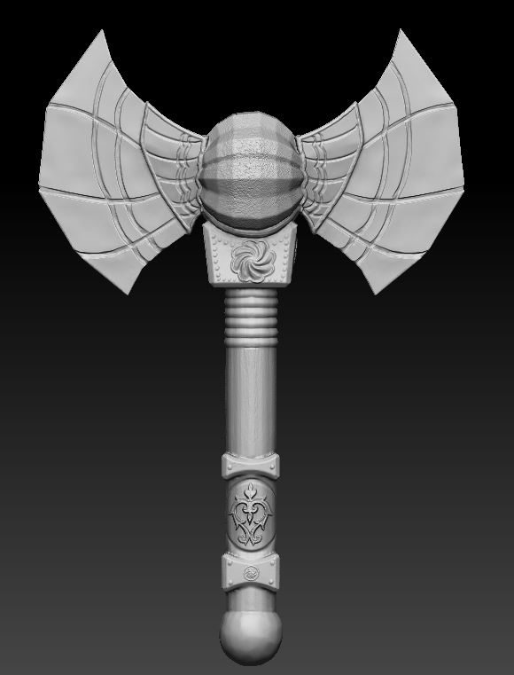

Next up was creating a model of a weapon for a character in Maya and exporting it out into ZBrush to add textures. I decided to create a symmetrical axe with a faceted sphere in the center by adding more complex shapes in Maya. I established this by adding vertices and extruding faces. I imported my sketch so I could more accurately create the shapes I was going for. In ZBrush, I smoothed the edges and added textures and engraved designs. I started by creating the indentations and popping out designs on the blade and handle. Then I used the Alpha tool to add more precise emblems like the one at the bottom of the handle and below the blade. To finish the model in ZBrush, I used the Alpha tool again to add a wooden texture to the handle and a rough texture to the faceted sphere. Finally, I exported the model to Adobe Substance Painter. I used the unwrapped 2D image of the shapes to add color that reflects the textures from ZBrush. This was a fun project to experiment more with the tools in Maya and ZBrush and helped us practice for our 3D character model.

Next, I created a character head in ZBrush, similarly to the skull assignment. This was for us to practice sculpting facial features so we could better create an actual character’s face. At first, I started by trying to create my own version of Walt Disney’s Luca sea monster. However, it was too simple and I couldn’t practice adding a whole lot of texture to the character’s face. So I greatly shifted my vision and exaggerated the fish-like features. I continued adding wrinkles, sagging to the face, bigger lips and eyes, and an exaggerated the arch of the brow. (To save him, I basically just tried to make him as ugly as possible to push the facial features.) I also used the Alpha tool again to get a scaly texture on the top of the head. Even though I struggled at the beginning to create a design that was working, I’m very happy with this character and I hope to expand on his design in the future. This was great for learning to push the features in character design and get familiar with how to sculpt exaggerated facial features. It was both extremely fun and helpful to have to create a character before finalizing our full 3D character model.


Finally, we began on our final 3D character Model. My teach told me that modeling a bigger character with less definite features would be difficult, but decided to go for the challenge. Although some parts of the process were hard, I’m ultimately very happy with how the final result turned out. It took a long time learning 3D and three different applications, but it was worth it to bring this character to life.
Character Model Artist Statement:
Creating this character in 3D form took a lot of time and learning. I completed a series of other assignments to learn to 3D model before being able to fully complete the final work. I used Maya to create the basic shape, ZBrush to add the texture, and Adobe Substance Painter to add colors. Now, I have a model and rig I can animate and motion capture.
To start, I sketched a few ideas for a character before settling on a snail man with glasses. My teacher told me 3D modeling and animating this subject would be difficult, but we decided that it was worth a shot anyways. I started creating basic shapes in Maya, consistently switching between a smooth mode and the geometric mode to make sure all the vertices and faces weren’t overlapping. After creating all of the shapes in a single object, I exported the smoother version into ZBrush. Here, I added texture to exaggerate the features of my character. I struggled with this part the most because I went into the design wanting to create a simpler character, but the simple design wasn’t working out. So I continued to push the features and decided to add a visible fungus-inspired illness and turn my character into a zombie snail man to add more visual interest. After adding features and textures, I put this model into Adobe Substance Painter for color. Again, I struggled here because I wasn’t sure what I wanted to do with his color palette. Originally, I wanted more realism and was going for more earth tones. However, I decided to go with more fantasy-like colors to add to the zombie factor. After adding a background and rendering the model, he was ready to go back into Maya for animation. I created a skeleton rig and used paint weights to make sure all the joints were moving smoothly. It was complicated because of his size, but worth the time to get everything moving correctly. To start animating, I posed each keyframe and Maya filled in the in-betweens. I did this for a walk, run, and jumping cycle, then rendered each frame out to put into Adobe After Effects.
The process was long and experimental, but it was worth it. I learned a lot about so many different applications and what makes an interesting 3D model and character. Even though I struggled, I’m very happy with how my final model turned out. I know so much more about not just how to 3D model, but what kind of 3D designs appeal to me.