Narrative Visual Perspective in Design
From this second Design narrative unit, I really valued learning more about how designers are able to design for specific brands or purposes and are able to come up with their own topics for design. I really enjoyed the process of creating all the projects under the product design segment and the movie poster segment. I was able to thoroughly enjoy being able to come up with what I wanted to create and learning how to use Adobe Photoshop and Adobe Illustrator even more. I also learned how brands do mockups and try to think creatively about the colors they use as well as how they try to integrate different types of typography and slogans.
Product Design
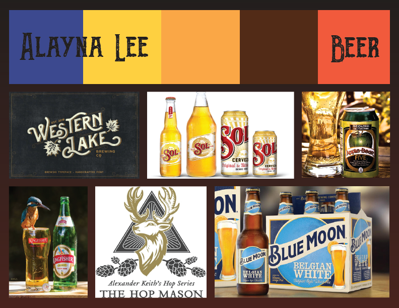
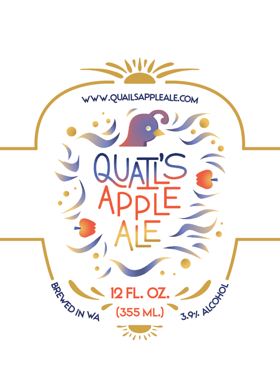
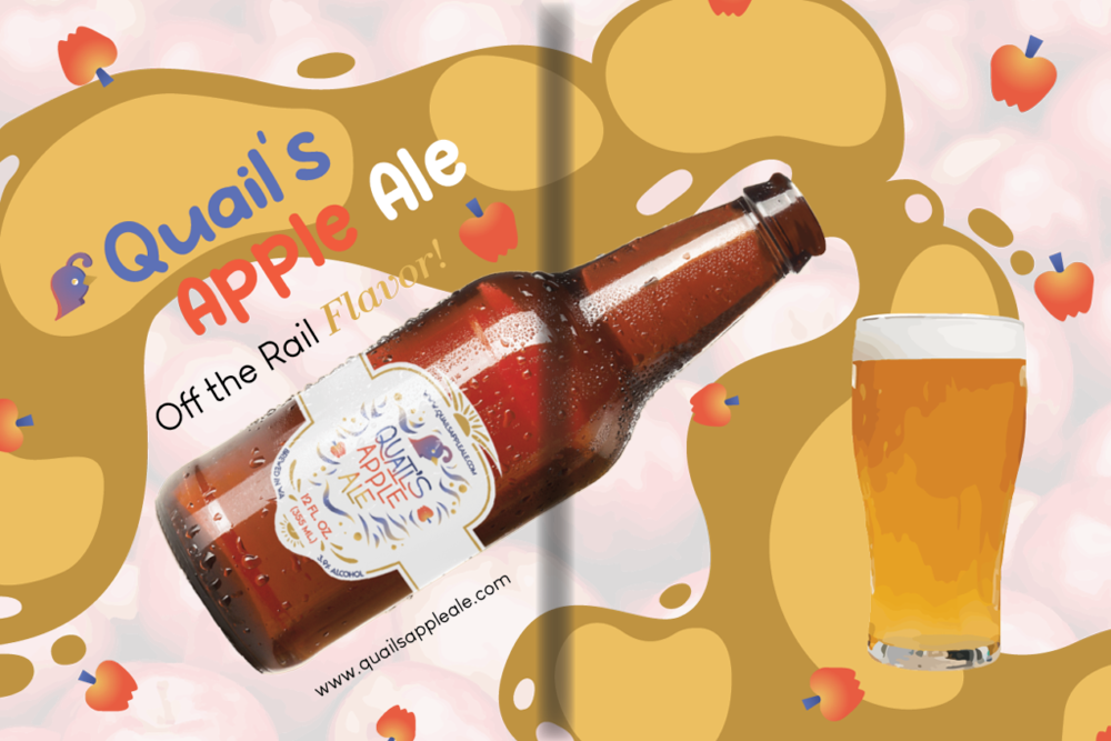
My product, Quail’s Apple Ale, is an apple-based beer focused towards people who are looking for a refreshing drink to enjoy after a long day of work, a drink to enjoy with a gathering of friends, or even enjoy at a fun party at the beach. Quail’s Apple Ale is brewed in Washington and has a 3.9% alcohol content. My main demographic is young adults who aren’t looking for a hard beer but rather a light beer with a sweet apple tang, and pretty much anyone who is looking for a spark of flavor.
If I were to create a magazine advertisement for my ale brand, I would most likely use more logos as opposed to ethos or pathos. This is because my brand focuses most on the difference between Quail’s Apple Ale and the appeal of other beers. With small alcohol content, my beer is mostly focused towards audiences who want to find pleasure in a good tasting drink rather than a drink that’s hard to down. My brand focuses on the taste of the drink first then the emotion of the customer second.
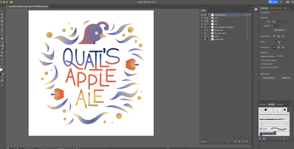
One technique I used to create my brand was to come up with rhymes to make my brand name catchy and easy to remember. I tried a bunch of rhymes for different products but ultimately came across ale. I immediately thought of apple ale and then added quail into the mix to have a branding that could have a recognizable mascot. With this idea in mind, I took the main aspects— quails, apples, and ales— and tried to figure out a color scheme. With this, I used an online color wheel and found a triad of blue, red, and yellow which fit my theme. After this came designing the logo itself. This is a part I struggled with because I had multiple ideas for how I wanted the logo to look. It was going to start with a western-based font to give the brand authenticity but started moving towards more of a modern approach to a logo. I struggled with choosing what I wanted to keep and remove from each of my logo sketches. In the end, I decided on each aspect based on what each part represents for the brand and if it would be able to appeal to a specific audience.
The button below is a link to see ALL parts of this product design project. This includes the logo, label, triptych, and video advertisement of not only just Quail’s Apple Ale but for all Design students’ projects.
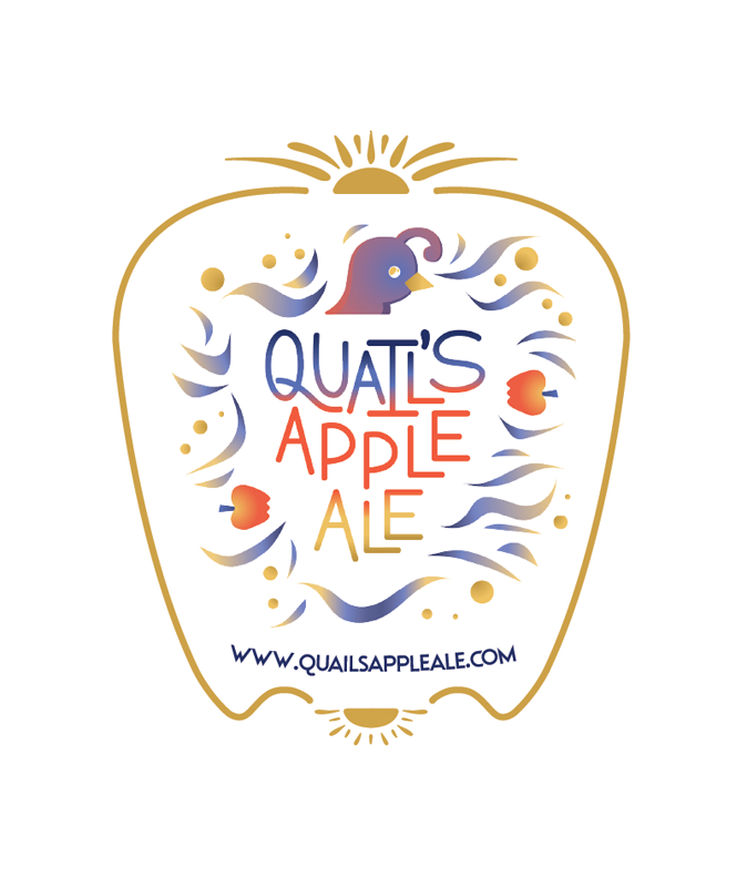
Product Logo
Product Label
Product Triptych
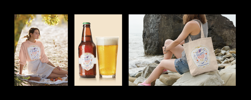
For this product design project, I created a triptych and a magazine advertisement (shown below under “Product Video & Magazine Advertisement”) for Quail’s Apple Ale. The triptych features my product’s logo on a display of items including a sweatshirt, an ale bottle, and a tote bag. In my magazine ad, I reused the ale bottle to tie my spread together with the flooded ale background I created. What I also included in my advertisement was some text with the title of my product, my slogan, and my website; along with some graphic design elements I created through Illustrator.
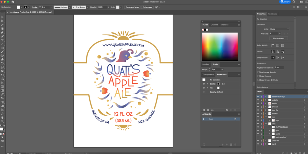
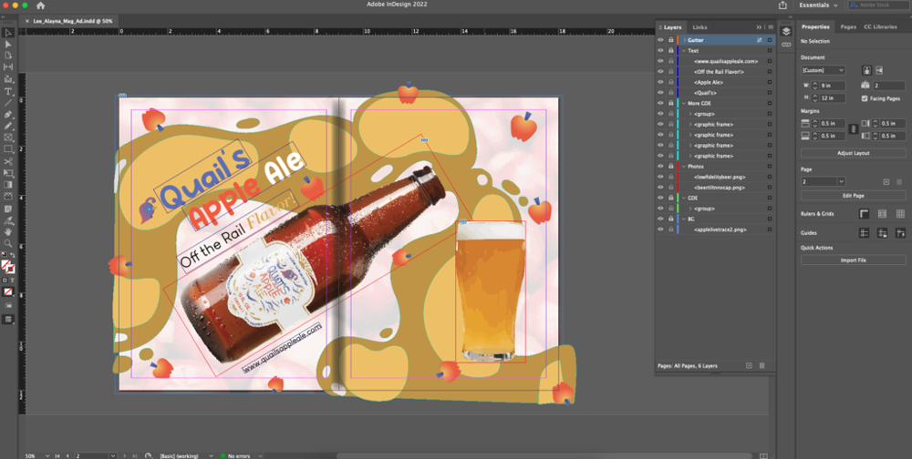
I was able to create the triptych by taking my original logo and creating it into a label. I came up with an apple background design that was able to include a gold trim that connected the information of my website, the alcohol percentage, the volume of the drink, and where the ale was brewed. For my sweatshirt and tote bag, I removed all of this information besides the website. Then, I inserted these labels onto mockups on Placeit. How I created my magazine ad, however, was through the placement of images and graphic design elements into InDesign that I created within Illustrator and Photoshop. The images of the open cup of ale and the apple background were from Pexels that I put into Photoshop to crop and edit. Afterward, I placed these images into Illustrator to live trace them. Once I had all these graphic design elements, I placed them into InDesign with the transparent PNG of the ale bottle I edited within Photoshop. The quail and the apples I created were copied and pasted from my earlier Illustrator project creating the logo for my product.
Product Video & Magazine Advertisement
Movie Poster
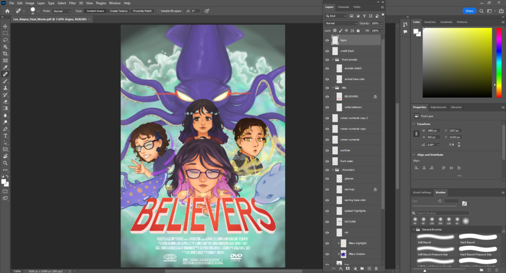
The story is about a giant squid supervillain whose main intention is to kill the people who have done it wrong. The squid has a memory of being pushed down to the bottom of the ocean after it tried attacking the nearby city decades ago. The four protagonists live in this city and heard from a local news station that the old supervillain had resurfaced in the middle of the ocean. The superhero friends realize that they are the only people who have the capabilities of defeating a villain this huge and preventing it from destroying their city. With their superhero powers of teleportation, water control, electricity control, and time-shifting, they decide to team up and travel to the ocean to try and send the giant squid back to the bottom of the ocean.
The poster I created for my story was made entirely in Adobe Photoshop. I focused on a superhero theme for my poster but slowly shifted it over to an anime-based superhero poster since my natural drawing style consists of anime-like features. I started off with a base sketch of how I wanted to position my main characters and what I wanted to create for my background. Later sketches consisted of more details into the characters’ poses and how I wanted to paste my title, credit block, and movie logos. I ended up creating a main outline for the four protagonists while only rendering the squid antagonist and the waves for the background. Big majority of this project was shading and rendering using the brush tool, using adjustment layers, and changing opacities of some layers as well.