Introduction
The explorations project invites juniors at Freestyle to explore a specific creative interest and connect it to one of Freestyle’s core 21st Century skills. For my explorations project, I created four unique posters with inspirational quotes. Each poster represents a principle of C.R.A.P, which is a foundational concept in design. C.R.A.P stands for contrast, repetition, alignment, and proximity. I connected my explorations project to 21st century skills of visual literacy and social and civic responsibility. Throughout the process, my goal was to experiment with fonts and images to convey motivational messages and use my art as a way to promote positivity.
The Process

Initially, I wanted to create a concrete poem for my explorations project. A concrete poem is a format where the lines of a poem are arranged in a way to look like the subject of it. I thought a concrete poem would be a unique blend of art and writing and that I could create a riveting arrangement of words. However, I struggled to find a poem of mine to use and realized that I wanted more versatility with my project to incorporate color and make multiple products. So, I decided to create posters. The push for this idea came from posters I’ve seen in my classrooms, which I feel often lack authenticity and character. They generally feature the same positive quotes and generic designs. So I wanted to see, how can I make a poster which tells a story but creates an engaging experience for the viewer? Once pivoting to this new idea, I decided to implement C.R.A.P as a tool to help me organize my designs and also make my illustrations interesting. I’m interested in typography, an interest which was especially developed during the Documentary unit when I had to design the pages for my book. Furthermore, I love layout and am always looking for different ideas to try out for my page in my school newspaper and on my bulletin board in my room.
I began by finding some inspirations which featured modern, bold color palettes with different text effects. I payed attention to opacity, length, and warp to consider implementing in my own designs.

After watching some YouTube videos about typography terms and skills, I started experimenting with text formats in Illustrator. I still attempted a concrete poem, but decided that I would soley focus on posters

I made the decision to use Illustrator for its versatility and also the fact that it is the Adobe application I have had the most experience with. However, I had not experimented with fonts extensively in Illustrator until this project, so it was an exciting new experience as well.
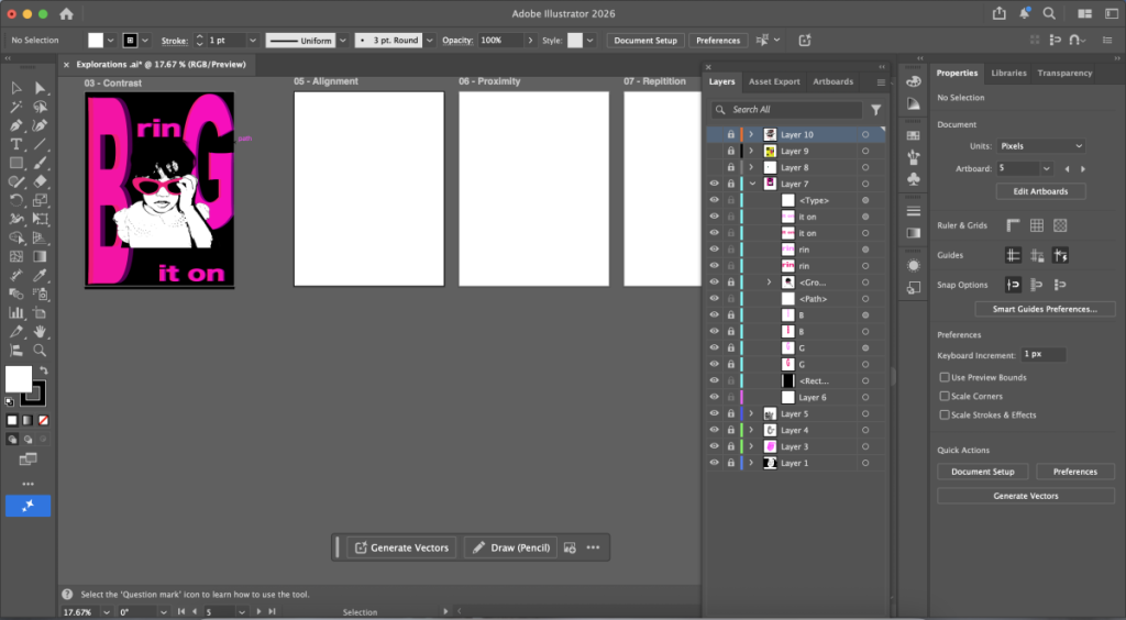
Contrast
For contrast, I used contrasting colors of black and pink along with the personal touch of adding my baby photo.
Key Features
- Baby photo, sunglasses, boss attitude
- Quote: “Bring it on.” I thought of this quote.
- Technical aspect in Illustrator: stamp effect, 3D lettering effect using varying opacity, individual manipulation of letters to change sizes, pen tool to create shapes.
- I purposely made the B and G big to give the illusion of it spelling “BIG” with my head being the I. I kept the “rin” to give the illusion of a crown on my head


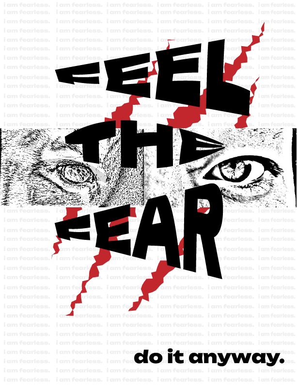
Repetition
For repetition, I decided to place a repeated phrase in the background of my design.
Key Features
- I wanted to do an overlay of human eyes with tiger eyes for a fierce design.
- Quote: “Feel the fear, do it anyway.” I found this quote on multiple designs online and it spoke to me.
- I asked my friend to take a photo of her eyes and then found a royalty free image of a tiger to create the central image.
- Technical aspects in Illustrator: Overlay, repeated words with shortcut CMD D, claw marks using pen and roughen effect, warp tool for the text.
- I decided to use a white, gray, and red color palette for a more serious and stark tone of the quote. I also used a photo-copy filter on my friend’s eyes and the tiger’s eyes to create a somewhat unsettling stare. It reminded me of the nocturnal cameras documentarians use for getting footage of wild animals.

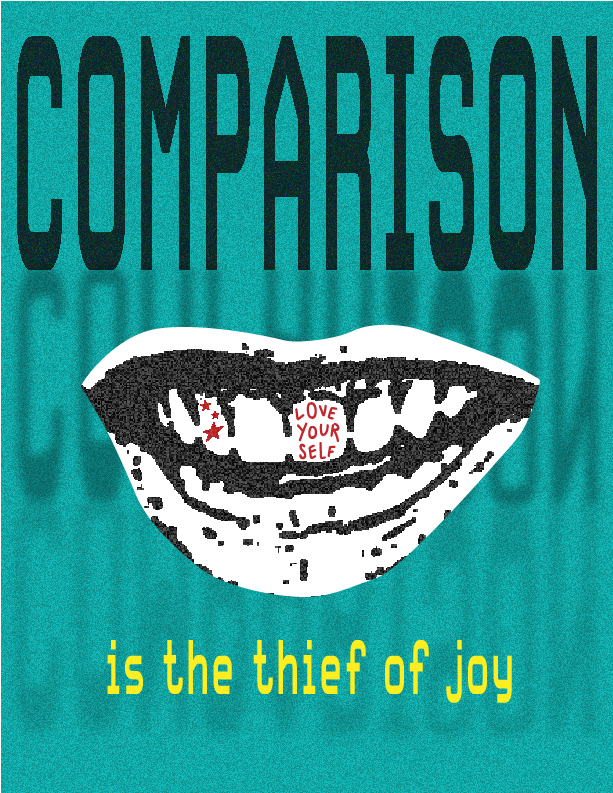
Alignment
For alignment, I wanted to line up words in the background and create a contrasting word at the bottom to be the focal point. This is my favorite design.
Key Features
- I used a photo of my smile I got from a photo of me at the beginning of the year in Freestyle. I wanted to make my mouth a large statement on the page.
- Quote: “Comparison is the thief of joy.” I also found this quote online and feel its relevance in my own life.
- Technical Aspects in Illustrator: Clipping mask to isolate smile, gaussian blur, grain effect, reflecting words, paintbrush tool, stamp effect.
- I chose a font which matched a “computer-style” font to illustrate the technological significance of comparison. Many of us compare ourselves with others online, especially on social media. Furthermore, I blurred the words to illustrate the message of losing oneself when trying to be someone else. Including my own smile was meaningful and I decided to paint on a message on one of my teeth to look like a tooth gem. To tie it together, I made the word comparison in black, but “thief of joy” in a bright yellow to work with the teal background and convey optimism.


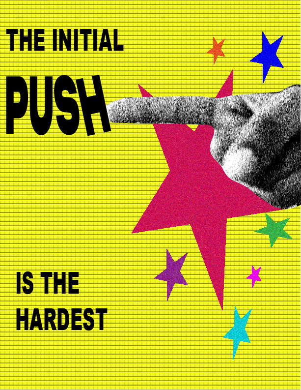
Proximity
For proximity, I wanted to create movement on the page.
Key Features
- I wanted to make the letters seem like they were falling or being pushed on the page and use youthful colors. To tie into the theme of personal touch, I took a photo of my hand pointing to give the illusion that I was pushing the letters.
- Quote: “The initial push is the hardest.” I found this quote on Pinterest and felt that it was a motivational message applicable to working through any difficult task. (Even completing this project!)
- Technical Aspects in Illustrator: I used the touch type tool to individually move letters, a graphic pen and brick effect for the photo of my hand and background. I also used the star shape and added a grain effect to make them seem glittery.
- I wanted to juxtapose the gray of the hand with colorful colors so I chose to use more youthful, bright, cheery colors. To fit the principle of proximity, I grouped the stars together, separating the letters from the stars.

Final Four
I’m really pleased with my final product because I feel that it is a creative representation of positive messages which I think all of us can use. The most challenging part was the planning stages and setbacks I had using Illustrator, especially because I took a long time to do things rather than finding shortcuts to make the process efficient. Because of this project, I have gained new skillsets and proficiency in Illustrator. I am glad that I stuck out during the process because I was tenacious to push my ideas through to the final product, and I shared my posters with my friends and classmates. It makes me proud that my designs are hanging in their rooms. Throughout exploring this medium, I realized my love for poster and cover design, and I hope to continue to learn more about the art of fonts.
Presentation
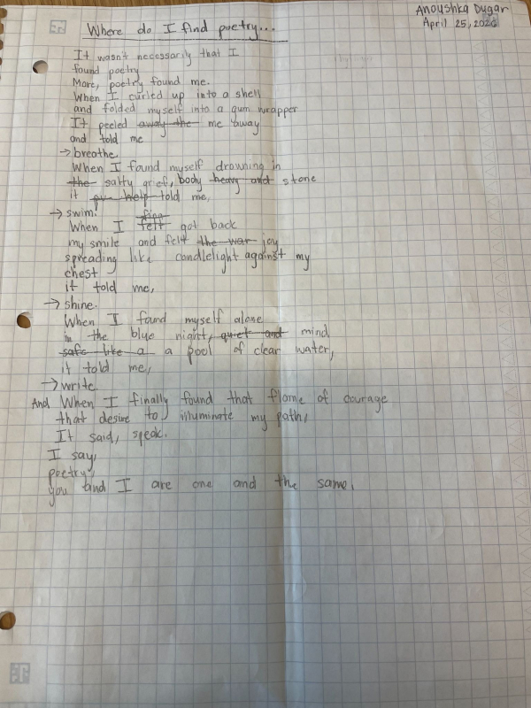
Poetry
We began our poetry unit in English with workshops conducted by local poet and author Christine Moore. I was eagerly awaiting this unit as poetry is my favorite form of creative writing. Ms.Moore’s first workshop was about using newspaper articles to find a subject for our poems. Our second workshop was on cento poem, which use lines from other poems to create new poetry. The the third workshop was on Ars Poetica, which were poems about our personal connections to poetry. Finally, our fourth and fifth workshops, led by our English teacher Mr.Greco, centered on the poems from National Poet Laureate Ada Limón,
Workshop Poems


Reflection
At the end of my second semester of junior year, we began one of my favorite units of the entire year; poetry. Documentary writing required me to communicate a real life subject in an informative and direct delivery, while poetry challenged me to think in a new way by expressing my observations of the world around me through lyrical lines and metaphorical approaches. Since middle school, I have had a deep love and interest for reading and writing poetry. In poetry, words are rhythmic, offering a glimpse into a more emotionally driven view of the world around us in a song-like beat, making the writing experience all the more engaging and enjoyable. I enjoyed embracing a poetic way of life during the unit, especially during the process of analyzing mentor poems. When reading excerpts from Ada Limón’s Bright Dead Things or I, Too by Langston Hughes, I guided my experience by paying attention to more than the meaning, instead focusing on line breaks, cadence, alliteration, and tone. Poetry cultivated my curiosity as a writer but also as a human, fostering a critical habit of mind which was educational and meaningful. And when it came to writing my own poem, I applied new poetic techniques we learned in class along with feedback from my classmates to develop my work to be stronger.
I chose to focus my attention on one longer poem which I had started writing in my notebook around a year ago, which was in the form of a letter. It was after some research that I realized that poetry and letters form an entire sub-genre, called epistolary poems. My poem, Letters in Sevens explores feelings of sadness, loneliness, and ultimate faith in a seven line and seven stanza structure. Seven is an important number in my life. I had seven friends in my first friend group, I am currently 17, and I am in the class of 2027. Not only did organization help me collect my thoughts, but it also provided neat guidelines for my line breaks. Line breaks are incredibly important in poetry and after reading poems by various authors, arranging the words on the page is just as important as the choice of words themselves. Letters in Sevens is arranged as such that it slowly unravels more and more after each stanza, illustrating the quality of the narrator coming to terms with personal freedom towards the end of the poem. It is this creative and artistic freedom I love so much about poetry. Words have meaning, but they also convey visual and audible messages — which I tried to emphasize in my recitation of the poem to my classmates. Previously in my reflection, I mentioned how much I missed the solitude of being with my notebook and pen, jotting down poems and couplets in bed which I did so often in middle school. This year, this spirit has become ignited again, thanks in part to this unit. I sneak lines into my notes app and book whenever I can, even if they are incomplete, they have potential to be a poem which will eventually bloom.
Poetry Production
In my production, I aimed to capture the mystical and somber quality of my poem by reading it in a dramatic yet hopeful tone and incorporating wistful music. Additionally, I used images to illustrate the subject of my poem directly and different fade effects to add movement to the text.
I used royalty free videos and images in my video to add an interesting visual element and music to set the tone of my poem to compliment my voice. I decided to implement these technical choices to make my poem come alive.