So this is my introduction to my design portion of my Narrative 2 project. I worked extremely hard on both of the things that I have here. One is a movie poster I made, and the other is a product line that I created. I spent the most time on my Photoshop Movie Poster project, so I’m going to talk about that first.
Movie Poster
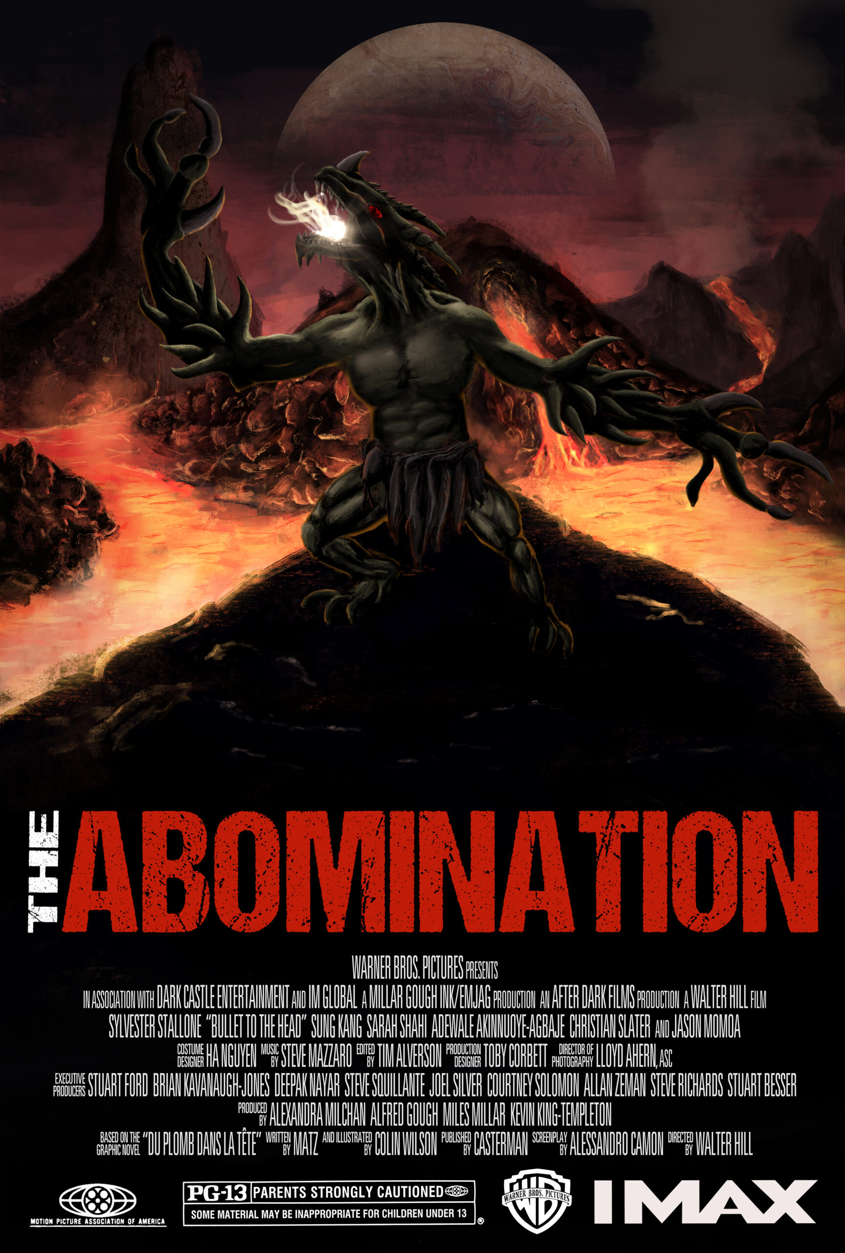
This poster is based off of a fictional story I created. The main character is a scientist on Mars that gets mutated into a half human-half alien through one of his experiments with extraterrestrials. He is physically changed into this imposing monster, but keeps the human brain and memories. He is then labeled as a threat and outcast to life on Mars. With the inability to speak, the “abomination” is challenged to adapt to all of his physical changes, environmental changes, while the human colony tries to hunt him. This poster showcases all of the different parts of the abomination while still hinting back at the human roots with some of its human features.
I created this poster in Photoshop. Originally, I had planned to use compositional techniques to create the creature and scene out of only pictures that had been spliced together. This was shut down, as I wasn’t able to get the photos that I needed, so I decided to do a mix of painting and compositing. This technique is commonly referred to as photo-bashing. I used a Wacom tablet and stylus as my paintbrush to bring everything together. I used this project as a way to push my abilities in Photoshop, and I believe I was pretty successful as what I was trying to accomplish.
Product Logo
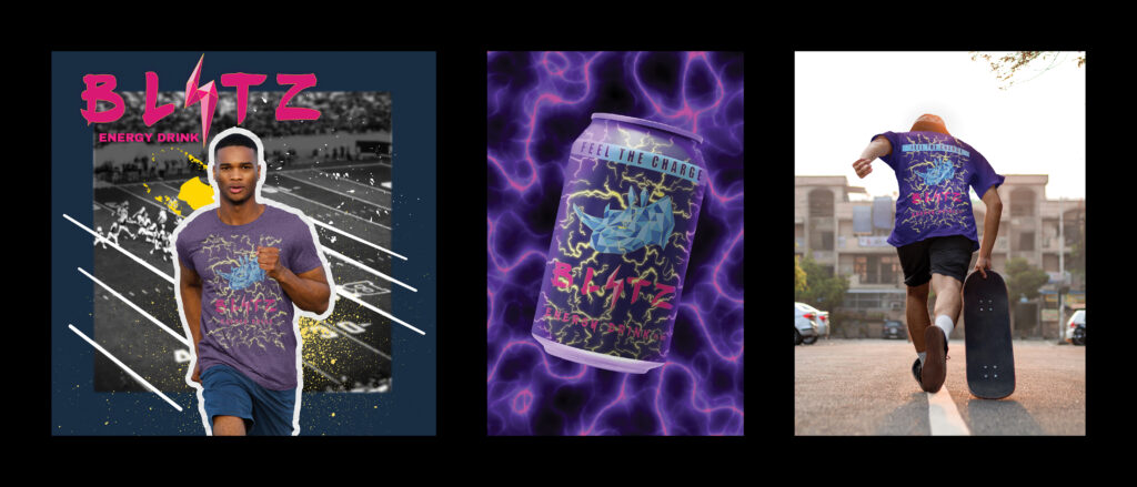
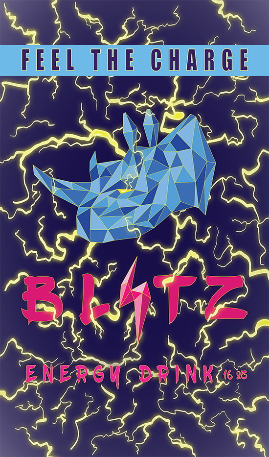
My product is called Blitz and it is an energy drink. I made it with the intention of reimagining what energy can labels look like. All of the energy drinks out on the market are very cookie cutter. I wanted to appeal to the younger generation as the hot new thing.
The way I designed my logo and label was first by using pencil and paper to sketch out ideas for what I wanted my rhino to look like. From there I messed with colors and outlined my favorite look. I took a scan of the final idea and uploaded it to my computer to bring into Adobe Illustrator. From there it was just a task of recreating what I had gotten down on paper on Illustrator. My main challenge was creating the lightning to look realistic, but after a couple YouTube tutorials, I was pretty much set.
If I was doing a magazine advertisement for this product, I would make it super high energy and mix together a whole bunch of different extreme sports athletes doing crazy stuff while the can is at the center. It would have the same theme of the geometric rhino, but with different terrains and people riding them. I would use famous people to endorse my product.
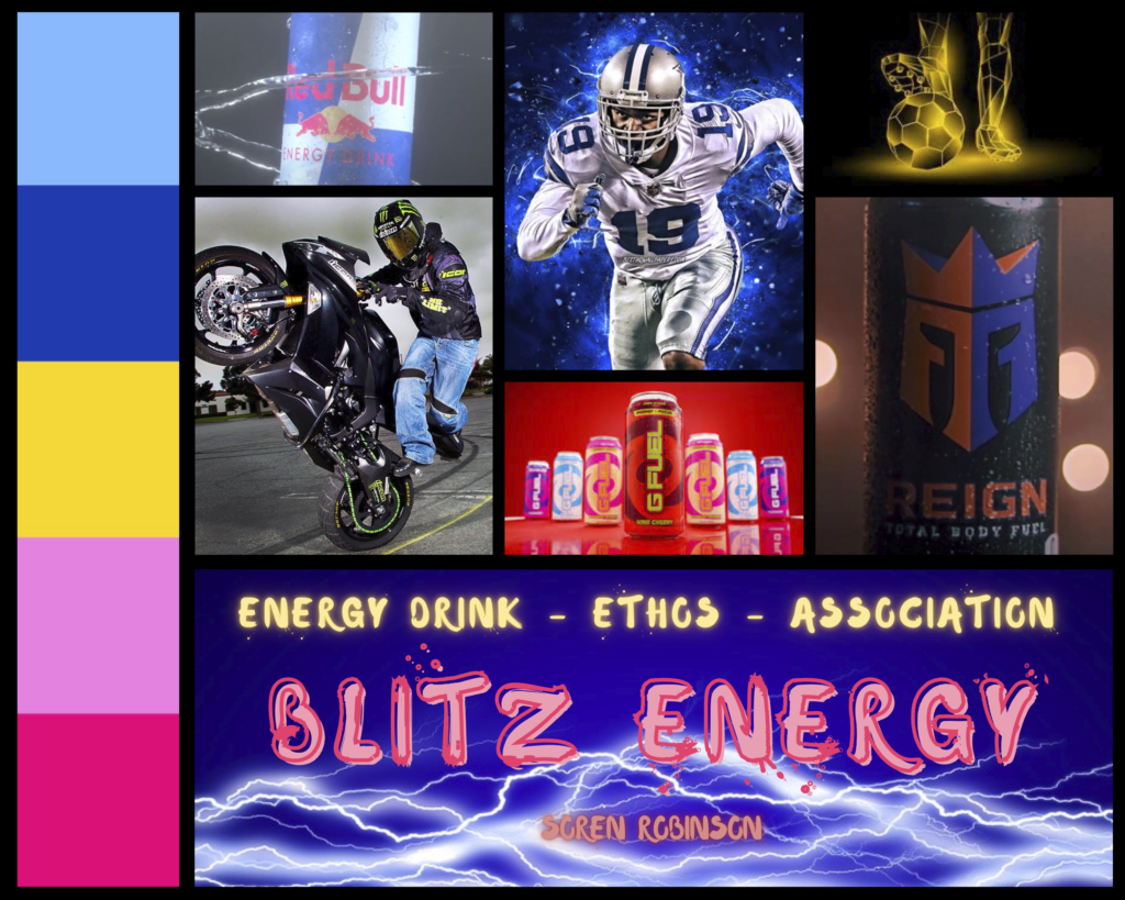
This is the mood board I used to help me come up with the unity and direction I wanted for my product. Throughout making this mood board, I changed how I wanted to represent my product, which made my product much better.